Top 11 Useful Tips for Better UI Design
The user interface is the part of web design where your visitor meets, communicate, and interact with your website or mobile and web applications. As a web designer, you are bound to create a user interface design that is not just beautiful and eye-catching but also functional and easy to navigate. How you lay out your website’s range of capabilities and other elements can make a great difference to the overall feel of your website. Some of these elements can be easy to overlook but if they are well-thought-out and deliberate, their impact to the viewer might be huge.
Here is a list of useful tips that you can take note of when crafting a UI design. As you know, UI design is a subgroup of UX design and focuses on the functionality of your site to give your audience the best possible experience. Its design and use of different user interface elements can either make or break the web presence you’re trying to build as it provides the type of experience your users have while using your websites or apps. Creating a great familiarity and an exciting connection for your users means generating leads, sales or profits; and most of all, success.
Know your users

It’s obvious. In every business, you have to know your target market first, whether you have a large one or none. And we are not just talking about demographics here because knowing your users means knowing what they want and how they want it.
This level of empathy cannot be achieved through analyzing stats alone; you have to watch them use your products, browse through your page, know what they click and what they don’t, and even talking to them personally through a comment section, social media or a live chat. You might also want to dig deeper and know not just what they want but also what they need.
There are many available ways to do this and once you know what their goals and desires are, what challenges they have, or what their deep-seated needs are; you will be able to gain insights and find ways on how to address them while fulfilling a web user’s fundamental requirements.
Define How People Use Your Interface

After knowing who your target market is, you should identify how your users will usually navigate your interface. This type of behavior may not be the same as how you use a website as a web designer. You might see things that your viewers will never even notice are there. So, it essential that you know how to put yourself in their shoes and design from their perspective.
There are two ways on how people interact with websites. They can directly interact with apps by tapping a button or dragging and dropping an item with a finger, and indirectly by pointing and clicking with a mouse or using key commands or shortcuts with a keyboard.
After identifying your demographic, you need to consider these things when designing your website or app. If you’re designing a business consulting website, your users are usually tech-unsavvy businessmen and you should design your buttons that are easy to find. If you’re designing an app for programmers or writers, you might want to design an interface that supports common keyboard shortcuts.
Keep it Simple

The phrase, “simplicity is beauty” has never been deemed untrue and it works in all aspects of design, even in UI design. As subtly implied above, business people work in a fast-paced environment and they do not have the time to browse and read through your site’s All they need is a large, visible button that will give them what they want from your site. And this is what others would want, too.
It is quite proven that a simple and clean modern website or app generates more success and revenue than that website with lots of ads and buttons. That is why minimalist designs are one of the best design trends nowadays. Gone are the days when web pages are traditionally filled with buttons and links that are linked to other pages of the website. Single page websites and apps are gaining notoriety as more people prefer scrolling down to find more information than waiting for pages to load when clicking on a label from the navigation menu.
Make the Interactions Efficient

Aside from making your overall design simple and your aesthetic minimal, you also have to make sure that the interactions done on your interface are efficient. Repetitive links like “Read more.” don’t actually work, unless they are placed there in subtle numbers and as an extension of an article that does not have any reason to be displayed as a whole.
Anybody can open and use your website or app and all will have the same version even if they are in different sizes depending on what device they use. If you have a variety of options integrated into your interface, an average Joe may get overwhelmed and get turned off, closing your page in less than 20 seconds, and increase your bounce rate.
In order to make these interactions more efficient, you can use the concept called progressive disclosures. It is where secondary features are hidden away on secondary interfaces while the major content is displayed well on the website’s homepage or your app’s landing page. This way, your average Joe will only have the features that he needs, while power users can have the option to dig deeper into the site.
Use Familiar Design Patterns
Using familiar design patterns make your interface easy to learn and content easy to find. A list of the best common practices in web design is made available for this purpose, and any web designer or developer should treat it like a bible.
A unique and state-of-the-art design can be used for creative websites or apps; yet, these websites and apps still incorporates the basic design principles into their projects. With these familiar design patterns, it is easier for your users to remember how to use your interface and encourage them to come back for more as familiarity breeds fondness.
Familiar elements and functionalities also make decision-making in the part of the viewers easier. Yes, integrating a never-before-seen feature can pique an audience’s interest, but not for long; especially if they are in large numbers, which also applies to widgets, banners, and such. Some of these elements may look cool but the more options you present to the user, especially unfamiliar ones, may make it harder for them to decide which to click first or may make them click the exit button instead.
Be Consistent in Your Design
There is no other thing that can turn a user off than an unorganized and cluttered web page or interface. After making your design simple and familiar, you also have to make sure that all the elements are in a cohesive and coherent manner.
The overall layout, navigation menus, pricing pages, blog indexes, content feeds, and other free form elements should have one thing in common that holds them together in a single place. Whether it’s the color, typography, or layout; each and every page should be consistent with one another.
This is also one way to build your brand across your website or app, just like how products are consistent with their advertisements, packaging, and other marketing materials. If you incorporate a consistent branding to your products, you will be able to generate familiarity as well as loyalty.
Understand How UI Plays into UX
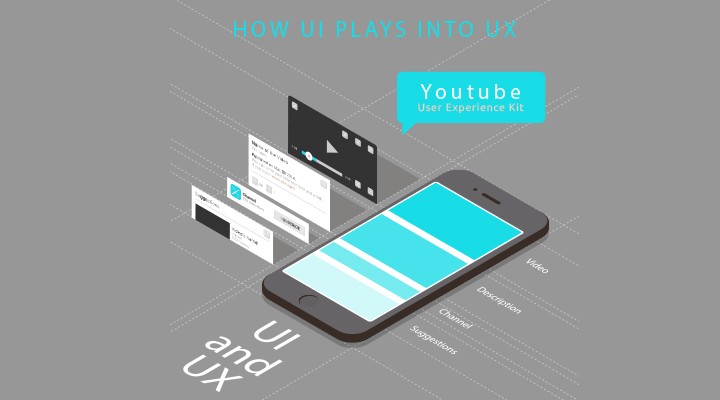
As mentioned earlier, UI is a subset of UX. It means that the user experience your website gives to its audience depends on the how the user interface is designed and laid out. According to the fundamental principles of human-computer interaction (HCI), interaction is given to technology through the interface while experience is given by technology during the interaction. Therefore, UX is relative to UI.
Just like how an architect and an engineer working to build a structure. UI designers, as engineers of a website or app, need to design based on basic principles along with the solutions to the problems users will encounter, how the user flow will play out as well as key product areas and hierarchies.
On the other hand, UX designers serve as the architects of websites and apps as he sees the overall design and how the users perceive the product as a whole. He takes the needs and wants of the consumers into consideration and other diverse factors that make an experience worthwhile when designing the product from top to bottom. This is evident with the top UI kits available nowadays.
Anticipate Mistakes

Just like anyone of every walk in life, mistakes are inevitable. It is very helpful to condition yourself that designing a user interface or any other creative project is a trial and error process before you embark on this journey. This way, you will have the right amount flexibility and patience to get this project through, no matter what happens.
This also applies to designing a user interface. Human error is unavoidable and the best way not to make them happen is to anticipate them and provide ways to fix them before they even happen, at least in UI design. After all, when these errors do happen, it will take a lot of effort from both designers and users to counteract the ramifications. Think entering your PIN wrongly three times on an ATM machine.
Therefore, it is very important to identify these errors and integrate solutions into the design first hand to avoid suffering the consequences. There are a lot of mistake-prevention techniques available in eCommerce websites and apps as well as form designs. For example, buttons are inactive until all the fields are filled up, a form detects an email address that hasn’t been entered properly, and a pop-up asking if you really want to leave the page even if there is still information that hasn’t been saved.
Give Feedback Fast

Long loading time can be a pet peeve and a turn off for most people. As a user, what is more frustrating is when you have no idea what is going on with the web page you needed open, whether it is still working or have already died altogether. Most digital interfaces nowadays fail to consider this factor in their designs, making most users wonder whether they should reload the page, restart their computers or just kill the page.
It is human nature to expect a response when we put something into action. Therefore, when your user asks your interface to do something, make sure to keep them entertained if your page needs to load longer than usual, whatever the reason is. You can use animation techniques or any visualization that does not imply progress. If you use a progress bar on your websites or apps, you can use some visual tricks that will make the loading time look faster.
This also applies to web and mobile UI forms and other elements that require your users to click on a “Submit” button. A simple assurance informing them that their information has been successfully submitted or that their passwords are incorrect can bring your website a long way. Just make sure it all happens considerably fast.
Don’t Ignore Standards
The best practices for web design were not made from the whims of an individual or a group of people. They were decided and curated based on the basic principles as well as the innovative ways that have developed through the years after being applied to real-world scenarios. And they should not be ignored.
As designers are highly creative individuals, they love reinventing things and putting their own style with anything they create. Yet, we all know that this does not work all the time and just like any creative material, why change something if it does not improve it?
Standards should always be considered especially when designing something like a user interface for websites and web apps. We have advised to use familiar elements and keep things consistent for this reason. You can be creative all you want, but make sure your web UI menu is consistently placed on the same corner throughout your web pages or you do not place your “Next” button where the “Exit” button usually is. You can clearly imagine what happens after that.
Implement a Visual Hierarchy

One way to effectively organize your content is to implement a visual hierarchy. This will help your viewers determine what are the elements all about, what kind of information they belong to, and how to use these types of information. The most important parts of the content should be highlighted along with information that the viewer should focus on.
Designing a user interface will give you a wide array of ways and methods to achieve this. This can be done by using different kinds of typography, incorporating colors whether on the font itself or its background, using blocks or a grid-based layout, and much more.
You can also create a color contrast and use them to convey a visual hierarchy as well as establish a relationship between the elements. Just make sure, though, that your use of colors is uniform across the same type of information and content. Also, keep them relatively at the minimum as not to overwhelm the look of your website or app. Remember, you have to keep your UI design simple.
So, there you have them. All in all, what these tips are basically saying is that your UI design must be human-centered as well as user-friendly. This means understanding the whole context from your users perspective and building your design from there. You also have to take note that, although some users tend to bypass poor functionality with beauty, it does not hurt to have them both on board. More probably, you will be able to make a fan out of your visitors when you follow these tips, have them stay with your product for a long time and have their seats on the edge for new releases willing to pay more just for the experience they will get.


