A Simple Guide on Creating Typography Effects Using jQuery and CSS3
Web design is incomplete without an appropriate use of typography. As a web designer, a special focus on typography will allow you to have a website that meets yours as well as your customers’ expectations. It is a timely and planned addition of varied typography effects that can render a much more refined look and feel to your website. In this tutorial, I’ll be explaining you the creation of special typography effects so as to enhance the visual appearance of the site under focus. So, let’s get going now! (Typographical Art Designs)

A Closer Look at CSS @Keyframe Rule
Popularly known as CSS3 keyframe animations, the CSS3 @keyframe rule helps you in creating awesome animations while combating the need for writing complex and lengthy scripts. Have a look at the CSS2 @Keyframe rule:
In the above format, you can find that @keyframe rule is followed by a special identifier. Also, the @rule along with its corresponding identifier is followed by a unique rule set that is being defined using curly braces. (3D Typography Poster Designs)
A Close Look at Keyframe Selectors
An easy way of adding a rule set within @keyframes rule is shown below:
In the above code, the animation is being segregated into different levels viz: 0%, 31%, 62% and 100%. Now, the explanation for each level is below:
- 0%- it represents the beginning of animation
- 31% and 62% – these two levels represent the intermediate execution of the animation
- 100%- it represents the completion of animation under focus
Two different examples to display the process of creating typography effects using jQuery and CSS3 (jQuery UI Templates)
Example No.1
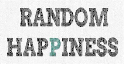
This is what we’re looking forward to create using CSS3 and jQuery:

In the above example, we’ll be applying a special animation to span class which would run once the entire web page has been loaded successfully. Here, we’ll be making a blurry letter look sharper. We will be using a mask for adding texture to letters. The code snippet for the same is shown below:
In addition to above, we can use the below code for creating random appearance of letters via allotment of animation delay to each letter within the typography effect:
It is the above animation that makes each letter appear blurry along with a text-shadow which is equipped with a transparent color and fuzziness. This text would later appear sharpened using a subtle text shadow and a solid color.
Example No.2
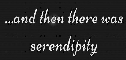
This is what we’re looking forward to create:

Quite similar to the above example 1, here we’ll be animating the letter in a specific order. Moreover, we’ll also apply a mask that would render texture to all letters. Code Snippet associated with the same is shown below:
Now that the animation would sharpen up the letters, we’d apply a new animation delay to each child as shown in below code snippet:
That’s it!
You can’t neglect the significance of having a brilliant typography for your website. I hope the details covered in the above post would allow you to equip your site with a scintillating typography that adds excellence to your web portal.


