Learning the Usage of SVG Viewport & View Box
Understanding the working of SVG (scalable vector graphics) is quite helpful in accurately designing a website. It becomes all the more crucial once you get more advanced in customizing SVG. This include gradients and different patterns that seem quite intimating for the majority of webmasters.

SVG looks great at any scale and height, but it can be scaled in a variety of ways so getting it scaled and behave as per your needs can be quite tricky for beginners. While this topic is quite diverse, my intention is to briefly discuss about SVG and its related elements- view box and viewport. This is quite helpful to get you started with the foundation of your website and make it more appealing to your visitors. (Best Website Templates)
So, let’s get started:
SVG is a Broad Concept Which Goes Beyond “Just” an Image
The reason why SVG is so difficult to scale because many time we come up with an idea on how an image should be scaled appropriately, and SVG doesn’t behave that way.
Raster images such as JPG, PNG, and GIF, boast clear defined sizes. The image file describes the browser regarding how a grid should be colored with pixels wide and pixels tall. Also, these raster images have a well defined aspect ration, which isn’t a case with SVG.
You can easily instruct browser to use a raster image with pre-determined height and width, however, forcing the same to a different aspect ration, things would go wrong. The reason being, traditionally a support was provided for auto scaling on images. It means you simply set the height and width, and the browser starts adjusting the other dimensions so that there would be no change in the aspect ratio.
On the contrary, SVG images can be rendered using any pixel size, so they don’t have clearly defined dimensions. Also, they don’t have pre-defined aspect ratios. You need to provide this information in order to make SVG image fit the dimensions.
Viewport
The viewport is the section of the page in view or where SVG will be visible. You can consider viewport as a window through which a particular section of an image can be seen. Here, the SVG can be provided with any width depending upon your needs. The user is allowed to see only a particular section of image at a time.
The viewport can be set using ‘height’ and ‘width’ attribute within the <svg>.
Though an SVG value can be defined with or without using a unit identifier. A value without any specific unit can be mentioned under user space using user units. Values that are specified in user units will be assumed in pixel units by default.
Viewport can also be defined using these units: em, ex, px, pt, pc, cm, mm, in (inches), and in percentages.
Whatever the unit you define on the <svg> element will have an effect on its size (viewport). For shapes within the svg image are determined by the units set on each shape. If you choose not to define the units, then the value will be considered as pixels by default.
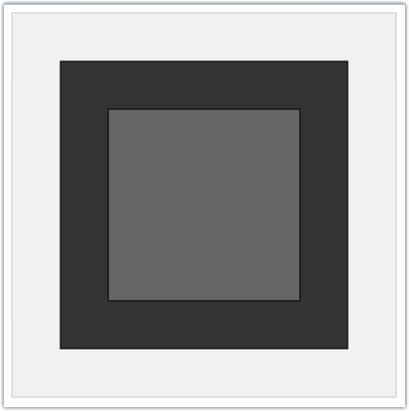
Following is the example of an <svg> element defining the shapes and set of units.
The above example showcases an <svg> image set in cm. The other two <rect> elements are also defined using two units. One uses pixels ( as there are no units specified) and the other one uses mm for height and width. The output should look like this:
 The View Box
SVG view box is a powerhouse in itself because it’s a place wherein vector graphics can be made scalable. The viewbox does following functions. It allows you define the aspect ratio of an image It provides ways to define all the lengths and coordinates used within the SVG, so that they can fit into the particular container element to eliminate the unnecessary white space. It defines the origin of the SVG coordinate system. The point from where the viewbox should start. (171+ Box Templates)
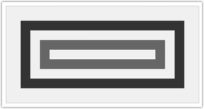
Using view box you can tell parser the amount of graphics stretch to fit into a particular container element. This eliminates unnecessary white space. The values within a view box can be specified using four numbers- min-x, min-y, width, and height within the <svg> element. The min-x and min-y define the origin of the view box, whereas width and height establish the size of the container element. Following is the example of viewbox:
The output should look like this:
>
The above example creates an <svg> element that uses a coordinate system 400 units wide and 200 units height. You can see how four coordinates are used together to define the view box of the <svg> element.
The 400X200 pixels display an area that starts at user unit (0,0) and spans 20×10 user units to the right and to the bottom. This way it can be said that 400 by 200 pixels <svg> element uses a coordinate system that moves from 0,0 to 20,10.
In other words, the first two coordinates in the viewbox are user coordinates that starts in the upper left corner of <svg> element, while the last two coordinates are user coordinates of the lower right corner. The space is rectangle that begins in the upper upper left coordinates of the view box and moves to the right 10px and 5px down.
PreserveAspectRatio
The viewbox attributes has another side known as PreserveAspectRatio. It defines how an image should be scaled if the aspect ratio of the view box doesn’t match the aspect ratio of the viewport. In most of the cases, its default behavior works fine: the image continues to scale unless until it fits both height and width, and it is located at the center of the extra space.
There are two ways with which the default behavior of PreserveAspect ratio can be set. The first way is- preserveAspectRatio=”xMidYMid meet”. The method instructs the browser to center the scaled viewBox region within the available region of the viewport, in both x and y directions. We advice you to substitute the mid value with min or max to ensure proper graphic alignments between the elements. It’s worth noticing the use of camelCase here. SVG is an XML file, so ‘x’ will always remain in lowercase and ‘Y’ in upper case.
The second way is to let the default preserveAspectRatio informs the browser to scale the graphic until it fills the available space ( both height and width). Here, the values for SVG is “slice” which allows you scale the image to fit the dimensions while eliminating the extra white space.


