Free Sales Guide on Interpreting Charts and Graphs

Charts and Graphs
A. Introduction
Sales charts and graphs serve as critical instruments for gauging the commercial performance of [Your Company Name]. These graphical representations offer insightful visual depictions of various metrics such as sales trends, customer preferences, and inventory levels. Mastery in reading and interpreting these charts and graphs is crucial for data-driven decision-making and long-term strategic planning.
Importance of Sales Charts and Graphs
Sales charts and graphs are more than just visual aids; they are strategic assets that can significantly impact business decisions. For instance, identifying a downward trend in sales early on can prompt timely interventions, such as launching a special promotional campaign or re-evaluating pricing strategies. Likewise, noticing an uptick in a specific product category may lead to increased inventory investments or targeted marketing efforts for that segment.
B. Types of Sales Charts and Graphs
Understanding the types of sales charts and graphs is the first step toward becoming proficient in interpreting the data they present. We employ a range of chart types to visualize sales data, each with its unique set of advantages and limitations. Knowing when to use which type of chart can significantly impact the quality of your analysis and subsequent decision-making.
Common Types and Their Characteristics
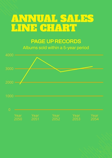
Line Chart: Ideal for tracking sales data over a continuous period, such as days, weeks, or years. Line charts are best suited for identifying long-term trends and patterns.
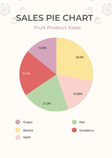
Pie Chart: Used to display how individual parts make up a whole. This type of chart is most effective when you have a limited number of categories that contribute to a single data set.
Bar Graph: Useful for comparing discrete data points across categories. Vertical bar graphs are typically used to compare data over time, while horizontal bar graphs are often used to compare categories.
Characteristics and Best Uses of Common Chart Types
Chart Type | Characteristics | Best Used For |
|---|---|---|
Line Chart | Shows trends over time, good for continuous data | Tracking monthly or yearly sales |
Pie Chart | Shows proportions, best for limited categories | Analyzing market share or product categories |
Bar Graph | Compares discrete data points, good for non-continuous data | Comparing performance across products or time periods |
Factors for Choosing the Right Chart Type
Continuous data is better represented by line charts, whereas discrete data can be displayed effectively using bar graphs.
Pie charts become less effective as the number of categories increases. They are best used when you have fewer categories to display.
C. Interpreting Line Charts
Line charts are one of the most commonly used types of charts in sales data analysis at [Your Company Name]. They excel in displaying trends over a specific time period, making them invaluable for longitudinal analysis. Interpreting line charts involves more than just observing rises and falls; it requires understanding the underlying factors that contribute to those fluctuations and what they signify for your business objectives.
Elements of a Line Chart
X-Axis: Represents the time variable, such as days, months, or years.
Y-Axis: Denotes the metric being measured, often sales revenue or units sold.
Line: Connects data points in a way that visually depicts the trend over time.
Data Points: Specific markers that represent the measured value at each time interval.
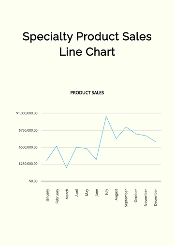
When these data points are plotted on a line chart, several patterns could emerge. For example, a sharp increase from February to March might indicate the impact of a successful marketing campaign or perhaps a seasonal effect.
Key Patterns to Look For
Upward Trend: A pattern of consistently rising data points often suggests that the implemented sales strategies are effective. This could be due to a well-received product launch, growing market demand, or a successful marketing campaign. However, it's crucial to assess the sustainability of this growth to ensure it's not a temporary surge.
Downward Trend: A sustained pattern of decline in the line graph is a cause for concern. This could be indicative of several issues such as market saturation, ineffective pricing strategies, or increased competition from rival companies. Swift action is required to understand and address the root causes.
Volatility: A line chart showing frequent oscillations between highs and lows suggests market instability or potential influence of external factors such as economic or political events. In such scenarios, it becomes important to analyze the external environment and make contingency plans.
Advanced Techniques for Interpretation
Moving Averages: Implementing moving averages is a technique to smooth out data over a specific time frame, making it easier to identify underlying trends. For instance, a 3-month moving average could provide valuable insights into quarterly performance, removing the 'noise' associated with monthly fluctuations.
Rate of Change: By calculating the rate of change between consecutive periods, you can quantify the speed at which sales are increasing or decreasing. This quantitative measure can offer more granular insights into the dynamics of sales growth or contraction.
Seasonal Adjustments: Many businesses experience seasonal fluctuations.
Accounting for these in your line chart can offer a more accurate depiction of performance. This involves adjusting the data to remove the seasonal component, enabling a clearer view of the non-seasonal trends.
By mastering these techniques and understanding the nuances of line charts, you will be better positioned to derive actionable insights from the sales data. This, in turn, can inform strategic decisions at [Your Company Name], from short-term adjustments to long-term planning.
D. Interpreting Pie Charts
Pie charts are particularly effective for displaying the distribution of a single set of data into its constituent parts. They offer a snapshot of how individual categories contribute to an overall total. While pie charts may appear straightforward, interpreting them accurately is critical for actionable insights.
Elements of a Pie Chart
Slices: Each slice represents a category or a segment of the whole data set.
Labels: These typically indicate what each slice represents, often accompanied by the actual value or percentage share.
Legend: An optional key explaining the colors or patterns used for each slice.
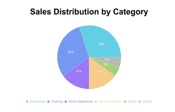
In a pie chart, the slice for Electronics is the largest, indicating that it is the most significant contributor to sales for that quarter.
Key Metrics to Observe
Dominant Slices: A slice that takes up a significant portion of the pie chart is an indicator of a high-performing category. This could suggest that a strategic focus on this category, such as ramping up advertising or increasing inventory levels, could further optimize sales performance. It's essential to understand the factors contributing to this dominance for targeted strategic actions.
Smaller Slices: On the flip side, smaller slices might signify categories that are lagging in performance. These require careful evaluation to determine whether they are worth sustaining through modified marketing tactics or require discontinuation to reallocate resources to more lucrative segments.
Proportionality: Understanding how individual slices relate to each other proportionally can provide insights into the synergies or conflicts among different categories. For instance, if two closely related categories are underperforming, it might indicate a shared underlying issue that needs to be addressed.
Advanced Techniques for Interpretation
Relative Size Comparison: Assessing the percentage change in each slice over multiple time periods can unveil trends or anomalies in category performance. For instance, a shrinking slice could indicate a declining market share, warranting immediate corrective actions.
Segment Overlays: To achieve a multi-dimensional analysis, consider overlaying additional metrics on each slice, such as profit margins or customer retention rates. This allows for a more nuanced understanding of each category's overall contribution to the business.
Temporal Tracking: Periodic comparisons of pie charts over different time frames can expose shifts in market dynamics, like the rise or decline of certain categories. This is crucial for long-term planning and helps in foreseeing potential market shifts that can significantly impact business strategy.
By mastering these advanced techniques and paying attention to the subtleties of pie charts, you can extract meaningful conclusions that are essential for decision-making processes at [Your Company Name]. This deeper level of understanding enables you to optimize resource allocation, identify opportunities, and mitigate risks effectively.
E. Interpreting Bar Graphs
Bar graphs are highly versatile and are widely used for comparing quantities across different categories. At [Your Company Name], bar graphs are often employed for everything from sales performance by region to customer demographics. Correct interpretation of these graphs can provide invaluable insights that can shape both tactical and strategic decisions.
Elements of a Bar Graph
Bars: Vertical or horizontal rectangles that represent the metric being compared.
X-Axis: Usually represents the categories being compared, such as product types or time periods.
Y-Axis: Indicates the scale of the metric being measured, such as sales volume or revenue.
Labels: Numerical labels on or above the bars indicate the precise value of the metric.
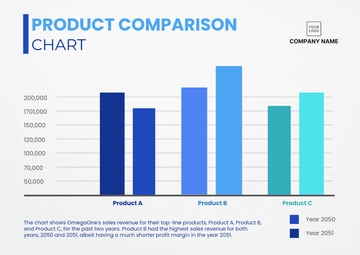
The bars representing each region's sales can quickly convey which areas are performing well and which may require attention.
Key Metrics to Observe
Height/Length of Bars: The most immediate metric to assess in a bar graph is the size of each bar, whether the graph is oriented vertically or horizontally. Bars of greater length or height typically indicate superior performance in the metric under consideration. This could be a signal to potentially expand operations or penetrate deeper into that specific market sector. However, it's important to balance this initial observation with other metrics to validate the opportunity for growth.
Comparison Across Categories: A crucial interpretative step is to compare bars across different categories, such as regions or time periods. If certain categories consistently exhibit larger bars, this could signify either a more favorable market condition or the effectiveness of the local operational strategies. Identification of these standout performers can serve as a case study for replicating success in other categories.
Variability: Observing significant variations in the size of bars within a single category can be enlightening. These fluctuations may highlight inconsistencies in performance and potentially point to areas that could benefit from targeted improvements, be it in resource allocation, staffing, or marketing strategies.
Advanced Techniques for Interpretation
Stacked Bars: Stacked bar graphs divide each primary bar into smaller sub-categories, providing an additional layer of information. This enables a nuanced understanding of not just the total metric, but also its composition. For instance, a bar representing total sales could be subdivided into online and offline sales, offering insights into channel effectiveness.
Percentage Bars: Converting the data to percentages can shift the focus from absolute values to relative contributions. This is particularly useful when you wish to understand how each category compares to the whole in terms of proportionality, rather than just scale.
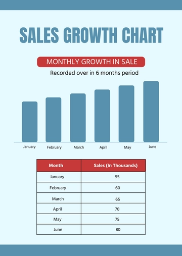
Time Series Analysis: When bar graphs represent data spanning multiple time periods, they can function similarly to line graphs in revealing trends. Careful observation of changes in bar heights over time can provide valuable insights into emerging trends, growth rates, and even seasonal fluctuations that might warrant strategic adjustments.
By adeptly interpreting bar graphs and applying these advanced techniques, you can derive comprehensive insights into various aspects of [Your Company Name]'s performance. This enables you to make data-driven decisions that contribute positively to both short-term and long-term organizational goals.
F. Conclusion
Interpreting sales charts and graphs is crucial for the sustained growth and profitability of [Your Company Name]. Understanding the nuances of line charts, pie charts, and bar graphs can aid in strategic planning and operational adjustments. Make it a practice to regularly review and analyze these visual aids for the most informed decision-making.
- 100% Customizable, free editor
- Access 1 Million+ Templates, photo’s & graphics
- Download or share as a template
- Click and replace photos, graphics, text, backgrounds
- Resize, crop, AI write & more
- Access advanced editor
The Sales Guide on Interpreting Charts and Graphs Template is an instructional booklet aimed at equipping sales personnel with the skills needed to understand various forms of data visualizations. Cover the basics of chart types, interpret scales, and draw meaningful conclusions from visual data. Get it now at Template.net!
You may also like
- Bar Graph Chart
- Line Graph Chart
- Pie Graph Chart
- Table Graph Chart
- Scatter Graph Chart
- Area Graph Chart
- Tree Graph Chart
- Birth Chart
- Chore Chart
- Time Table Chart
- Dress Size Chart
- Football Depth Chart
- Color Chart
- Color Wheel Chart
- Color Mix Chart
- Classroom Seating Chart
- Church Organizational Chart
- Hierarchy Organizational Chart
- Tree Organizational Chart
- Organization Chart
- Time Chart
- Blood Pressure Chart
- Behavior Chart
- Process Flowchart
- Process Flow Chart
- Baby Feeding Chart
- BMI Chart
- Ring Size Chart
- Height Chart
- Number Chart
- Food Chart
- Baby Milestones Chart
- Blood Sugar Chart
- Body Temperature Chart
- Diet Chart
- Metric Chart
- Pregnancy Weight Gain Chart
- HCG Levels Chart
- Astrology Chart
- Blood Oxygen Level Chart
- Gauge Chart
- Sales Chart
- Marketing Chart
- Military Time Chart
- Pregnancy Food Chart
- Medical Chart
- Wedding Seating Chart
- Guitar Chord Chart
- Pedigree Chart
- Natal Chart
- Team Organizational Chart
- Feelings Chart
- Piano Chord Chart
- Shoe Size Chart
- Activity Chart
- Height Weight
- Eye Chart
- Chakra Chart
- Reflexology Chart
- Hospital Organizational Chart
- Radar Chart
- College Organizational Chart
- Column Chart
- Roman Numerals Chart
- Weather Chart
- Height Conversion Chart
- Food Calorie Chart
- Fundraising Chart
- Kids Chore Chart
- Donut Chart
- Incident Flow Chart
- Patient Chart
- Body Measurement Chart
- Synastry Chart
- Funnel Chart
- Goal Chart
- Weight Loss Chart
- Money Chart
- Research FlowChart
- Medical Organizational Chart
- Protein Chart
- Retail Organizational Chart
- Sports Organizational Chart
- Vitamin Chart
- Research Gantt Chart
- To Do Chart
- Tooth Chart
- Conjugation Chart
- Drug Chart
- Event FlowChart
- Gildan Size Chart
- Logistics Organizational Chart
- Production FlowChart
- Bank Organizational Chart
- Dental Chart
- Dissertation Gantt Chart
- Training Gantt Chart
- Warehouse Organizational Chart
- Army Weight Chart
- Communication FlowChart
- Face Chart
- Pharma Organizational Chart
- Travel Gantt Chart
- Gaming FlowChart
- Insurance Organizational Chart
- Manufacturing Chart
- Progress Chart
- Travel Organizational Chart
- Charity FlowChart
- Design Firm/Company Organizational Chart
- Hospital Gantt Chart
- Manufacturing Gantt Chart
- Recruitment Gantt Chart
- Website Gantt Chart
- Environment Organizational Chart
- Fire Organizational Chart
