Top 5 Bootstrap Alternative CSS Frameworks
To say Twitter Bootstrap has become a popular framework for developers could be viewed as an understatement- there are a lot of websites out there that are clearly built with Bootstrap Framework. Bootstrap is free, it provides a great deal of functionality, it’s simple to work with and allows you to get up and running fast with a solid framework. However, Bootstrap is not for everyone. For those of you that would prefer to work with an alternative framework, here are your top viva choices.
Why Not Bootstrap?
- Bootstrap is a very big file that can weigh your sites down at times.
- You may want to replace some Bootstrap features with your own which takes time.
- Bootstrap is too common and can be seen as less professional to some.
1 . Foundation Framework – Professional Choice for Designers
Foundation is also a popular framework that has similar quality and features like Bootstrap. Like Bootstrap, it has a grid system which assists the developer in making quick changes. Foundation has been a leader in comparison to other front-end frameworks with regards to grids – it features a block grid which the developer can use to split the content of an unordered list into a grid. This framework uses different measuring units than Bootstrap. Bootstrap uses pixels while Foundation uses Reams. (Foundation Templates & Themes)
Foundation has features such as pricing tables, a pre-built interchange feature for responsive images, and an orbit slider. Lat also offers better specifications and features for mobile apps than Bootstrap does. Foundation is a good choice if you need many user interface elements. Bootstrap and Foundation both offer JavaScript components ready to use right out of the box. Foundation is mobile-first and slightly smaller than Bootstrap, making it a very popular framework.
2. Skeleton Styles a Handful of HTML Elements
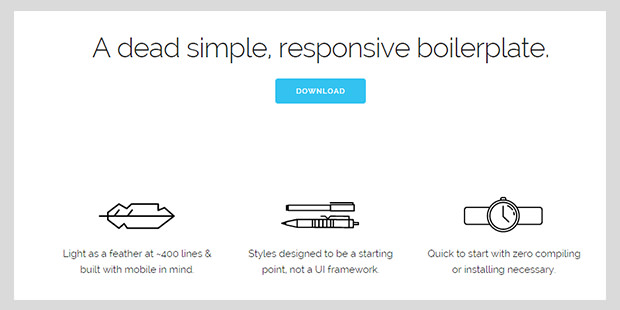
Skeleton, like Foundation and Bootstrap, includes a basic grid system. It is a good choice for smaller projects when you don’t need the power of larger frameworks. The Skeleton grid uses 16 columns per row instead of 12, and provides a couple of responsive components. Skeleton can be deployed rapidly and it is much more lightweight. It is ideal to use in the situation where you have some pre-built components already, and it offers flexibility in this way. It allows developers to quickly build responsive websites. Skeleton provides you with the fundamentals to get you started such as buttons, lists, tables and forms, though little-to-no powerful features.
3. YAML4 Framework for Responsive Websites
YAML 4 is tested and supported in browsers such as Chrome, Opera, Safari, Firefox and lnternet Explorer. YAML has a slim framework core and also offers support for older browser versions. It has a flexible grid system YAML provides a set of matched building blocks, and it has a wide range of themes for developers to work with.
It may lack some basic features such as multi-level drop-down menus that you can find with Foundation or Bootstrap, but YAML separates the structural layout modules from the visual design which Foundation does not do. It also gives you the choice of using Compass if you want to change the look. You can also find tutorials and templates increasing YAML’s ability to work with content management systems such as WordPress.
4. CardinalCSS for Aesthetic Design Decisions
CardinalCSS is a mobile-first cu framework created for high performance and availability. Its purpose was to make it easier to prototype, scale, and maintain CSS in the creation of responsive websites, applications and user interfaces. It leaves out many design decisions which can bog down more complicated CSS frameworks. Cardinal leaves the design up to the developer and functions to create a base for the development project. Their motto is “build more with less“.
This framework uses the REM unit to scale the typography and layout at breakpoints that you choose. The system is built without using floats – with Cardinal you design for the smallest devices first, then you are able to determine the most important features of your application. It produces an application that focuses on the most important tasks. It has helpful default styles, fluid typography and a responsive grid system.
5. 960 Grid System with Rapid Prototyping
This is a front-end framework which streamlines the web-development workflow, based on a 960 px wide container. The container then can be divided into 12, 16 or 24 columns for greater ease in laying out content. There are numerous templates and layouts to get you started. 960 was made to speed up prototype designing. but it works just as well in production environments. Because 960.gs has a custom CSS generator, it is possible to download different sizes of CSS files, and therefore your project will be portable across various screen sizes such as desktop TV and smartphones. 960.gs has a feature which enables you to use background space effectively matching and perfecting the design proportions. 960 Grid System is the lightest CSS framework here and has no extra features, just a grid.
The advantage of CSS frameworks are the quicker loading times, smaller file sizes, plug-in support and grid systems, along with many other features. The choice of framework is often due to personal preference, and appropriateness for the project. Using Bootstrap on some projects might be unnecessary when the project is simple, or when some components are already existing in the project and you don’t want to make great changes. There are also many kinds of CSS Frameworks designed for specific purposes. (CSS3 Websites Templates for Design )


