Free AI Calendar Heat Map Generator

Create Calendar Heat Map Charts, Customize Online with Smart AI Powered Generator
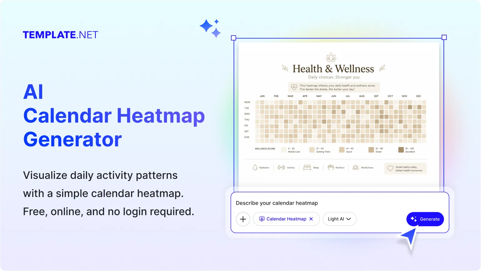
Template.net's Free AI Calendar Heat Map Generator helps you transform date-based datasets into structured calendar heat visualizations using simple text or voice prompts. Describe your daily values, activity records, performance metrics, or historical data, and the AI automatically generates a clear calendar-based visualization that highlights patterns through color intensity across dates. Customize date ranges, color scales, labels, legends, themes, and layouts using the intuitive chart editor. Update your visualization anytime, then download or share it with just a few clicks.
Design Professional Calendar Heat Visualizations for Free
Everything you need to create calendar-based visualizations without advanced data visualization or analytics experience.
AI-Powered Calendar Heat Visualization
Turn simple text or voice prompts into structured calendar heat visualizations automatically. The AI organizes daily data into a calendar layout and applies color intensity based on data values.
Visualize Daily Activity Clearly
Display daily values across weeks, months, or years using calendar heat visualizations that make activity levels easy to compare at a glance.
Identify Time-Based Patterns
Reveal recurring trends, seasonal behavior, busy periods, inactive days, and performance changes through structured calendar heat visualizations.
Flexible Chart Editing Experience
Edit dates, values, color scales, legends, labels, themes, fonts, spacing, and layouts using an intuitive visual editor.
Convert Daily Data into Calendar Heat Visualizations
Transform spreadsheets, reports, activity logs, business records, or prompt-based descriptions into organized calendar heat visualizations within seconds.
Analyze Trends with Color-Coded Charts
Use calendar heat visualizations to quickly identify peak activity, consistency, seasonal trends, workload distribution, and long-term performance through intuitive color variations.
Fully Customizable Calendar Heat Visualizations
Adjust date ranges, color gradients, legends, labels, titles, backgrounds, themes, and chart layouts to match your reporting requirements.
Quick Date and Value Management
Add daily values, activity counts, events, notes, and labels while keeping every visualization organized and easy to interpret.
Full Mode Presentation
Open your calendar heat map in Full Mode to view date patterns clearly, inspect activity levels across the entire calendar, and refine colors, labels, and layouts before downloading or sharing.
Multilingual Support
Generate calendar heat visualizations in 20+ multiple languages including English, Spanish, Hindi, Arabic, Chinese, Japanese, and more.
Real-Time Collaboration
Collaborate with colleagues, analysts, educators, researchers, or teams by reviewing, editing, and refining visualizations together in real time.
Clear Calendar-Based Chart Layouts
Automatically organize daily data into structured calendar grids with consistent color intensity that improves readability and trend analysis.
Access Anywhere
Create, edit, and manage visualizations from desktop, tablet, or mobile browsers without installing additional software.
Structured Date Organization
Automatically organize chronological data into daily, monthly, and yearly calendar views for accurate visualization and easy interpretation.
Edit and Update Anytime
Modify dates, values, labels, legends, color scales, or layouts whenever your data changes without recreating the visualization.
Add Notes and Activity Highlights
Include annotations, milestones, reminders, or important events to provide additional context within your visualization.
Export, Share, and Publish Instantly
Download visualizations in PNG, JPG, PDF, and SVG formats. Share instantly via Email, LinkedIn, WhatsApp, Facebook, X (Twitter), Pinterest, or generate a live link or QR code.
Embed Calendar Heat Visualizations Anywhere
Embed calendar heat visualizations into websites, dashboards, reports, blogs, presentations, educational resources, or business portals for seamless data visualization.
How to Create a Free AI Calendar Heat Visualization
Describe your date-based data using a text or voice prompt, let the AI generate a structured visualization, customize it, and export it in seconds.
Step 1: Enter Your Prompt and Generate a Visualization
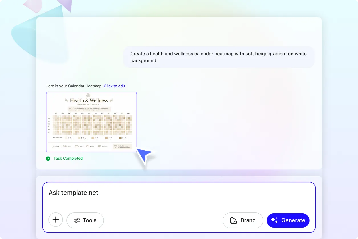
Open the AI Calendar Heat Map Generator and describe your dataset, such as "Create a Calendar Heat Map showing daily website traffic for the past 12 months." Click Generate to instantly create a color-coded visualization that displays activity across calendar dates.
Step 2: Review and Refine the Visualization
Review dates, values, color intensity, legends, labels, and calendar layout. Adjust date ranges, color gradients, themes, annotations, or value assignments to ensure the visualization accurately represents your data.
Step 3: Customize, Export, and Share
Personalize the visualization, resize it for your project, and download it in PNG, JPG, PDF, or SVG formats. Share instantly via Email, LinkedIn, WhatsApp, Facebook, X (Twitter), Pinterest, or generate a live link or QR code.
Create Calendar Heat Visualizations in Seconds and Analyze Daily Trends Clearly
Turn Daily Data into Meaningful Visual Insights
Transform date-based datasets into calendar heat visualizations that reveal activity levels through color intensity. Easily identify busy periods, inactive days, recurring patterns, and long-term trends without reviewing rows of raw data.
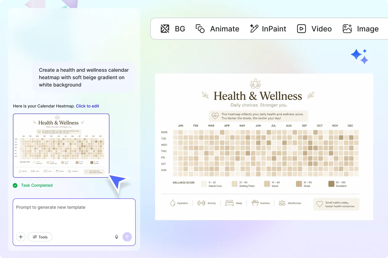
Adapt Calendar Heat Visualizations for Any Industry
Customize calendar heat visualizations for business analytics, website traffic, employee attendance, sales performance, customer engagement, software development, education, healthcare, financial reporting, habit tracking, and research.
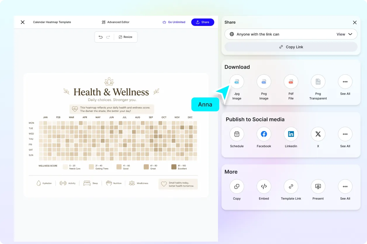
Share and Collaborate with Confidence
Share visualizations with colleagues, clients, researchers, educators, or stakeholders to simplify discussions around daily performance and historical trends.
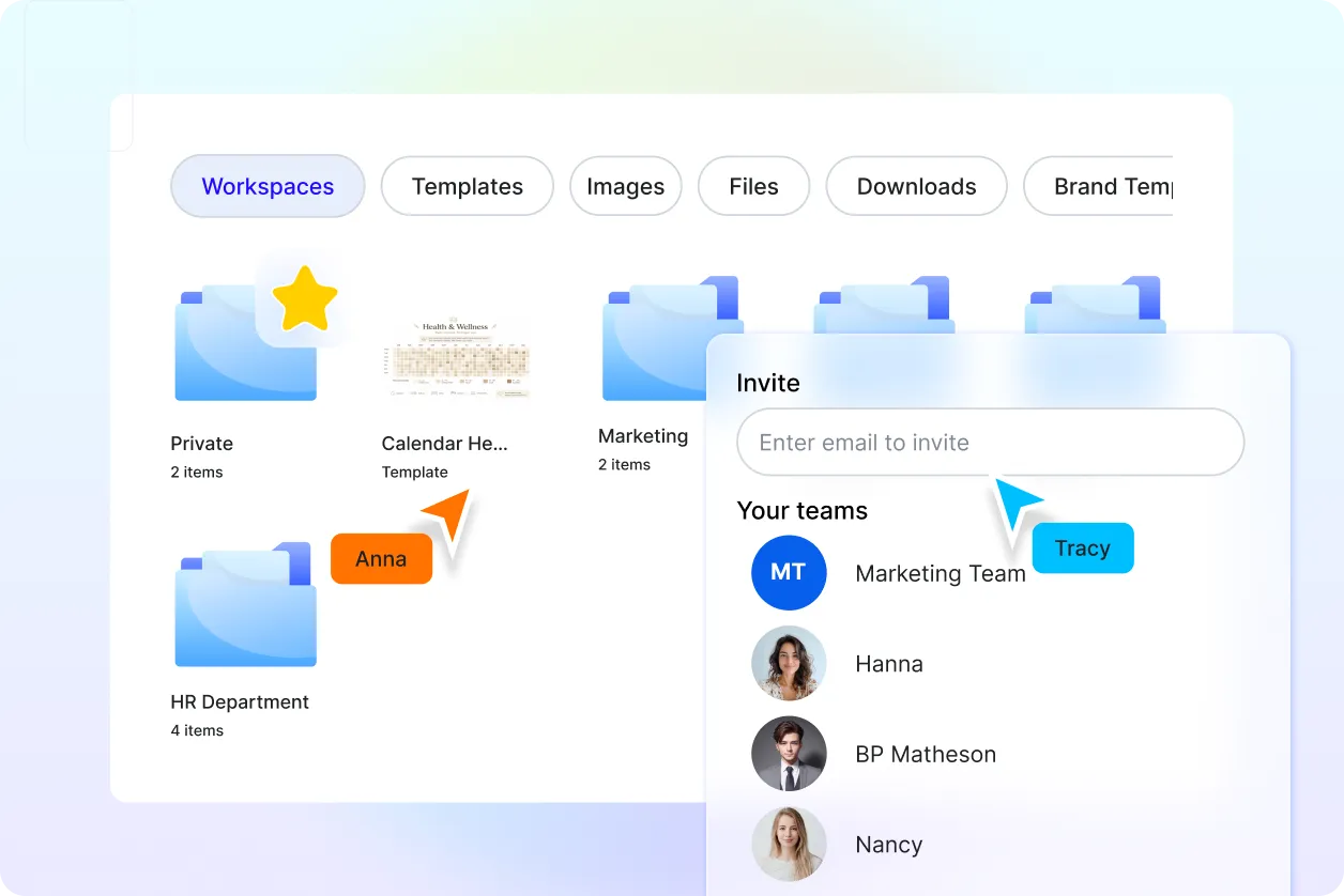
Organize and Update Calendar-Based Visualizations Easily
Keep all visualizations, datasets, and revisions organized in one place. Update daily values, date ranges, labels, or color scales anytime without recreating the visualization.
