Table of Contents


Horizontal Chart
A Horizontal Chart is a powerful tool for visualizing data, making complex information more accessible and engaging. These charts are commonly used in various fields, from business and finance to education and research, allowing clear comparisons and easy interpretation of data.

What Is a Horizontal Chart?
A horizontal chart is a graphical representation of data in which data points or categories are displayed along the horizontal or x-axis, while the corresponding values or measurements are represented on the vertical or y-axis. Horizontal charts are typically used to present data in a way that allows for easy comparison between different categories or data sets. They are useful when you have long category labels or when you want to emphasize the comparison between categories. Often, they are employed in various fields, such as business, finance, and statistics, to visualize and communicate data effectively.
Horizontal Chart Uses, Purpose, Importance
Horizontal charts serve a range of crucial purposes across various fields. By presenting data points or categories along the horizontal axis, horizontal charts make it easy to compare values, identify trends, and understand relative proportions. They are commonly used to showcase sales figures, market trends, and financial performance. In education, horizontal bar charts can display student performance, while in research, they help present scientific data.
How to Generate a Horizontal Chart with AI?
Creating a Horizontal Chart might be challenging, but with AI tools such as those available on Template.net, you can create one easily. Begin by inputting your dataset into the AI-driven chart generator. The AI algorithm then analyzes your data, identifies the relevant categories and values, and selects an appropriate chart type, such as a horizontal bar chart.
It also handles the formatting, labeling, and scaling of the chart, ensuring it’s visually appealing and informative. AI-powered chart generators are especially beneficial for individuals with limited design or data visualization skills, as they can swiftly transform raw data into visually compelling horizontal charts.
Additionally, these tools can offer customization options, allowing users to fine-tune chart elements according to their specific needs. Creating professional-looking horizontal charts is simplified, making data communication more accessible and efficient.
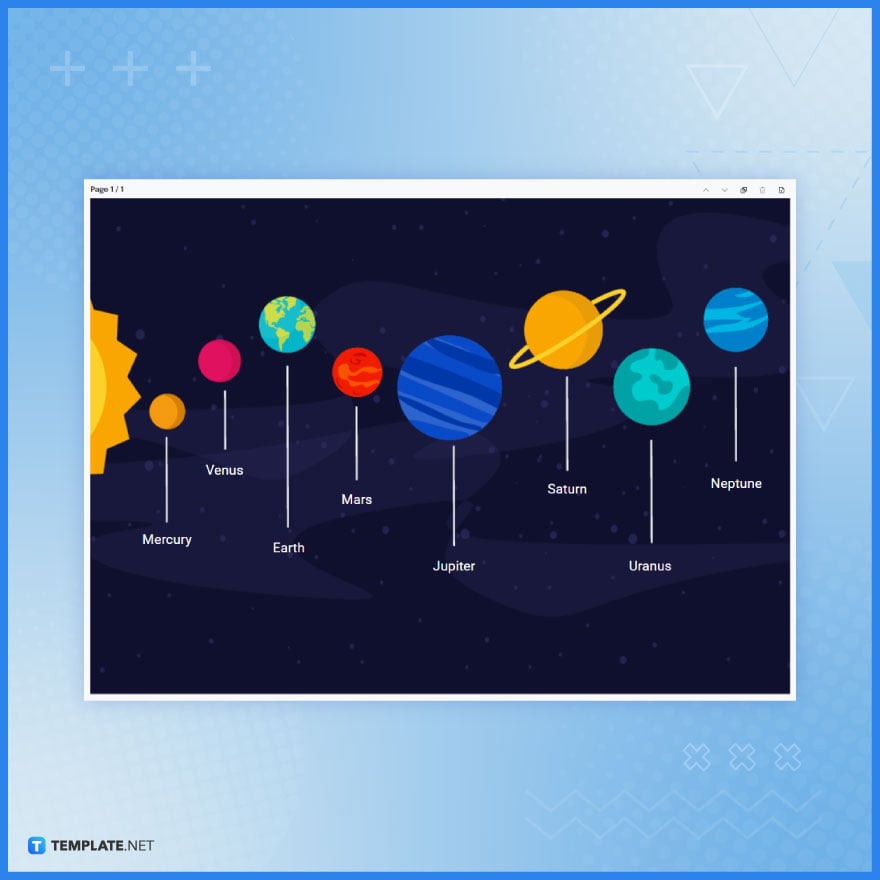
Horizontal Chart Example
Horizontal charts are a type of data visualization that displays data in a horizontal orientation, with data points or categories presented along the horizontal or x-axis and corresponding values or measurements represented on the vertical or y-axis. These charts help emphasize comparisons between categories or when you have lengthy category labels. Here is an example of a horizontal chart generated by our AI generator:
The importance of horizontal charts lies in their ability to simplify data presentation, enhance data-driven decision-making, and facilitate clear communication of insights by providing a different perspective than traditional vertical charts. They are a valuable tool in data analysis, reporting, and creative presentations.
FAQS
When should I use a horizontal chart?
Use a horizontal chart when you want to emphasize comparisons or have lengthy category labels.
How do horizontal charts differ from vertical charts?
Horizontal charts display data horizontally, while vertical charts display data vertically.
What industries use horizontal charts?
Horizontal charts are used in business, education, healthcare, research, and many other fields.
What data does a horizontal stacked bar chart represent?
It shows how a whole is divided into parts, each represented by a horizontal bar.
Can horizontal charts display time-based data?
Yes, horizontal charts can show time-based data, especially in horizontal timeline charts.
What’s a waterfall chart, and how is it used horizontally?
A horizontal waterfall chart represents incremental changes in data, often used for financial analysis.
How do I add labels and annotations to a horizontal chart?
You can use charting software features to add labels, titles, and other annotations.
What’s the difference between a horizontal bullet chart and a horizontal bar chart?
A bullet chart is more compact and used to display performance against a target.
What is the significance of color in horizontal charts?
Color can be used to highlight data points, and categories, or emphasize specific information.
Are horizontal charts suitable for presenting complex data sets?
Yes, horizontal charts can simplify complex data for better understanding.
More in AI

