Photoshop CC Tutorial : Give your Piece a Genuine Vintage Touch
1. INTRODUCTION
Today I am going to talk about how you can get the most impact from your limited color palette by utilizing found textures.(33 Best Photoshop Textures)
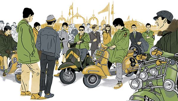
First of all, it’s noteworthy that my work is highly influenced by the past in its aesthetic. I always find that setting your self a limited number of colors to work with before a project really helps achieve that vintage look.
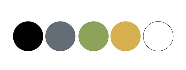
As a starting point, I would not choose more than five colors and I’d be looking at one very dark shade for shadows, and one very light for highlights. Everything in between will be used as mid tones.
For this specific project, I’m using 5 colors. Black, Green, yellow, grey and white.
2. DOCUMENT SETUP
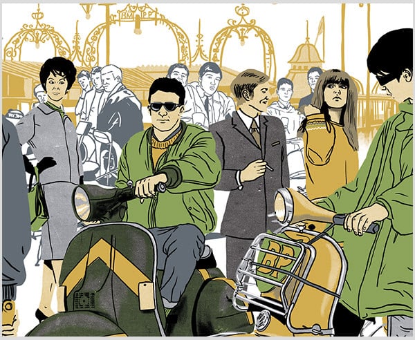
This project is going to be for my portfolio and I’m illustrating a scene focusing on a British subculture- The mods.
I eventually want this scene to have a few detailed characters in the foreground and some less detailed in the back, giving my piece more depth, I also want Brighton Pier, a famous hang out for the mods, in the distance.
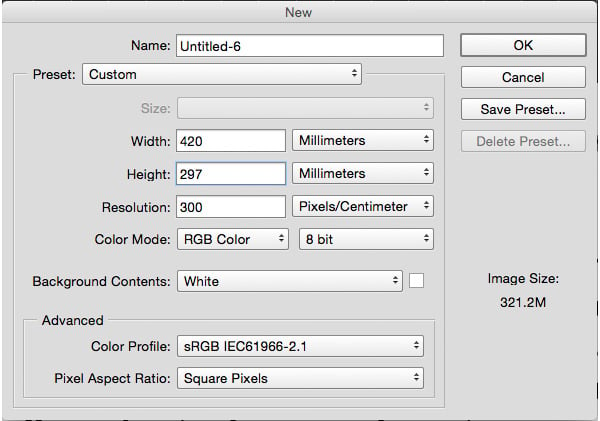
I’m going to draw my characters one by one, so I’m going to start a new document by opening Photoshop CC and going to File and creating a new document. My settings are below.
I’m going for A3 size, 300dpi, and RGB color mode, as I don’t intend to print, but showcase on the web. Normally you would only need 72dpi for web-based content but because I may change my mind later and decide to print it I’m creating it at 300dpi and I can always shrink it down to 72dpi at a later point. You can’t upscale 72 dpi to 300dpi, as it will be very pixelated and bad quality.
3. OUR FIRST LAYER
Now I have my blank canvas I’m going to create a new layer by clicking on the little icon next to the trash can at the bottom of the layers panel (highlighted below)
![]()
4. DRAWING OUTLINE
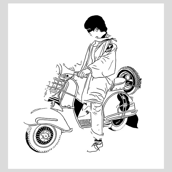
Now I’m going to select the brush tool by pressing ‘B’ on my keyboard and start drawing my initial character on the layer we just created.
Everybody works different, and I like to draw my characters with no outlines. This tutorial will work whether you draw outlines or not, it’s all personal preference.
5. SEPARATING YOUR COLORS CORRECTLY
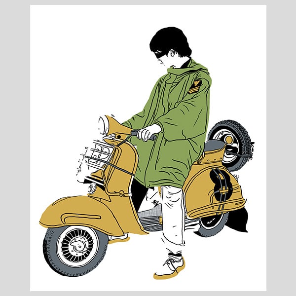
The next thing I am going to do is create a different layer for each color I want to use. So I have started coloring solid green, yellow and grey all on separate layers.
As you can see I have left out certain parts of the trousers, shoes, and skin as this is where I would like to introduce some textures into the mix.
6. SOURCING YOUR TEXTURES
Textures are used in a variety of ways in the creative industries, there’s no right or wrong way, but having worked freelance for a number I have developed a certain nondestructive way of using textures.
Textures can be found in old magazines or bought from sites like graphicriver.net or creativemarket.com. I find using found textures a lot better as they are always unique but buying them or finding them for free download also works!
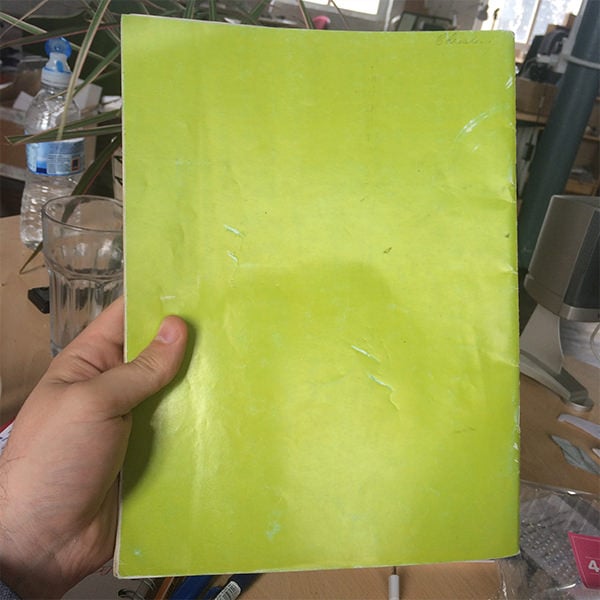
I’ve found an old magazine in my archive with a really nice dot matrix texture on the back; it’s hard to see right now but just wait until we scan it in!
7. SETTING UP YOUR TEXTURES
So I’m scanning in the texture at 300dpi. Once it’s scanned I’m going to open the file in Photoshop.
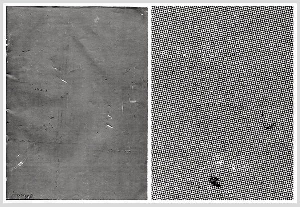
On the document I’ve gone to image>adjustments>threshold and played with the levels to gain the exposure I want. Your document will turn from whatever color it was, to black and white.
This texture is a beauty; below you can see the full size and also a close-up, check the detail. The finer the dots the greater it’s going to look in my work.
Over the years I’ve kept a library of all the textures I’ve found and re-use them over and over again.
8. SEPARATING THE TEXTURE FROM ITS BACKGROUND
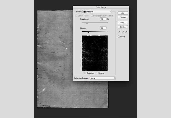
The next step is to separate the black dots from the white background. To do this go to SELECT>COLOUR RANGE and from the drop-down menu click on ‘shadows’, click ok and all the black areas on the document should be highlighted.
9. SEPEARTING THE TEXTURE FROM ITS BACKGROUND CONTINUED
Turn off your background texture layer and the selection should still be active. Click on the new layer button in the layers panel and then make this active by clicking on it. (Vintage Photoshop Background Patterns)
Press ‘D’ to reset your colors to black and white and then press CMD>F5 to open the ‘fill’ dialogue box. Make sure the contents drop-down menu is set to ‘foreground color’ and press OK
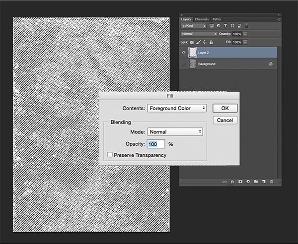
10. CREATE A TEXTURE LIBRARY FOR FUTURE REFERENCE
Your workspace should now look a bit like this, you can delete the background layer if you want. Make sure you save this texture in your library so you can use it at a later date.
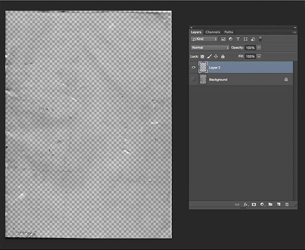
11. SETTING UP LAYERS FOR TEXTURE
Going back to my original piece, I have created a new layer for the skin and colored the area in solid black. You can turn it white if you want but it’s easier to see black for example purposes as the backgrounds white and essentially if the skin is also white it will become invisible. (40+ Best Photoshop Textures)
- Note, there are several ways of non-destructive coloring from color overlays to adjustment layers but that will be covered in a future tutorial. For the purpose of this example just click on the little ‘FX’ button a the bottom of the layers panel and select what color you want in there. If you need to turn it off at any point just click the little eye next to ‘colour overlay’ underneath the layer.
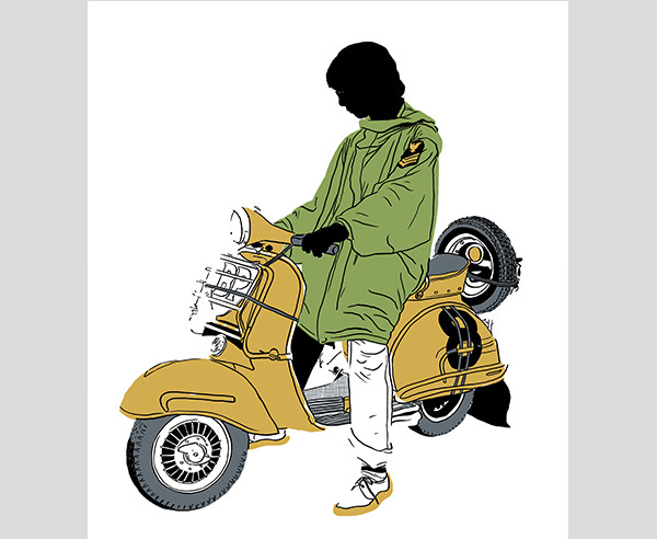
12. DRAGGING IN YOUR TEXTURE
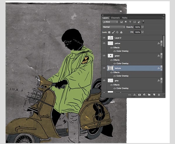
I have dragged in my texture and placed it across the whole skin area. Sometimes you might need to re-size the texture if it does not cover the whole target area by pressing CMD>T and using the free transform box.
Select your previous skin layer, hold CMD and click on the actual little square on the layer in the panel (highlighted below) and this should make a selection of all the items within that layer.
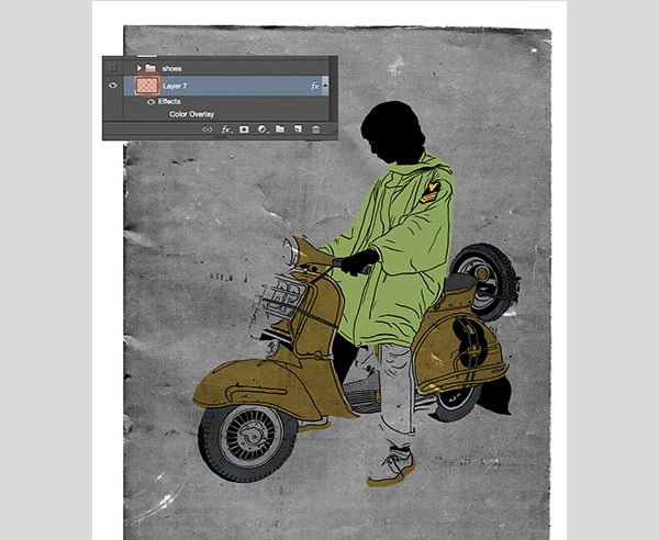
13. CREATING A MASK
With the selection still active, make the texture layer active and then click on the mask button at the bottom of the layers panel (highlighted). This creates a mask that hides all the texture apart from the areas of the skin we selected. You can disable or even delete it by right-clicking on the actual mask layer, and the texture will revert back to its original state. (18 Carpet Photoshop Textures)
14. THE GOOD BIT
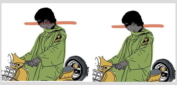
Now for the fun part. Go back to the skin layer and use the color overlay option (click the FX button at the bottom of the layers panel) to turn it from black to white.
All of a sudden you will be able to see your texture, pretty cool huh?
The reason we still have the original skin layer underneath the texture is that I’m intending to put more artwork behind this character and if that layer isn’t there, then whatever artwork is behind will be seen through the texture., check out the red line I have drawn as an example to show you what I mean below. This is with and without that initial skin layer on.
15. ADDING COLOR TO YOUR TEXTURE
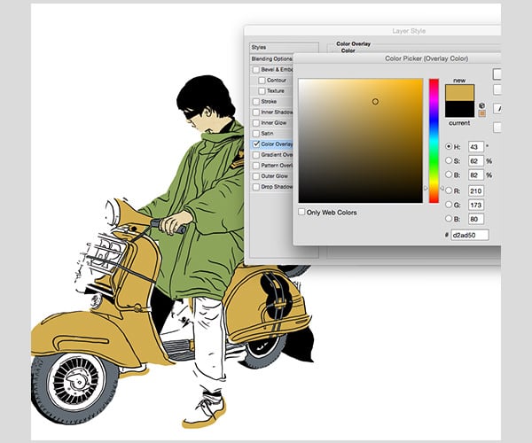
Now go to the texture layer and click the FX button at the bottom of the layers panel, then go to color overlay and use the yellow we picked for this project. All of a sudden you have a skin tone that is a different shade to the rest of the piece but this actually still the same yellow.
16. ADVANCED TECHNIQUES
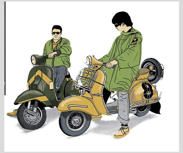
I have repeated the process numerous times here, and also added another character. I’ve utilized all the remaining colors with textures. I’ve even used different brushes for creating masks (again masking is a tutorial within itself).
For the mega advance, you could even overlay two different colors, like the dark green scooter here. It was created by using a green texture layer on top, but instead of a white base layer, I used grey. This gives a really nice bottle green and a great contrast to the rest of the piece.
Check out the difference between the 2 scooters tires. The darker one is the same as the lighter one with the only difference been a black texture over the top.
17. HAPPY ACCIDENTS
One of my best pieces of advice is to just make sure you play around and experiment. You will discover a lot of things by accident!
Even try scanning in new textures. Envelopes are a great place to start, they usually have some really nice halftone textures on the inside of them.
As you can see below in the close up you can get really complex with it! there’s plenty of textures but we have still only used the initial 5 colors!
If you have any questions about this tutorial or suggestions for future tutorials, from absolute beginner to advanced, Please comment below.


