Free Email Marketing Design Rubric
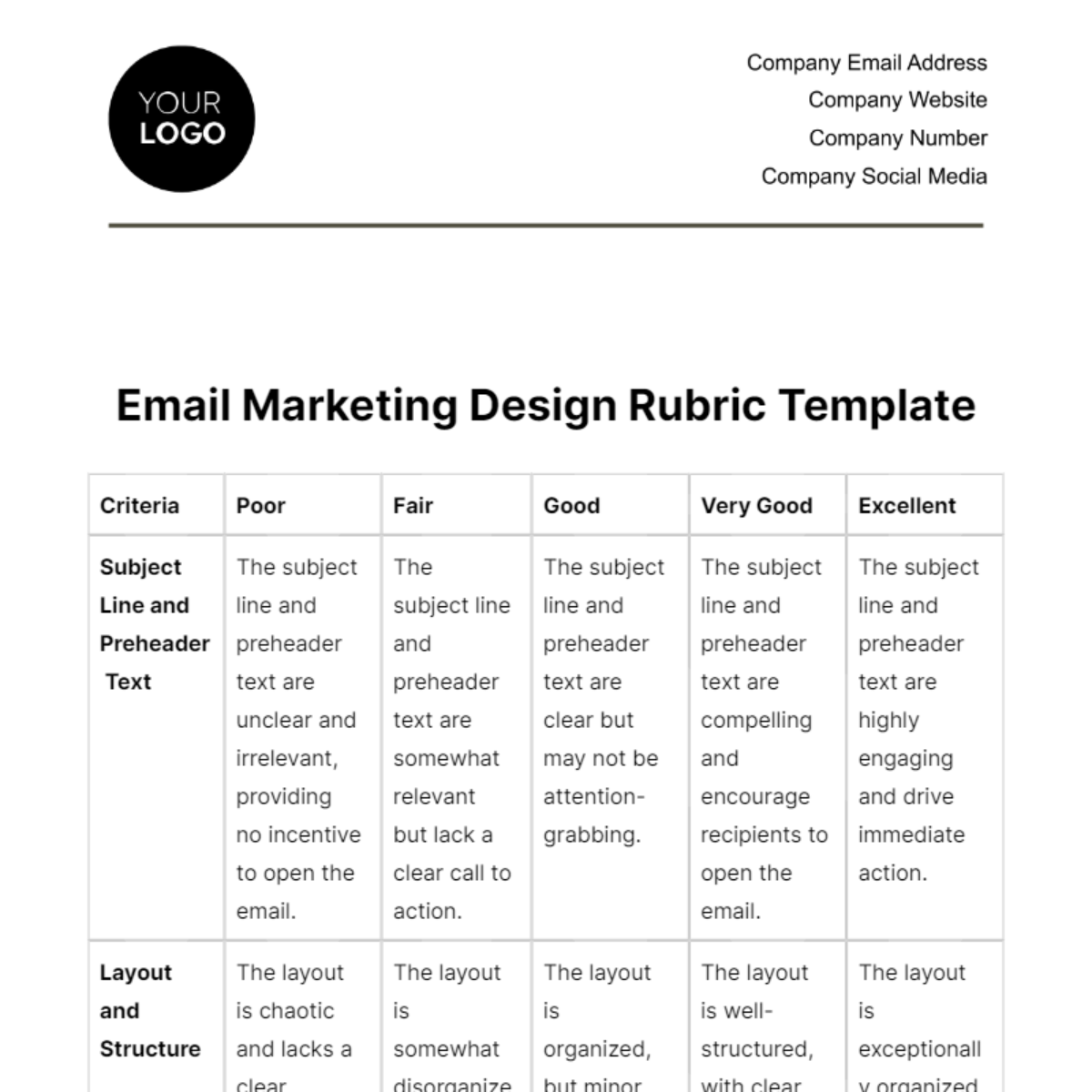
Criteria | Poor | Fair | Good | Very Good | Excellent |
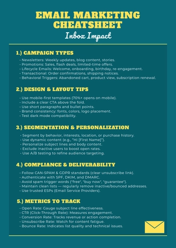
Subject Line and Preheader Text | The subject line and preheader text are unclear and irrelevant, providing no incentive to open the email. | The subject line and preheader text are somewhat relevant but lack a clear call to action. | The subject line and preheader text are clear but may not be attention-grabbing. | The subject line and preheader text are compelling and encourage recipients to open the email. | The subject line and preheader text are highly engaging and drive immediate action. |
Layout and Structure | The layout is chaotic and lacks a clear structure, making it difficult to navigate. | The layout is somewhat disorganized, with some sections needing improvement in clarity. | The layout is organized, but minor adjustments are needed for improved visual flow. | The layout is well-structured, with clear sections and an intuitive design. | The layout is exceptionally organized, providing an outstanding user experience. |
Visual Hierarchy | The visual hierarchy is confusing, with no clear emphasis on important elements. | The visual hierarchy is somewhat effective, but key elements could be more prominent. | The visual hierarchy is clear, guiding the eye to important content effectively. | The visual hierarchy is very well-executed, ensuring that key elements stand out. | The visual hierarchy is exceptional, guiding the eye naturally to essential content. |
Typography (Font Choices and Consistency) | Font choices are inconsistent, distracting, and difficult to read. | Font choices lack consistency, impacting readability but with some legible aspects. | Font choices are generally consistent and legible but could benefit from minor adjustments. | Font choices are highly consistent and easy to read, enhancing the overall design. | Font choices are perfectly matched, elevating the design's readability and aesthetic. |
Images and Graphics | Images and graphics are of poor quality, irrelevant, or excessive, negatively impacting the design. | Images and graphics are somewhat relevant but need improvement in quality and moderation. | Images and graphics are relevant and of good quality, enhancing the overall design. | Images and graphics are excellent in quality and relevance, complementing the design effectively. | Images and graphics are exceptional in quality, relevance, and artistic value. |
Clarity of Message | The email's message is unclear, leaving recipients confused about the purpose or content. | The message is somewhat clear but may require further simplification or emphasis. | The message is generally clear and communicates the purpose effectively. | The message is very clear, ensuring that recipients understand the email's content and purpose. | The message is exceptionally clear and impactful, leaving no room for ambiguity. |
Relevance of Content | Content is largely irrelevant to the recipient, failing to address their interests or needs. | Content is somewhat relevant, but some sections or topics require improvement. | Content is mostly relevant, addressing recipient interests and needs effectively. | Content is highly relevant and personalized, aligning perfectly with the recipient's interests. | Content is exceptionally relevant, personalized, and tailored to individual preferences. |
Call to Action (CTA) Visibility and Effectiveness | The CTA is hidden, unclear, or ineffective, making it challenging for recipients to take action. | The CTA is somewhat visible but could be more prominent, affecting click-through rates. | The CTA is visible, well-placed, and reasonably effective in prompting action. | The CTA is highly visible, strategically positioned, and effectively encourages recipients to act. | The CTA is exceptionally visible, strategically positioned, and extremely effective in driving immediate action. |
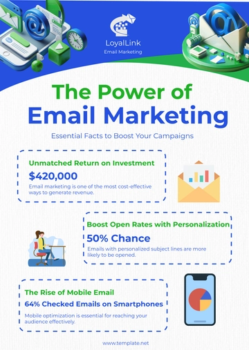
Mobile Optimization | The email is not mobile-friendly, rendering poorly on mobile devices and causing usability issues. | The email is somewhat mobile-friendly but may require adjustments to enhance the mobile experience. | The email is mobile-responsive, ensuring a satisfactory experience on mobile devices. | The email is highly mobile-optimized, providing an excellent user experience on all devices. | The email is exceptionally mobile-friendly, offering a seamless experience on any screen size. |
Branding Elements (Logo, Colors, Branding Guidelines) | Branding elements are inconsistent or nonexistent, undermining the brand's recognition and trust. | Branding elements lack some consistency but are somewhat recognizable. | Branding elements are generally consistent and support brand recognition. | Branding elements are highly consistent, enhancing brand recognition and trust. | Branding elements are perfectly in line with brand guidelines, reinforcing trust and recognition effectively. |
Overall Design Impact | The design is uninspiring and unengaging, failing to make a positive impression. | The design is somewhat appealing but lacks the wow factor and is only moderately engaging. | The design is visually appealing, making a good impression and engaging recipients effectively. | The design is highly appealing, creating a positive impact and keeping recipients engaged. | The design is exceptionally appealing, leaving a lasting impression and fully engaging recipients. |
- 100% Customizable, free editor
- Access 1 Million+ Templates, photo’s & graphics
- Download or share as a template
- Click and replace photos, graphics, text, backgrounds
- Resize, crop, AI write & more
- Access advanced editor
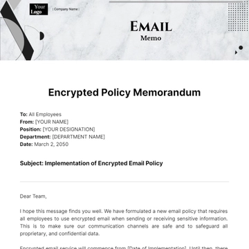
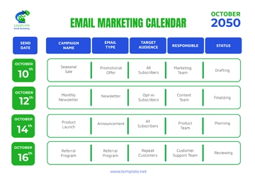
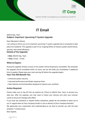
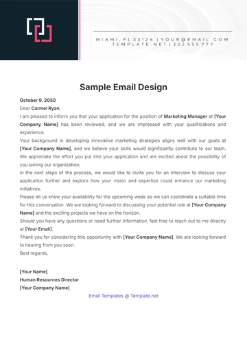
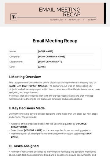
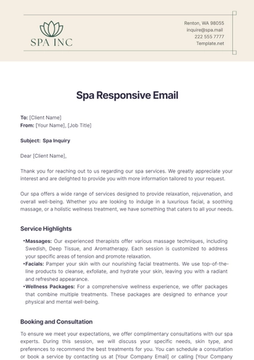
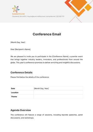
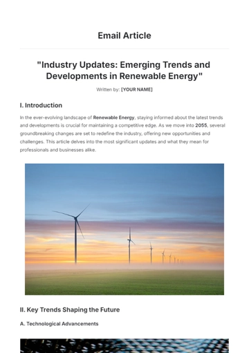
Craft captivating email designs with our Email Marketing Design Rubric Template, available on Template.net. Tailored with industry keywords, this editable document simplifies communication. Utilize our AI Editor Tool for seamless customization, ensuring adherence to design standards. Elevate your email marketing strategy by assessing designs comprehensively with this rubric template.
