Free Public Transportation Users Pictogram Chart
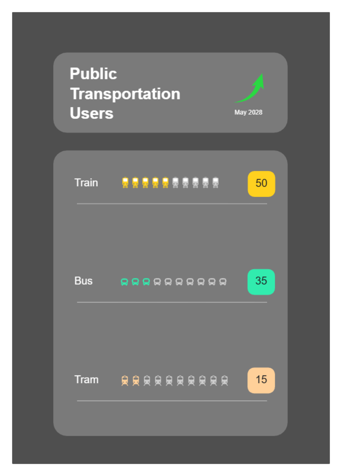
This infographic template presents a clean, modern data visualization for tracking public transportation usage trends as of May 2028. The design features a dark slate background with rounded rectangular modules that organize information into clear, distinct sections. At the top, a prominent header titled "Public Transportation Users" is paired with a stylized upward-pointing arrow to signify growth or movement. The central data visualization uses a combination of isotype icons and numerical callouts to compare three modes of travel: trains, buses, and trams. Each category displays a row of ten icons where the highlighted units correspond to the percentage or count shown in the colorful boxes on the right. High-contrast colors like lime green, soft purple, and peach are used to differentiate the transport types, ensuring the 50, 35, and 15 value distributions are immediately legible. This professional layout is ideal for reporting urban transit statistics or sustainability metrics.
