Free Website Visitor Preferences Pictogram Chart
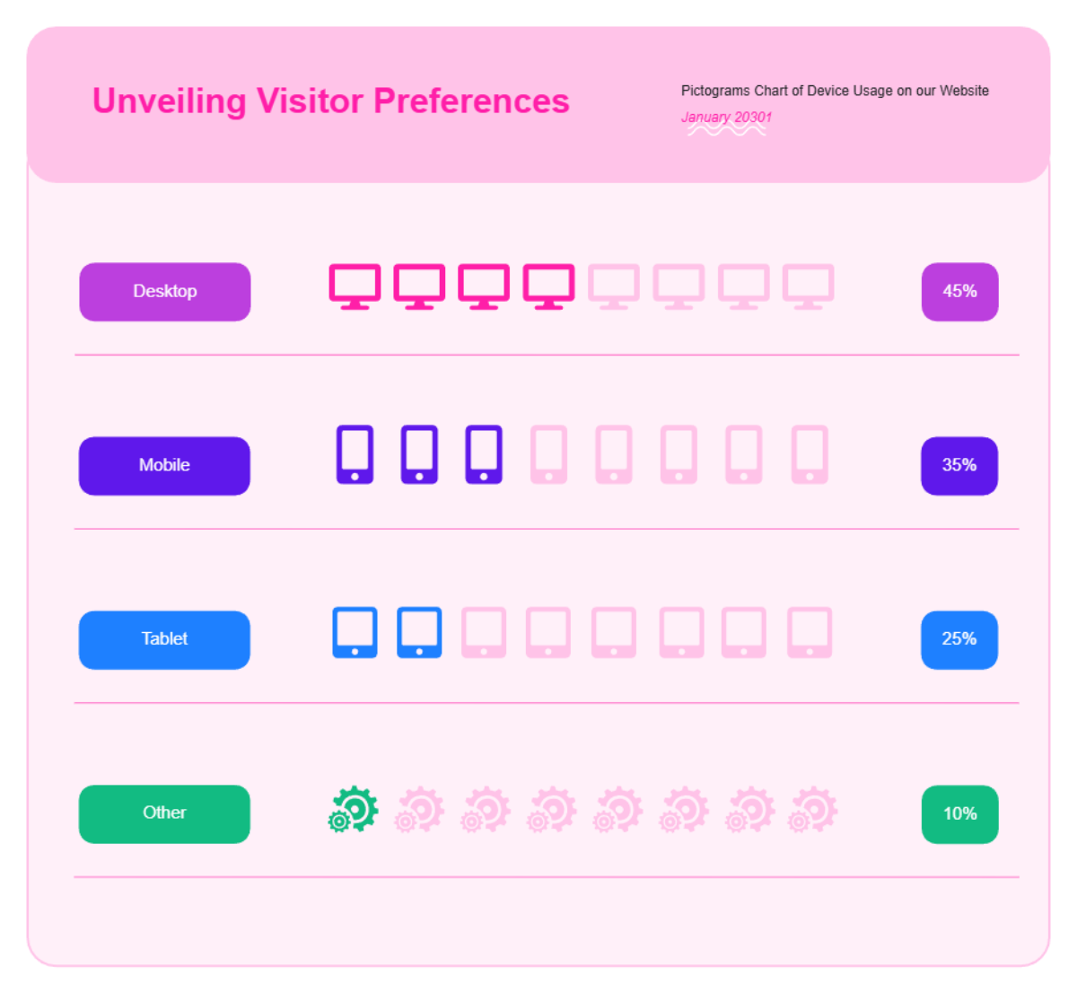
This vibrant infographic template titled Unveiling Visitor Preferences provides a clear visual breakdown of website device usage for January 2030. The design utilizes a soft pink header and a clean white background to present a pictogram chart that categorizes traffic into Desktop, Mobile, Tablet, and Other. Each category is assigned a distinct color—purple for desktop, red for mobile, green for tablet, and yellow for other—making the data easy to distinguish at a glance. To represent the data, rows of eight icons are used, with filled-in icons indicating the relative proportion of users for each device. Desktop usage leads at 45%, followed by Mobile at 35%, Tablet at 25%, and Other sources at 10%. This layout is ideal for marketing reports or presentations where complex statistics need to be communicated through simple, engaging, and professional imagery.
