Free Marketing Content Aesthetics Rubric
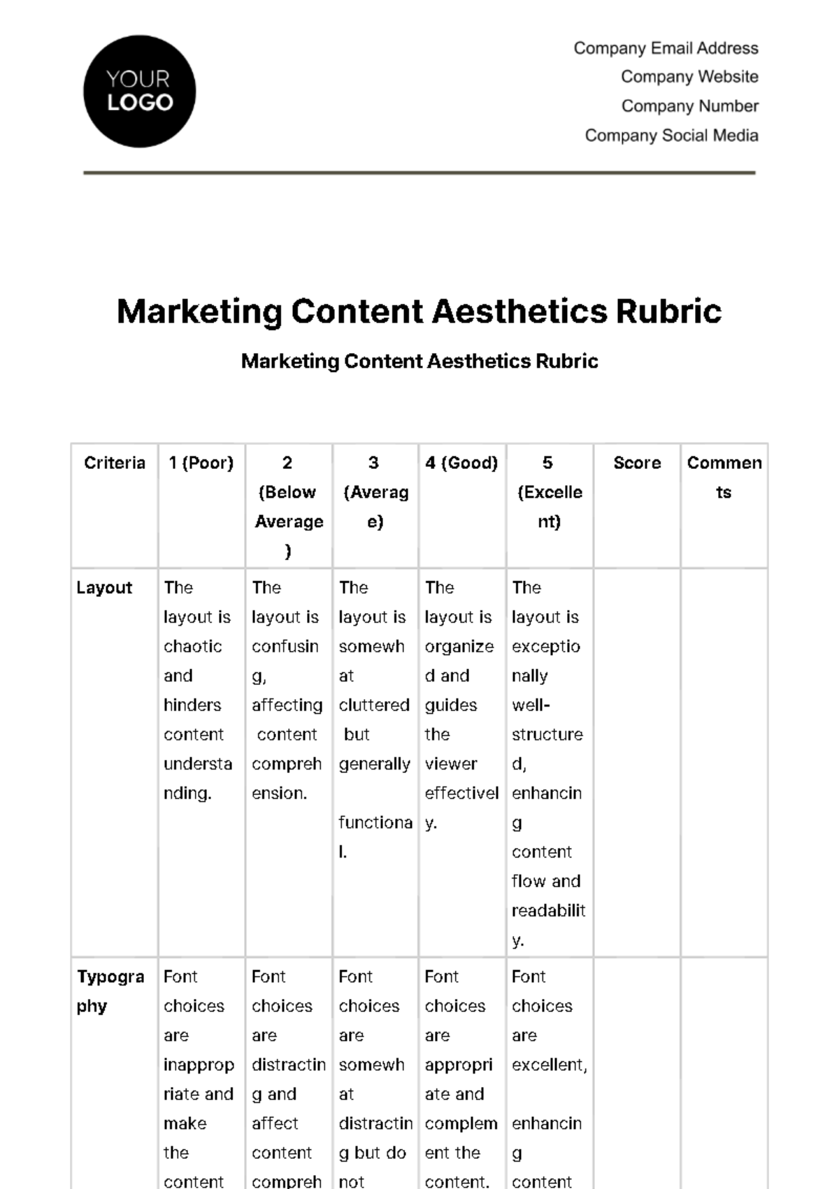
Marketing Content Aesthetics Rubric
Criteria | 1 (Poor) | 2 (Below Average) | 3 (Average) | 4 (Good) | 5 (Excellent) | Score | Comments |
Layout | The layout is chaotic and hinders content understanding. | The layout is confusing, affecting content comprehension. | The layout is somewhat cluttered but generally functional. | The layout is organized and guides the viewer effectively. | The layout is exceptionally well-structured, enhancing content flow and readability. | ||
Typography | Font choices are inappropriate and make the content difficult to read. | Font choices are distracting and affect content comprehension. | Font choices are somewhat distracting but do not significantly hinder readability. | Font choices are appropriate and complement the content. | Font choices are excellent, enhancing content readability and aesthetic appeal. | ||
Color Scheme | The color scheme is entirely inappropriate and detracts from the message. | The color scheme is distracting and negatively impacts content perception. | The color scheme is somewhat inconsistent but does not detract significantly. | The color scheme is suitable and aligns with brand guidelines. | The color scheme is harmonious, effectively conveying the intended message and brand identity. | ||
Images/ Graphics | Images/graphics are entirely irrelevant or of very poor quality, negatively impacting the content. | Several images/graphics are distracting or low quality, affecting content perception. | Some images/graphics are irrelevant or low quality but do not detract significantly. | Images and graphics are mostly relevant and complement the content. | Images and graphics are of high quality, relevant, and enhance content engagement. | ||
Video/Audio (if applicable) | Video/audio elements are entirely irrelevant or of very poor quality, negatively impacting the content. | Several video/audio elements are distracting or low quality, affecting content perception. | Some video/audio elements are irrelevant or low quality but do not detract significantly. | Video/audio elements are mostly relevant and complement the content. | Video/audio elements are of exceptional quality, relevant, and enhance content engagement. | ||
Branding Elements | Branding elements are entirely absent or misused, harming brand identity. | Branding elements are inconsistent and negatively affect brand representation. | Branding elements are somewhat inconsistent but do not significantly detract. | Branding elements are mostly consistent and align with brand guidelines. | Branding elements (logo, colors, fonts) are consistently and effectively integrated into the content. | ||
Overall Aesthetics | The marketing content's aesthetics are poor and need a complete overhaul. | The marketing content's aesthetics are below average and require significant improvement. | The marketing content's aesthetics are average, with notable areas for enhancement. | The marketing content's aesthetics are good, with some room for improvement. | The marketing content's aesthetics are exceptional, aligning with the brand and captivating the audience. | ||
Overall Score (Out of 30) | |||||||
Criteria | 1 (Poor) | 2 (Below Average) | 3 (Average) | 4 (Good) | 5 (Excellent) |
The layout is chaotic and hinders content understanding. | The layout is confusing, affecting content comprehension. | The layout is somewhat cluttered but generally functional. | The layout is organized and guides the viewer effectively. | The layout is exceptionally well-structured, enhancing content flow and readability. | |
Font choices are inappropriate and make the content difficult to read. | Font choices are distracting and affect content comprehension. | Font choices are somewhat distracting but do not significantly hinder readability. | Font choices are appropriate and complement the content. | Font choices are excellent, enhancing content readability and aesthetic appeal. | |
Layout |
- 100% Customizable, free editor
- Access 1 Million+ Templates, photo’s & graphics
- Download or share as a template
- Click and replace photos, graphics, text, backgrounds
- Resize, crop, AI write & more
- Access advanced editor
Explore Marketing Content Aesthetics Rubric Template from Template.net. An editable, customizable tool perfect for refining marketing strategies. Craft compelling content effortlessly with its user-friendly interface, editable in our Ai Editor Tool. Elevate your brand's aesthetics with this versatile template, designed to streamline your marketing efforts.
You may also like
- Marketing Google Slide
- Marketing Letter
- Marketing Quotation
- Marketing Report
- Marketing Strategic Plan
- Marketing Plan
- Marketing Proposal
- Marketing Flyer
- Marketing Presentation
- Real Estate Marketing Plan
- Marketing Contract
- Marketing Agreement
- Marketing Resume
- Marketing Checklist
- Marketing Brochure
- Marketing Banner
- Marketing Schedule
- Marketing Vector
- Marketing Logo
- Marketing Chart
- Marketing Campaign Plan
- Marketing Budget
- Marketing Postcard
- Marketing Poster
- Marketing Facebook Post
- Marketing Instagram Post
- Marketing Newsletter
- Marketing Infographic
