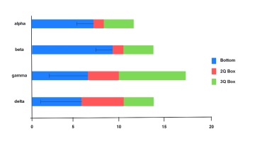
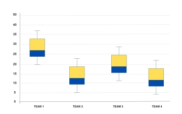
Free Box and Whisker Plot
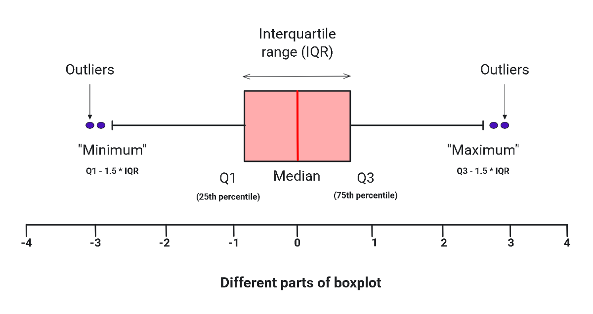
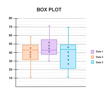
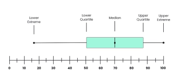
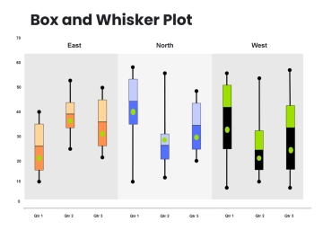
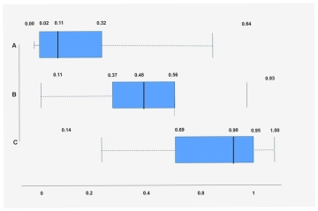
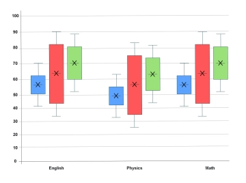
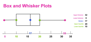
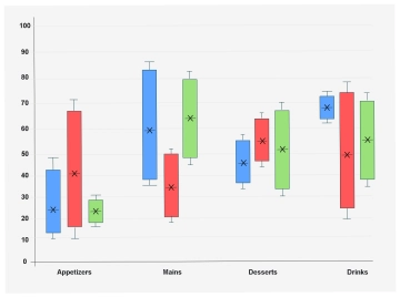
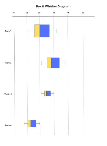
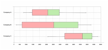
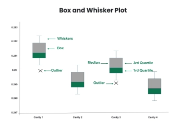
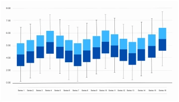
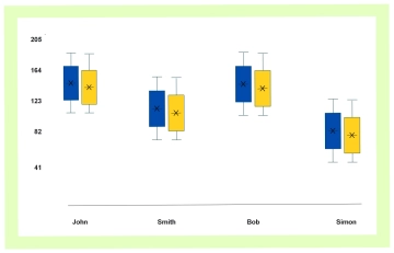
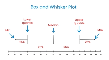
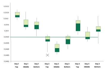
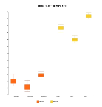
This Box and Whisker Plot is designed to help users visualize data distribution, spread, and outliers in a clear and structured way. It is suitable for students, educators, analysts, project managers, and product teams who need to compare datasets or communicate statistical insights effectively. Users begin by collecting and organizing numerical data, then determine the minimum, maximum, median, and quartiles. Next, they construct the box and whisker plot by placing these values along a scale and labeling the diagram for clarity. After completing the process, users achieve a concise visual representation that supports accurate analysis and informed decision-making.
