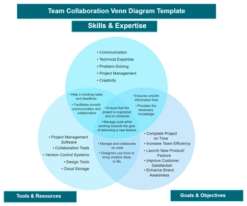
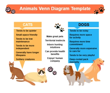
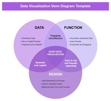
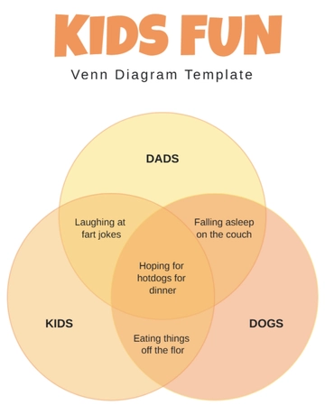
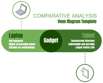
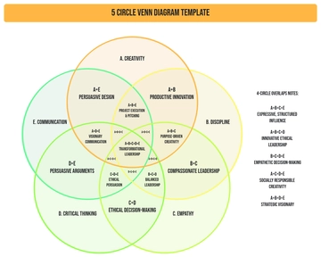
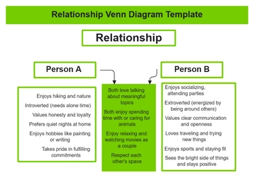
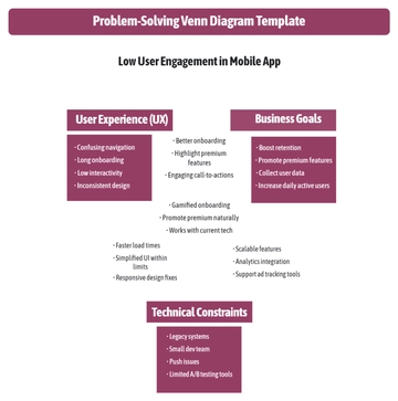
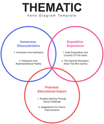
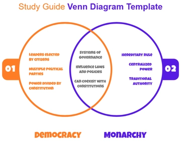
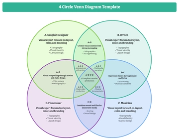
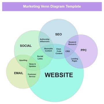
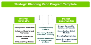
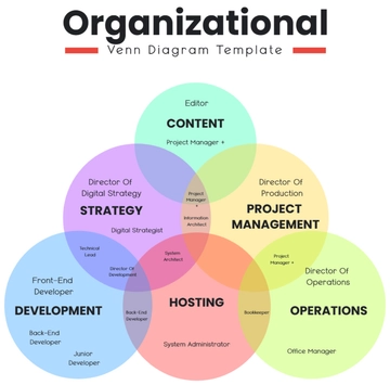
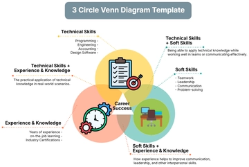
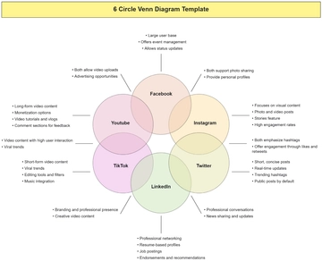
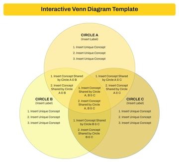
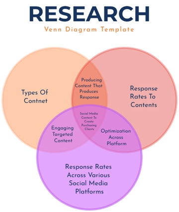
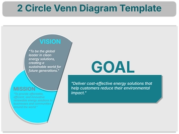
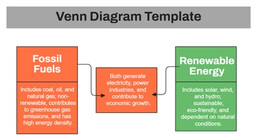
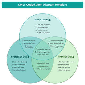
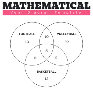
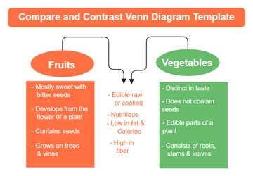
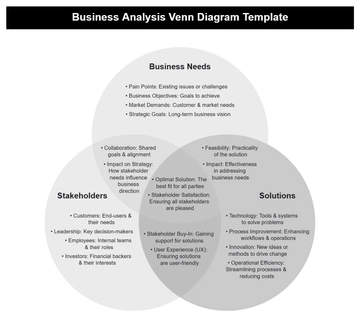
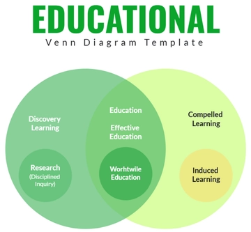
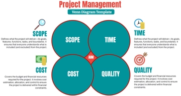
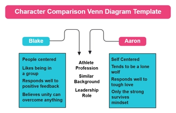
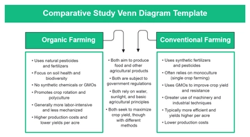
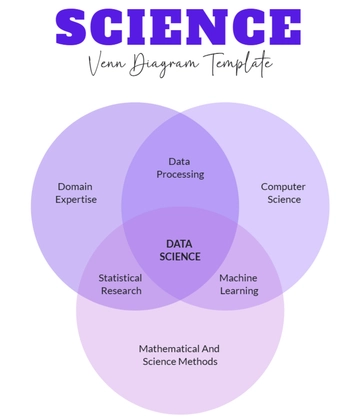
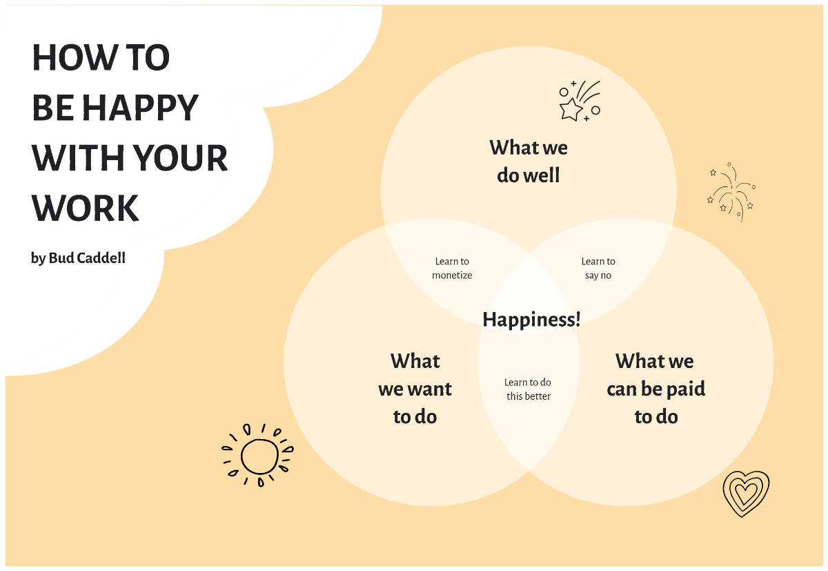
The Venn Diagram with Doodle Elements is designed to visually compare ideas or concepts while adding a creative and approachable style to presentations and documents. It is ideal for designers, educators, marketers, students, and creative teams who want to communicate relationships in an engaging way. Users begin by defining the key topics or categories to be compared, then enter their content into each overlapping section of the diagram. Next, they customize text, colors, and doodle accents to match their message or brand. The completed diagram delivers a clear, visually appealing comparison that improves understanding and audience engagement.
Free Venn Diagram with doodle elements
- 100% Customizable, free editor
- Access 1 Million+ Templates, photo’s & graphics
- Download or share as a template
- Click and replace photos, graphics, text, backgrounds
- Resize, crop, AI write & more
- Access advanced editor
AI Venn Diagram Maker Generator
Generate my free Venn Diagram MakerText or voice to generate a free Venn Diagram Maker
