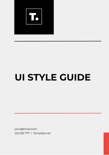
Free UI Style Guide
I. Introduction
This User Interface (UI) Style Guide is designed to provide a comprehensive framework for creating and maintaining consistent and user-friendly interfaces across digital platforms. The guide outlines standards and best practices for visual and interactive elements, ensuring a cohesive experience for users.
II. Branding
Logo Usage
Primary Logo: Use the full-color version of the [Your Company Name] logo on light backgrounds.
Secondary Logo: Use the monochrome version on dark backgrounds or for specific design contexts where color might distract from the content.
Clear Space: Maintain a clear space around the logo equal to the height of the 'X' in the logo to ensure visibility and impact.
Color Palette
Color | Hex Code | Usage |
|---|---|---|
Primary Blue | #0033A0 | Primary actions, buttons |
Secondary Green | #00A859 | Success messages, highlights |
Neutral Gray | #D9D9D9 | Backgrounds, borders |
Accent Red | #D9534F | Alerts, warnings |
Typography
Headings: Use Helvetica Neue Bold for headings, size 24px.
Body Text: Use Arial Regular for body text, size 16px.
Buttons: Use Verdana Bold for button text, size 14px.
III. Layout and Spacing
Grid System
Container Width: 1200px fixed for large screens, 100% for mobile.
Column Layout: 12-column grid system with 20px gutters between columns.
Spacing
Margins: Use a standard margin of 20px around all content areas.
Padding: Apply 15px padding inside containers for a consistent inner space.
IV. Buttons
Button Types
Primary Button:
Color: Primary Blue
Border Radius: 5px
Text Color: White
Secondary Button:
Color: Neutral Gray
Border Radius: 5px
Text Color: Primary Blue
Button States
State | Background Color | Text Color | Border |
|---|---|---|---|
Default | Primary Blue | White | None |
Hover | Primary Blue | Light Gray | None |
Disabled | Neutral Gray | Dark Gray | None |
V. Forms
Form Elements
Text Fields: Use a border radius of 4px, with a 1px solid Neutral Gray border.
Dropdowns: Apply a 2px solid Primary Blue border with a dropdown arrow icon.
Checkboxes: Use a 16x16px box with a Primary Blue checkmark icon inside.
Form Layout
Alignment: Align labels to the left of input fields.
Spacing: Provide 10px vertical spacing between form elements.
VI. Icons
Icon Style
Type: Use flat icons with a consistent stroke width of 2px.
Size: Standard icon size of 24x24px.
Icon Usage
Icon Type | Example | Usage |
|---|---|---|
Action Icons | Search, Edit | Actions and buttons |
Status Icons | Error, Success | Status indicators |
VII. Accessibility
Color Contrast
Text Contrast: Ensure text color contrasts at least 4.5:1 against background colors for readability.
Interactive Elements: Maintain a contrast ratio of at least 3:1 for all interactive elements.
Keyboard Navigation
Ensure all interactive elements are accessible via keyboard navigation. Implement focus states clearly visible.
VIII. Interaction Design
Animations
Duration: Limit animation durations to 300ms to avoid distractions.
Types: Use subtle transitions for hover effects and loading indicators.
Feedback
Success: Display success messages with a Secondary Green and a checkmark icon.
Error: Display error messages with Accent Red and an error icon.
IX. Contact Information
For any questions or additional support regarding the UI Style Guide, please contact:
Name: [Your Name]
Email: [Your Email]
Company Name: [Your Company Name]
Company Address: [Your Company Address]
Company Number: [Your Company Number]
This guide is intended to be a living document and may be updated as new standards and practices evolve. For the latest version, please refer to the official documentation or contact [Your Company Email].
- 100% Customizable, free editor
- Access 1 Million+ Templates, photo’s & graphics
- Download or share as a template
- Click and replace photos, graphics, text, backgrounds
- Resize, crop, AI write & more
- Access advanced editor
Create a cohesive user interface with the UI Style Guide Template, offered by Template.net. This customizable and printable template is easily downloadable and editable in our AI Editor Tool. It provides a structured format for defining design elements, color schemes, typography, and component guidelines, ensuring a consistent and professional look across your digital products.
