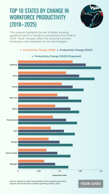
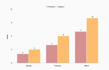
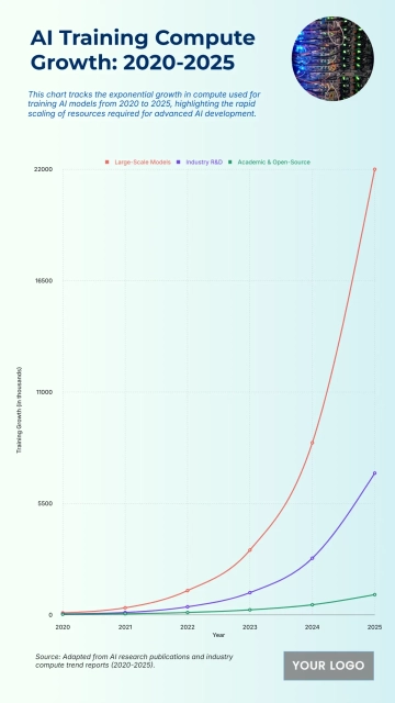
A modern chart for comparing team performance scores across two quarters, professionally designed by Template.net, with a bold headline, a grouped bar chart and a colour legend in coral red, teal and white.
A modern chart for comparing team performance scores across two quarters, professionally designed by Template.net, with a bold headline, a grouped bar chart and a colour legend in coral red, teal and white.