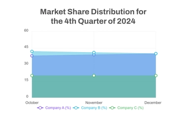
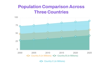
A clean area graph chart for comparing population trends across three countries, professionally designed by Template.net, with a stacked area chart, a colour-coded legend and a bold title in purple, teal green and sky blue.
A clean area graph chart for comparing population trends across three countries, professionally designed by Template.net, with a stacked area chart, a colour-coded legend and a bold title in purple, teal green and sky blue.