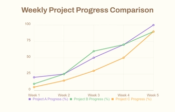
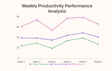
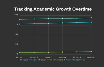
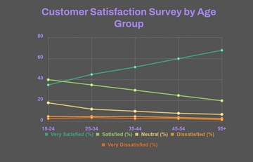
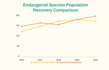
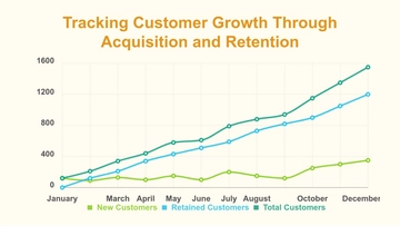
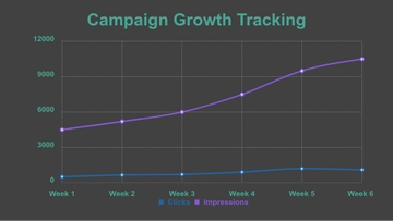
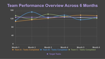
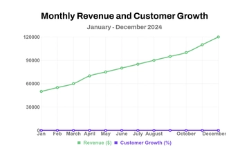
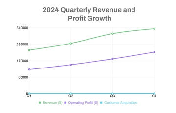
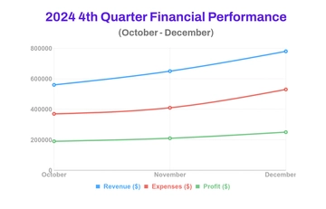
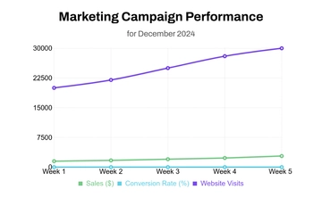
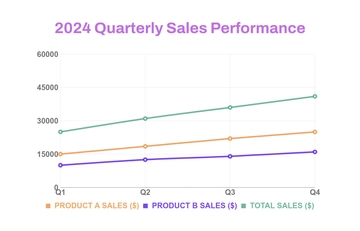
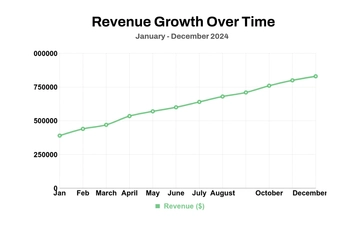
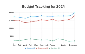
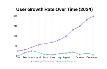
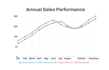
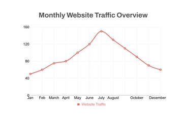
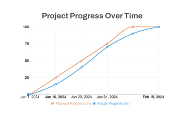
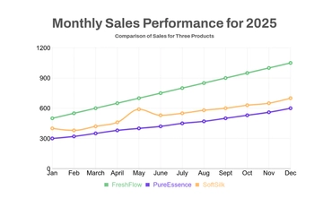
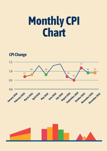
A playful line graph chart for comparing sessions and users over time, professionally designed by Template.net, with a bold title, a two-line graph and monthly axis labels in lavender purple, royal blue and bright red.
A playful line graph chart for comparing sessions and users over time, professionally designed by Template.net, with a bold title, a two-line graph and monthly axis labels in lavender purple, royal blue and bright red.