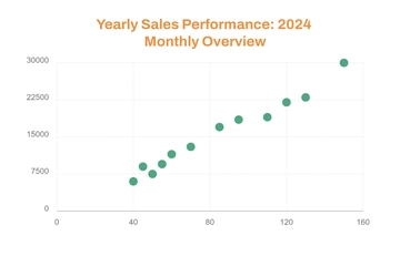
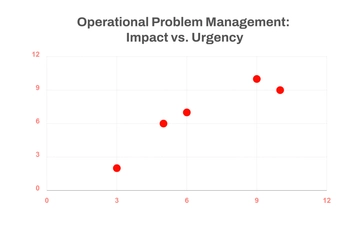
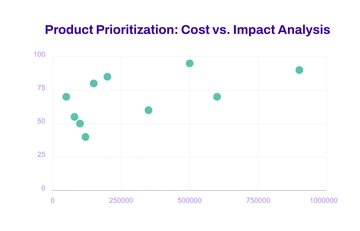
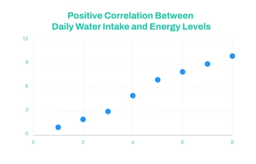
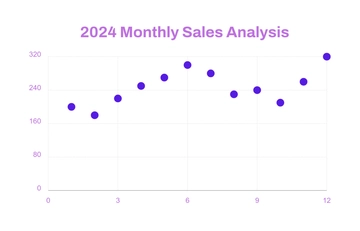
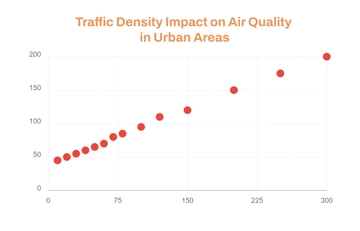
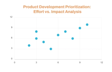
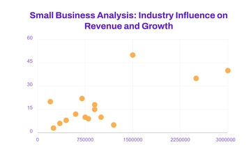
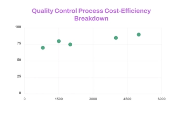
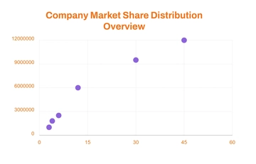
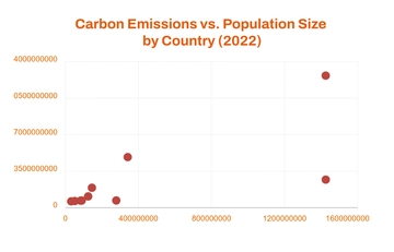
A clean scatter graph chart for comparing carbon emissions with population size by country, professionally designed by Template.net, with a scatter plot, red data points and an orange chart title in orange, brick red and white.
A clean scatter graph chart for comparing carbon emissions with population size by country, professionally designed by Template.net, with a scatter plot, red data points and an orange chart title in orange, brick red and white.