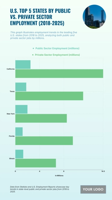
Top 10 States by Public vs. Private Sector Employment (2018–2025) Template with a grouped horizontal bar chart

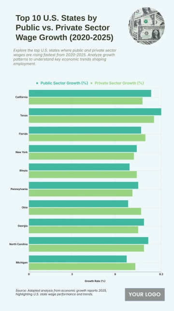
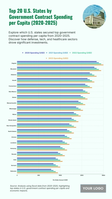
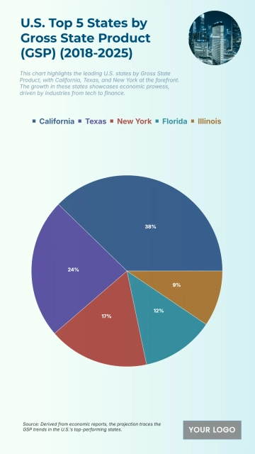
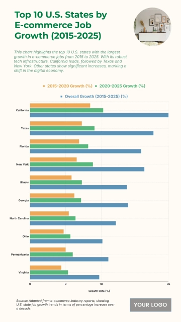
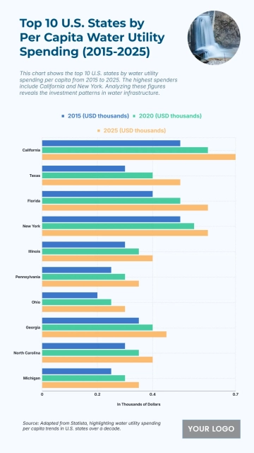
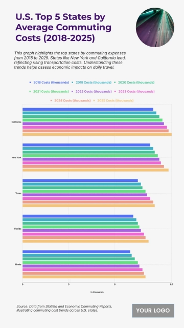
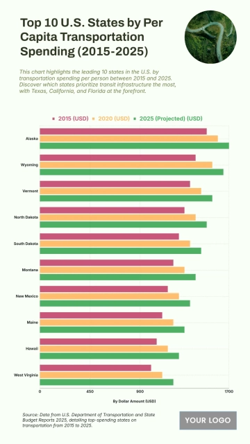
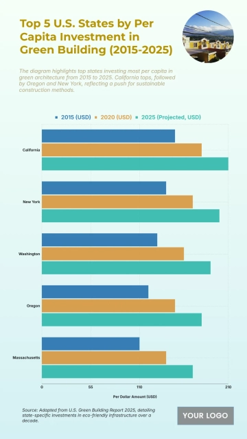
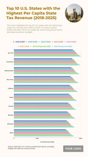
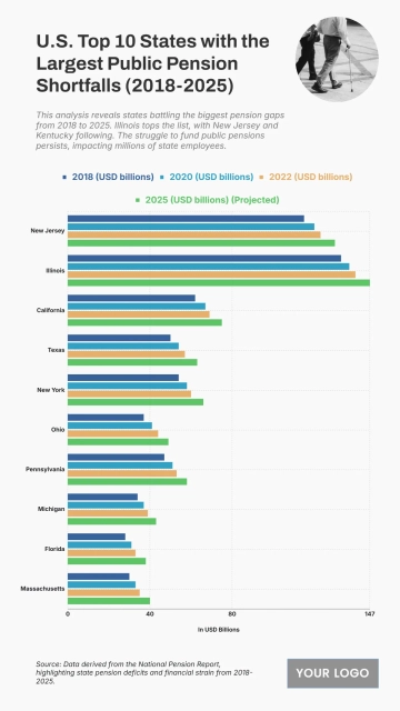
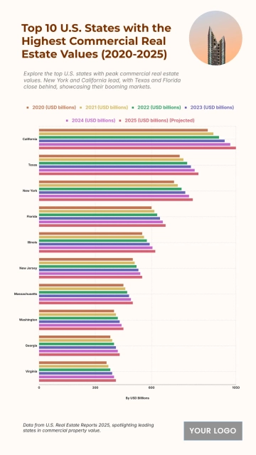
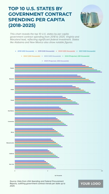
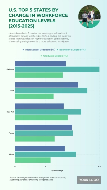
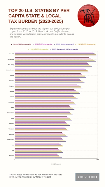
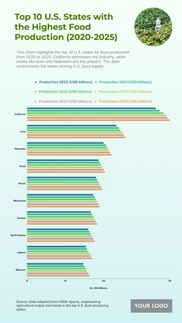
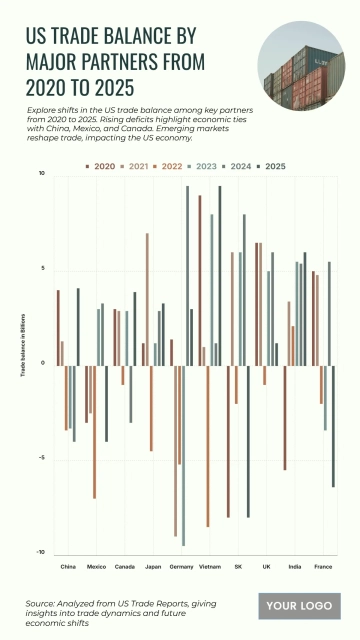
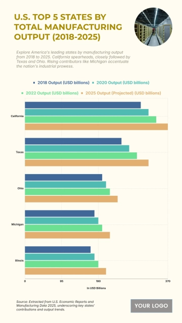
A professional 9:16 economy chart for comparing public and private sector employment across the top ten states, professionally designed by Template.net, with a grouped horizontal bar chart, a circular office photo and a logo placeholder in navy blue, magenta and coral orange.
Customize it in two ways:

  • Editable with AI Replace the character in [character_image] with [Upload image], replace the logo in [logo_image] with [Upload image], and replace the text with [text_input], change to relevant elements while keeping similar style, composition and background.
  • Easily edit it manually: customize the content, elements, photos, colors and fonts.

Free Top 10 States by Public vs. Private Sector Employment (2018–2025) Template

By Template.net

Open Editor
Infographics Generator