A Comprehensive Guide To Creating A Corporate Website
This is a comprehensive and complete guide to designing a corporate website.
We have also covered templates ranging from simple and minimal website designs to professional corporate design templates that most businesses can use. As you scroll down, you will be guided through several web page designs, templates, and inspirations that will give you n-number of ideas.
A Corporate Website as an Investment
What Is A Corporate Website?
A corporate website is your business identity that you show and disseminate to the public about your business and everything it represents. It is a tool for relaying your business’s personal brand, quality, and character. It became a trend at the beginning of the internet age. It allowed thousands of businesses to reach out to their customers worldwide and gave an avenue to allow customers to explore their businesses thoroughly through their websites.
Nearly every business organization has a website nowadays to interact not just with their customers but to the whole public as well. They also serve as access to information and whatever applications are included in the page. They also provide links to other relevant sites that either partner with the businesses concerned, or in a similar line of business that does not conflict with the business itself. This makes having a corporate website an important avenue.
Features of a corporate website
Homepage:
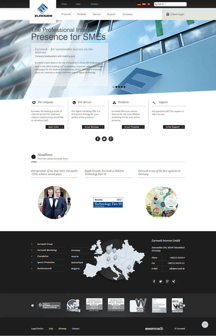
This is the most important part of your corporate website. It acts as the main page for navigation around your site and what the search engine will notice.
Here’s an example of a corporate website design template:
Depending on your business, your homepage will use different landing pages. Landing page is the section in your website where the visitor or viewer lands. Apart from the usual content it provides spaces for interaction with viewers and visitors. The visitors will have to enter their names and addresses so they can subscribe to your page.
Here’s a corporate website example of a site’s landing page:
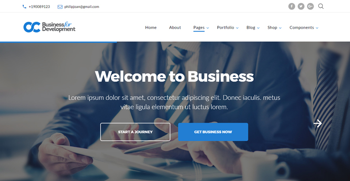
As you can see here space is provided for the visitors to click on. This is linked to a more detailed part of your business set up. The objective here is to generate sales for your business through your corporate website.
Your homepage should therefore include:
- an introduction to your business
- its history
- introduce the founder or owners
- the content of your site
- products or services you offer and their corresponding prices
Your homepage is also used to navigate towards other internal links that go directly to revenue generation, which is the most important aspect of your website.
Navigation Bar:
The corporate website will both have a primary and secondary navigation bar that will include links to other important pages of your site.
Here’s an excellent example of creative corporate web design with excellent navigational bars:
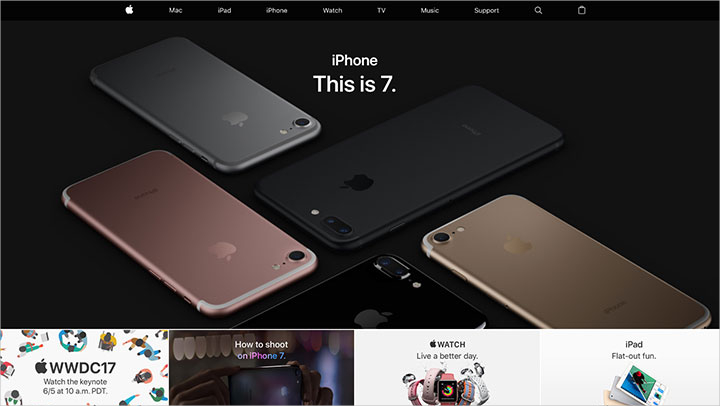
As you can see, Apple’s website has very simplified and user-friendly navigational bars that visitors find easy to click on and choose what they want to view. On their homepage are the necessary information and innovations that the company had done and undergone through the years and the navigational bars are what will lead directly to the landing page. The simple yet relevant design sets the difference between a successful corporate website or a bad one.
Look And Feel Of The Website Design:
Your corporate website should have the correct layout, colour, design and shape as well as the correct placement of buttons, boxes and menus. The graphics and logos are also included in this part of the design. Here’s an excellent example of a well-placed website design:
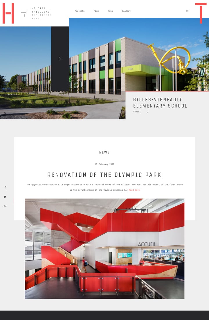
The illustration above shows an excellent corporate website design layout that’s easy on the eyes and attractive to visitors. There’s a consistent correlation in both control and display that would make the page easy to navigate. This is crucial for first-time visitors to the site who need to become familiar with the site the first time they come to your page.
An “About Us” Section:
This includes the company’s history and operations. Here’s an example of a good “About Us” section:
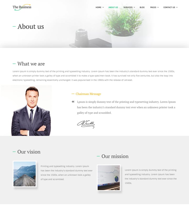
This section is important to let viewers know your business history. This adds credibility and shows the importance of how the company has evolved through the years. Since a lot of companies started small, most of them have been shaped by either pure luck, raw courage or hard-earned perseverance. It’s in stories like these that keep readers interested. Company histories like these present powerful stories of dedication and determination that readers look up to and relate with.
Mission Statement:
It is very important to convey the purpose of your company. This can either be called a company mission or a corporate mission but the purpose remains the same: It is what the company aims to accomplish.
A mission statement should provide the substance for which a company’s aim is formulated. It also addresses what the company does for its customers and upholds the company’s commitment to gain customer trust and provide service. A mission statement is also an avenue for presenting your product or services in such a way that makes them unique to make customers choose you. Overall, the goal of a mission statement is to provide the best service possible.
List Of The Company’s Products And Services:
It’s surprising how many of the corporate websites we see today fail miserably on the kind of products or services they offer. Most are vague and others make viewers wonder what the company really offers. It’s very important for a corporate website to provide at least even a general information on the kind of products or services being offered. One of the reasons for site information vagueness is the fact that most companies have unfounded fears of divulging too much information. Unless it’s a government website concerned about national security, there’s absolutely no reason for companies to be afraid of putting out a list of the products or services they offer.
Here’s an excellent example of a corporate website that offers a list of what they offer:
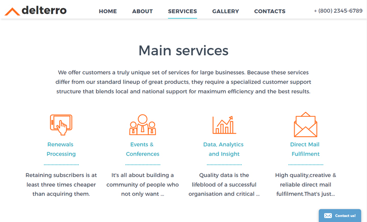
As you can see, there’s a complete information content on this company website design with buttons to click on ranging from card templates and their corresponding prices to reviews and quotations. It’s advisable for a creative web design to be easy to use and not difficult nor incomprehensible for viewers.
Overview Of Company Workforce:
This is the part of the corporate website where the people behind the company are introduced. Phrases like “Meet the team” or “Who we are” are commonly used. Some websites include important personalities behind each department and may include the founders, board members and other key executives. In some sites, the whole workforce is introduced in a group photo.
Here’s a good example of the people behind a company’s success in a website:
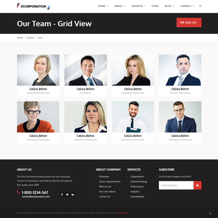
In some corporate websites, users can click on either the names or pictures of the people on the site for additional information. It will direct them to the company’s products after a brief introduction of the people behind the team. They may also serve as virtual assistants depending on the setup of the website.
News Section:
By incorporating a news section, a corporate website will make an impact on viewers and customers. Having a news section improves overall visibility to your site and will have the potential to increase traffic to your site. Major search engines usually look for new and unique content, so your site will continually be on the top tier of the search results. This is a good SEO strategy that can attract viewers and potential customers with your fresh content that can improve a search engine’s indexing results.
Here’s an example of a corporate website’s news section:
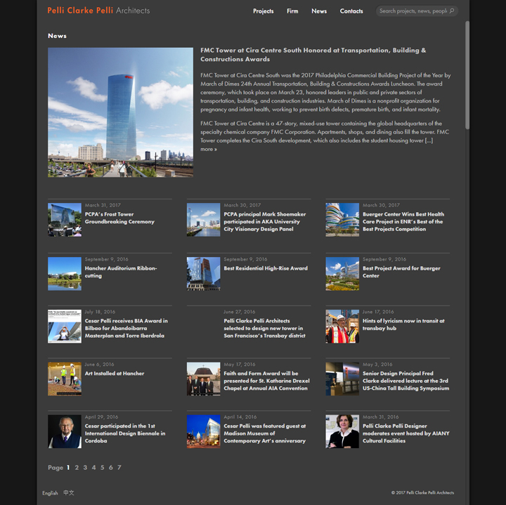
Press releases, press kits and links to other news sources that are helpful for your site should also be included. An archive is also important for new customers who need to look into your website’s previous activities. Such information can enhance your reputation and the kind of goods or services you offer that will help customers know your business better.
Owner/Investor Section:
This section of your corporate website shows the key owners and investors of the company. This section is usually accompanied by information such as financial statements, business plans, current stock pricing and annual reports. The aim here besides introducing key executives to the company is to make customers aware of your company’s solid financial health and standing.
Employment Section:
Most corporate websites include a “work for us” section. Besides making this strategy attractive to viewers and potential customers, this is also an opportunity for your company to advertise itself effectively to millions of internet users and attract dedicated employees who have the potential to become a valuable part of your company.
Here’s a good example of a corporate website’s hiring section:
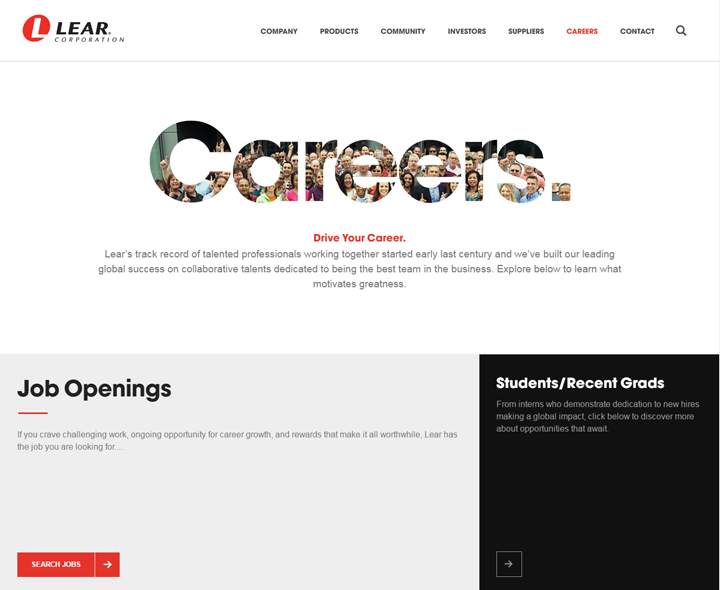
As you can see, the hiring section takes up very little space on a corporate website template. However, for any potential visitors to the site, this is a very effective and attractive piece that is strategically placed where visitors to the site can immediately see it.
Community Page:
This part of your corporate website may not be as prominent as other parts of your site, but this is very important to show how your company is taking part of social responsibility duties that help the community and the environment.
Here’s a great example of Intel’s community page on their corporate website:
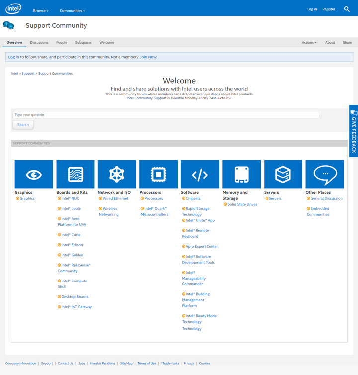
As you can see, corporate responsibility means reaching out to the community and being involved in either volunteer work or charitable causes. This part is intended to show your customers and visitors that your company is not only focused on making money. You intend to show also your company is willing to help in giving back to the community and extending a helping hand in whatever charitable and environmental causes needed.
A FAQ Section:
Frequently Asked Questions or FAQs are listed questions and answers that are relevant to your company’s being. In this section, you try to anticipate all the possible questions that your customers would ask on a frequent basis. Your website’s aim is to inform as much as promote your products or services. You can include all the necessary FAQs that can be easily read by customers and get all the necessary information.
Here is a part of famous fast food restaurant Subway’s FAQs section:
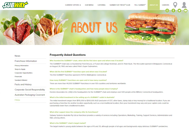
As seen in the illustration, everything from the company’s history down to business opportunities for customers is being explored in the FAQs section.
Store Locator:
This part is applicable only for businesses with multiple locations. Nevertheless, we will include this here since most large businesses started out small before growing to become the giants that they are now. This part can also be added later to your own website once it branches out to different locations. This is essential to guide customers where to go to the nearest branch from their own location.
Here’s an example of Ace Hardware’s website store locator:
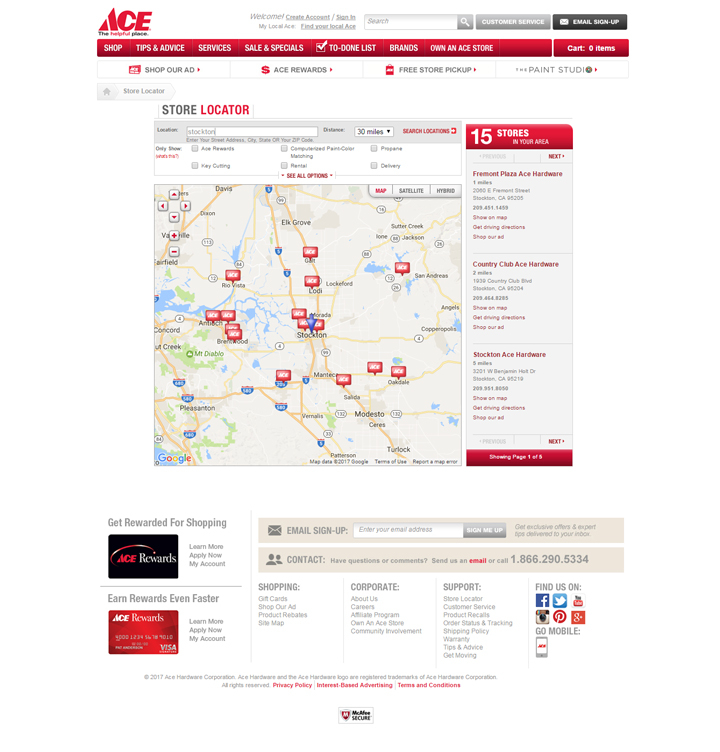
Other essential parts you have to include in your website are terms of use and privacy policy. The arrangement of the list of features are not in order and most sites do not follow a standard pattern. Of course, incorporating all these features in your website would make for an excellent layout.
How A Corporate Website Is Different From Other Websites
Most corporate websites aim to either satisfy a need, solve a problem or satisfy customers with the help of their products or services. While admittedly almost all corporate websites follow the same format of relaying to their customers that they are either the most reliable or best in service and customer care, the corporate website’s aim is to be unique than the others. The reason is for your site to stand out and not follow the cliche of commonality prevalent in so many corporate websites.
Selling propositions like Nike’s “just do it” and Coke’s immortal tagline “Open Happiness” are just two of the best examples of how taglines work to great effectivity.
Nike’s tagline may be simple, but it expresses a direct, honest-to-goodness approach to a sporting attitude that athletes could totally relate to.
Coca-Cola’s tagline from the 70’s managed to outlast its close competitors since it conveyed an emotional response of happiness and satisfaction to their customers. It was so effective in terms of sales and customer loyalty. These are the finest examples of branding and marketing strategy that most fledgeling companies have extolled in hopes of making it big like these established companies.
For a corporate website to be successful, the following aspects have to be considered especially when finding ways to have a unique selling proposition:
Quality – Your product or service must emphasise on top-notch quality to attract customers. Without the assurance of quality, buyers may not be encouraged, or worse, will not take a second look at your website and the products or services you offer.
Reliability and Dependability – This closely follows quality and should naturally follow how your goods or services are being offered and how these are trustworthy and offer customer satisfaction.
Convenience – Besides your website being easy to navigate and its layout being simple yet attractive, your products or services must offer convenience for customers to find it easy to buy your products or use your services. If your company is all about food, the natural thing for you to offer is fast delivery besides the taste that should be superior in order to create a devoted and loyal customer base.
Customer Service – Assurance of the best support that you can offer your customers in terms of service and product support is probably the best feature of all on your corporate website. Not only does customer service encourage customers to patronise your company, a word-of-mouth promotion from satisfied customers will enhance your reputation as a reliable company that customers can depend on.
Why You Should Have A Corporate Website
For businesses who are just starting such as start-up companies, it’s essential that your corporate websites are established to promote not just your company but your products and services as well. Big companies like Walmart have realized the value of e-commerce business after realizing their sales have fallen as their customers have shifted to online shopping.
That’s because the internet market has jumped over the years and has become a multi-million dollar industry and it has no signs of stopping. It’s projected that e-commerce will grow some more and become a multi-billion industry. Most companies have, in fact migrated their services to go online as Walmart has done.
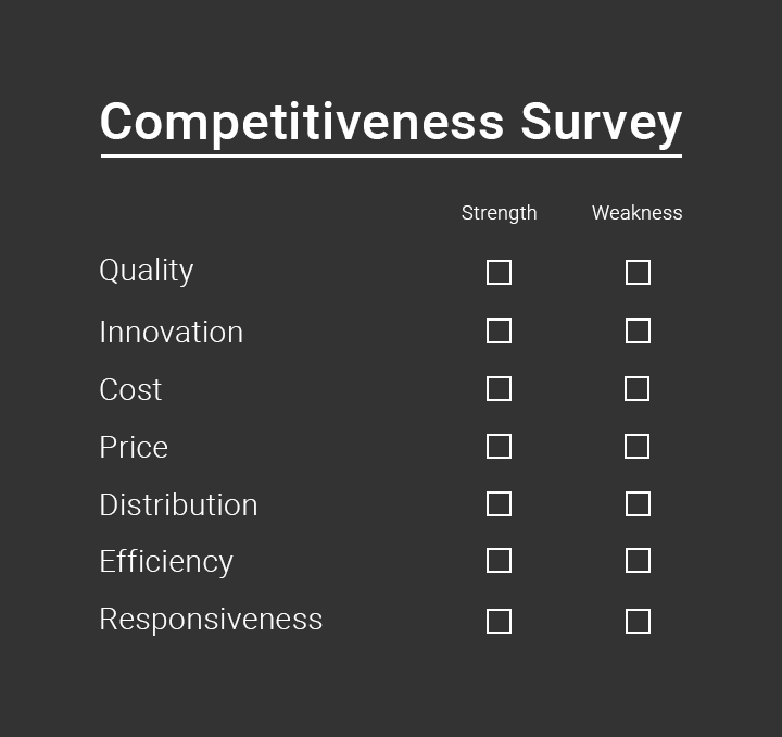
If you plan to have your business expand overseas, the more it is important to establish an online presence. Having a corporate website is the surest way to reach customers both locally and abroad. Creating a custom web design will only cost a fraction of the revenues you receive when the money comes pouring in once your website is up about and running. As a businessman, you should be able to know the different marketing strategies needed to have your business grow. This is where establishing a corporate website comes in.
These are some of the benefits of having a corporate website:
Cost-Efficiency – A well-developed website leaves a presence 24/7 online with maintenance costs lower than a physical store. Customers can also drop a line or leave a comment from any part of the world where you have a market presence, making it easier to reach them online and vice versa
Accessibility – Customers and clients can easily access your site anytime, anywhere and you don’t need a physical presence yourself to be able to reach out to your customers. You can either set up a dedicated customer service or answer client queries from the comfort of home or anywhere where you are connected
Convenience – Having your own website that houses your products and services for customers to browse online gives you the advantage of not having to make a time-consuming marketing effort offline. Physical offline marketing oftentimes are not so effective and will not reach all the customers you intend to target for your market.
Sales and Marketing Presence – As proven by big online shops like eBay and Amazon, online marketing strategies are very effective. Having a strong website and online presence helps draw in customers and your site is an effective tool for your products and services. Having an online presence also helps you to sell your products and services 24/7 with hardly any limitations. Since online sales are unpredictable, your best bet would be to stock up on your products that you see as best sellers. This can be foreseen when you look at the trend based on the performance of some of your products. Having an online presence is important both for your products and the brand you carry.
Credibility – As is normal for most customers, they usually check a product’s website before committing to buy their products. For this reason, it’s very important that you gain customer trust by establishing a website that they can check out and explore. Your website exists to act as proof that your business is legitimate, together with testimonials and other comments from customers. This is is a great opportunity for you to assure your customers of your commitment and responsibility and how your business can expand with customer trust and confidence.
As you can now see, having a corporate website is both an advantage and an opportunity to test your products and services in the market, as well as gain customer trust and loyalty from how your site and marketing strategy are being laid out.
Advantages Of Having A Corporate Website
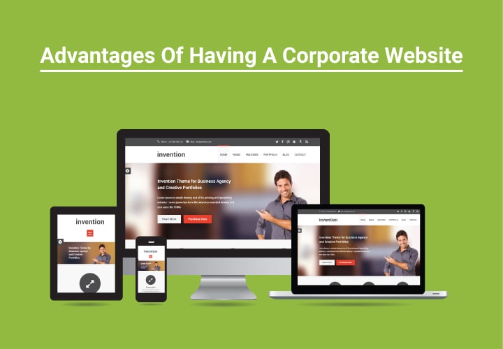
It may be surprising to know that most businesses didn’t even consider having a website until they realized how important it was to have an online presence. Now more than ever, with internet marketing taking up a bulk of the presence in the market, entrepreneurs who have long promoted their products in traditional markets have started to believe in the power of online presence in terms of growth and potential. To enumerate the advantages of having a corporate website, the following are essential to why having a website matters:
Lead Generation:
This is perhaps the best argument for why having a corporate website is an advantage. Potential customers will be able to come to your site or find you based on what they want. They can also see what you have to offer and they in turn will promote your products to their friends especially when they’re satisfied with your service.
Offering Solutions:
Offering solutions to client problems will help you gain a lot of satisfied customers who cater to your website and become regulars. Closely tied with lead generation, showing prospective clients how you can solve their problems through your products and services will in turn make them help you by promoting your company to their friends, colleagues and associates.
Showcasing Of Products:
Customers will be able to purchase from you at any time of the day without you even having to make an effort out of it. Having your website up and running 24/7, as long as you’re one of the top lists on any search engine will help you promote your products as well as bring in much needed sales.
Customers/Client Will Find It Easy To Contact You:
Having a website will make it easier for customers to contact you and keep in touch with you on a regular basis. This will make for a good customer experience and having that will help customers promote you to others who may need your products and services. You can also easily check on any queries through your laptop or mobile phones and answer each customer wherever you are.
Serves As A Platform for Social Media Presence:
Besides making sure that your corporate website is easily laid out and easy to navigate, having a presence on social media sites help to generate interest from those who may have otherwise not heard from you. Having your own website and then having an account of all major social media sites help generate viewers and increased viewership can spell increased sales and exposure to the public.
Having a website however doesn’t necessarily mean you’ll just be contented to sit and wait out your orders from your customers. You need to take a proactive approach besides making your website look good. To fully exploit the benefits of your website, you need to have a solid online presence that conveys the stability and commitment that customers look for in a company. Your website should also be optimized besides being customized so that people will find what they’re looking for when checking your site.
Matching Your Website And Your Business
Designing a website for your business is not about putting it up, leaving and forgetting about it until you’d want to check it out again. Corporate websites are more than that and it should be a medium for customers to be able to get what they want when they come to your site. Finding the means to how this can be achieved will make it easier for you to set your goals on how your site accomplishes what it’s intended for. What customers think when they come to your site is about how to get what they want and what they expect from the seller. How you exploit these things to your advantage will make your website highly successful and in demand.
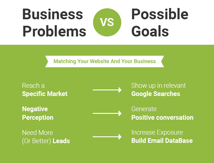
Your website should reflect your customers’ priorities and know what they want. The quicker your website delivers on what your customers need, the quicker your popularity grows and your reputation for quick response among customers, both active and potential clients. As seen in the illustration above, business problems as against business goals should be sorted out not only to optimize your website, but generate sales as well.
In order to optimize your website, these goals have to be achieved:
Drive Traffic Into Your Website
Online promotions, word-of-mouth, keywords, SEO and lead generation to drive traffic to your site and attract more customers by utilizing social media to promote your products and services
Drive Traffic Into Your Retail Store
This is probably the most important thing besides driving traffic to your website. If you have physical stores in different locations, your website should help drive traffic to these locations in order to generate sales not just online but in all your retail stores as well.
Building Your Brand
By building your brand, you must first understand what kind of products and services you are selling and it should be reflected on your website. Companies like L’Oreal has become so famous because its corporate brand has been on center stage for years with their “Because You’re Worth It” tagline. That tagline has been an instant click to millions of women across the world because it connotes trust and reliability in a brand and women the world over are attracted to such taglines. Oftentimes your tagline and logo can make a difference between success and failure in branding.
Create A Visual Identity
Creating a universal identity through a design logo is the key to why some companies have been hugely successful. Companies like Apple and its simple design logo has become one of the best-known brands across the globe. Its logo has become a standalone symbol that millions of people across the globe have been able to visually identify even without the accompanying brand name.
As seen in most major companies’ websites, lots of effort have been made to make their websites attractive by following all the goals mentioned above. Even with their size and ongoing volume of sales that run into billions of dollars, they still go to great lengths to make their websites attractive and make all available effort to drive traffic to their sites. Effective advertising coupled with a commitment to service and making their products reliable and trustworthy are the key factors in making customers come to your site. That’s matching business to your website.
Corporate Website Dos and Don’ts
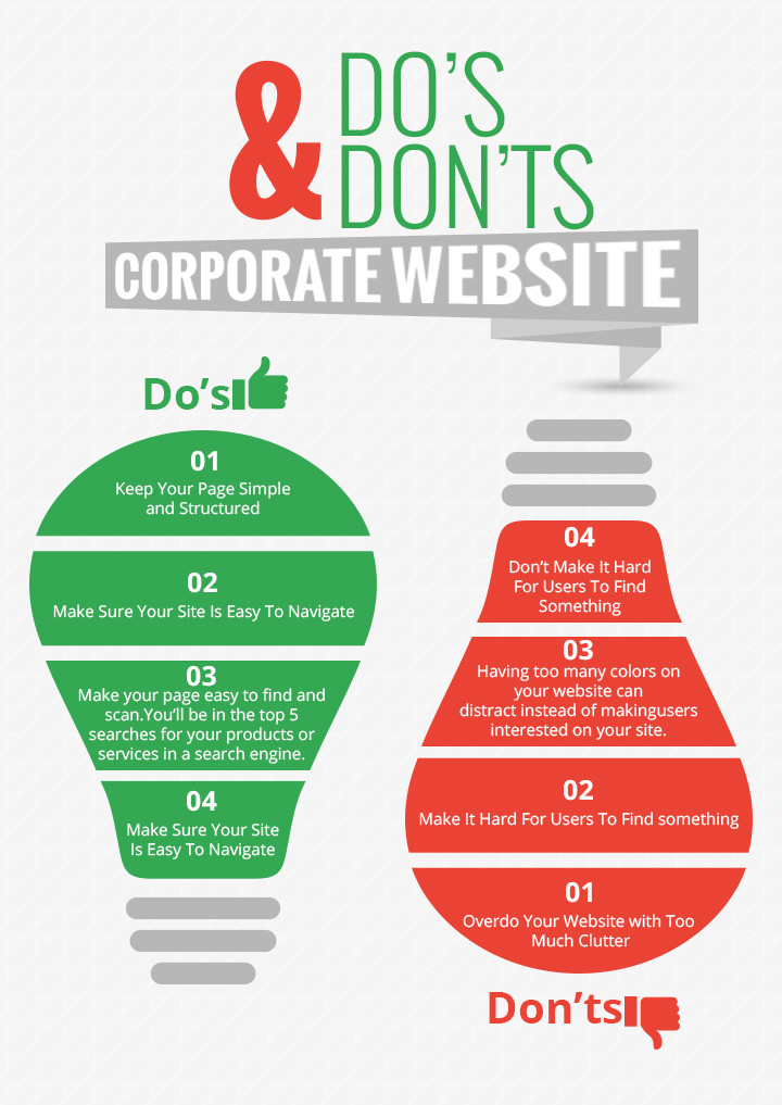
One of the most challenging aspects of building a corporate website is to keep people interested besides looking for what they need. The thing with online sites is that viewer attention is not the same as that of other forms of media like TV and newspapers. Just like people expecting a fast internet connection, people like their information fast without the delays. A corporate website then only has a few seconds to capture a potential client’s interest in its products or services being offered. Keeping your website simple, user-friendly and free from clutter will ensure potential customers will not lose interest and continue to browse your site.
DO: Keep Your Page Simple and Structured
While colors may be attractive, a website that’s too colorful will fail to attract visitors and clients who are not looking for attractive colors, otherwise they’ll look for entertainment sites. Your website is there for a reason and that’s to promote your products or services. Keeping it simple and organizing your corporate website’s content to make it easier and user-friendly will greatly improve your chances of effective communication and better impact on potential clients.
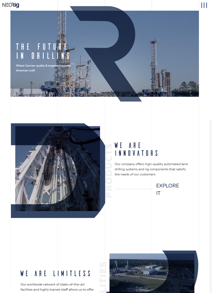
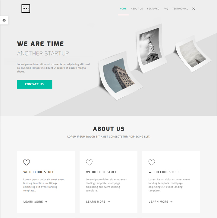
An example of a clean and well-structured corporate webpage design:
DON’T: Overdo Your Website with Too Much Clutter
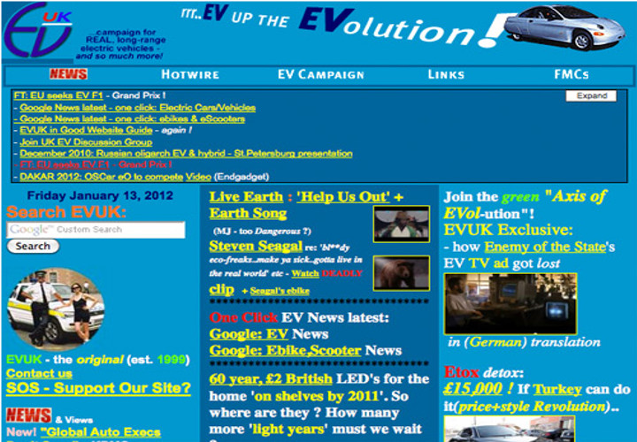
A disorganized corporate website is both unprofessional and suspicious. Remember that most corporate websites need to project an image of being trustworthy so clients will not hesitate to deal business with you. Each piece of content on your site should have a purpose. Irrelevant content like external links, videos and ads turn off potential customers and your purpose of conversion from plain visitors to buying customers will become a lost opportunity. A solid, easy to navigate website will generate more inquiries and serve your company’s website its purpose.
An example of a disorganized corporate webpage design:
DO: Make Sure Your Site Is Easy To Navigate
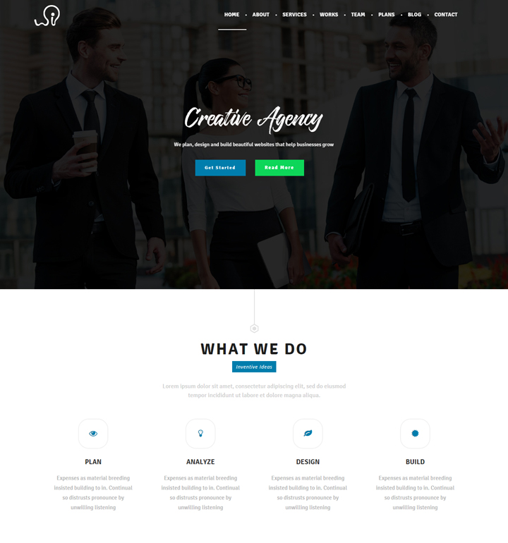
Making your corporate website clear and easy to navigate will encourage visitors and potential customers to further explore your site. It will also keep them interested in what products or services you offer them. Create a good, easy to find navigation bar buttons that users can easily click on and move from page to page. The call to action button should be highly visible that will let visitors become potential customers by either joining in or signing up. These are all part of the set up where companies can lure potential customers to their sites and possibly become paying customers.
An example of an easy to navigate webpage design:
DON’T: Make It Hard For Users To Find Something
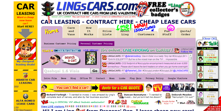
If a prospective client gets distracted at your disorganized company web page design, you could lose a potential customer and your corporate website wouldn’t serve its purpose. Getting visitors and potential customers in and around your website easily is the key to capturing users’ attention and keeping them interested in what you have to offer. Making it hard for users to find content and letting them get lost in the maze of your web page design will make them frustrated and leave your site. Once that happens, they will never come back and you’d lose a potential customer. When that happens often, you’d lose your website’s purpose and might as well shut it down. A negative customer experience is not good and will reflect not just on your company’s name, but on your products and services as well.
Here’s an example of a disorganized corporate webpage design:
DO: Make Your Page Easy To Find And Scan
As what was explained earlier, web users do not spend a lot of time looking for something on a single website. Once they don’t find what they’re looking for, they move on to the next site. The key is to make your corporate website easy to scan and search for in major search engines. Unless your site is all about news stories, users do not spend a lot of time on a single site reading a lot of content. Most corporate websites limit their texts to 300 words or less. The aim is not to put too much content but for keywords to improve your site’s position in the search engines. For better Search Engine Optimization (SEO), put in at least 250 words of text focusing on keywords on each page with minimal but relevant images. That way, you’ll be in the top 5 searches for your products or services in a search engine.
An example of an easy to scan website that utilizes SEO through proper use of keywords:
DON’T: Put In Too Many Colors
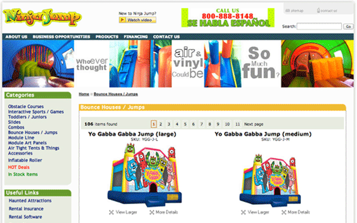
Having too many colors on your website can distract instead of making users interested on your site. Unless you’re a children’s entertainment site who needs a colorful website to attract kids, it wouldn’t serve any purpose making your website too colorful. For your corporate website design to look formal and professional, minimal colors should be used. Neutral colors are even preferable for some sites that want to get their message through. Convincing users to buy your products and services is in how your site delivers its intention through the right content and presentation. Colors are secondary and most of the time serves as decorative purposes only.
Here’s an example of a webpage that has too many colors on it:
Having a simple and purposeful website is the objective of most corporate website designs. From the way it is being set up to the contents, minimalism and simplicity are what’s important. Adding a social site to promote your brand and linking your business blog to grow awareness to your products and services will further give you the edge over other competitors. It’s not advisable however to overload your website with keywords because you can be penalized by search engines who do not tolerate sites that are overloaded with keywords and do not follow SEO guidelines. Adding fresh contents regularly is more advisable instead since search engines give more weight to sites that frequently add fresh contents. Create a mobile-friendly site that can be used by devices since this will reach target audience effectively and efficiently more than computers do. Make sure that your site can be contacted by these devices to maximize its effectivity.
If your corporate website is filled with tons of information comprising several paragraphs, chances are, no one’s going to read it and your product or service offering will be buried beneath tons of information that become useless. Using effective copywriting to make your message clear is better than putting in a lot of words on your site. Besides the usual setup, do not just rely on blogs alone to keep clients and potential customers interested. Amazon’s success is primarily due to reviews from clients and customers.
Business reviews are very helpful and can help potential customers balance your products or services according to their own specifics. Online testimonials from clients serve as effective endorsements for your product. There may be negative reviews but take it as a means to improve your products or services. You can’t satisfy everyone, but more positive reviews oftentimes outweigh the negative. Customers also tend to often judge for themselves and can tell which ones are truthful based on how clients gave their testimonials. Past client reviews are also helpful since this will add credibility to your products or services. A majority of consumers have been found to trust online recommendations more than any other reviews because they know these clients were direct users and not biased in their judgments of products and services.
Finally, don’t forget to test your corporate website on different devices. Be mindful of the loading time to check if your site loads fast enough. Slow loading time can be disastrous and will result in potential clients totally losing all interest on your site. Make sure that your corporate website is good enough to run on mobile phones, tablets and internet browsers to allow clients efficient browsing on your site from their devices.
Features Of A Corporate Website
Important Features
A well-built web design takes a lot of combination of factors to achieve. These combination of factors are different for each website depending on the line of business of the company and its specific needs. When looking at the different websites of famous businesses, one can’t really say whether one web design is better than another. It depends upon functionality but officially, here are the six key features of a corporate website:
Web Content Quality:
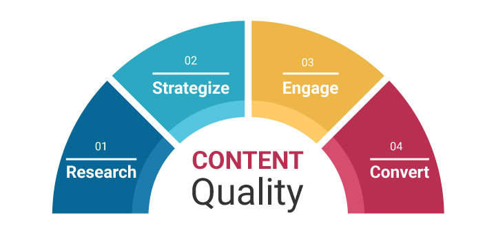
One basic reason people search the web and search engines is to look for information. People need to be fed a variety of information every day and the same goes with products that they need. Your website should supply the necessary information on your products or services and know what people need in order to maximize your marketing strategy. To do these, you need the four basic elements of quality content on your products and services to draw people into your website: Research, Strategize, Convert and Engage clients, customers and all those who are just curious about your site and what you offer.
Easy, User-friendly Navigation:
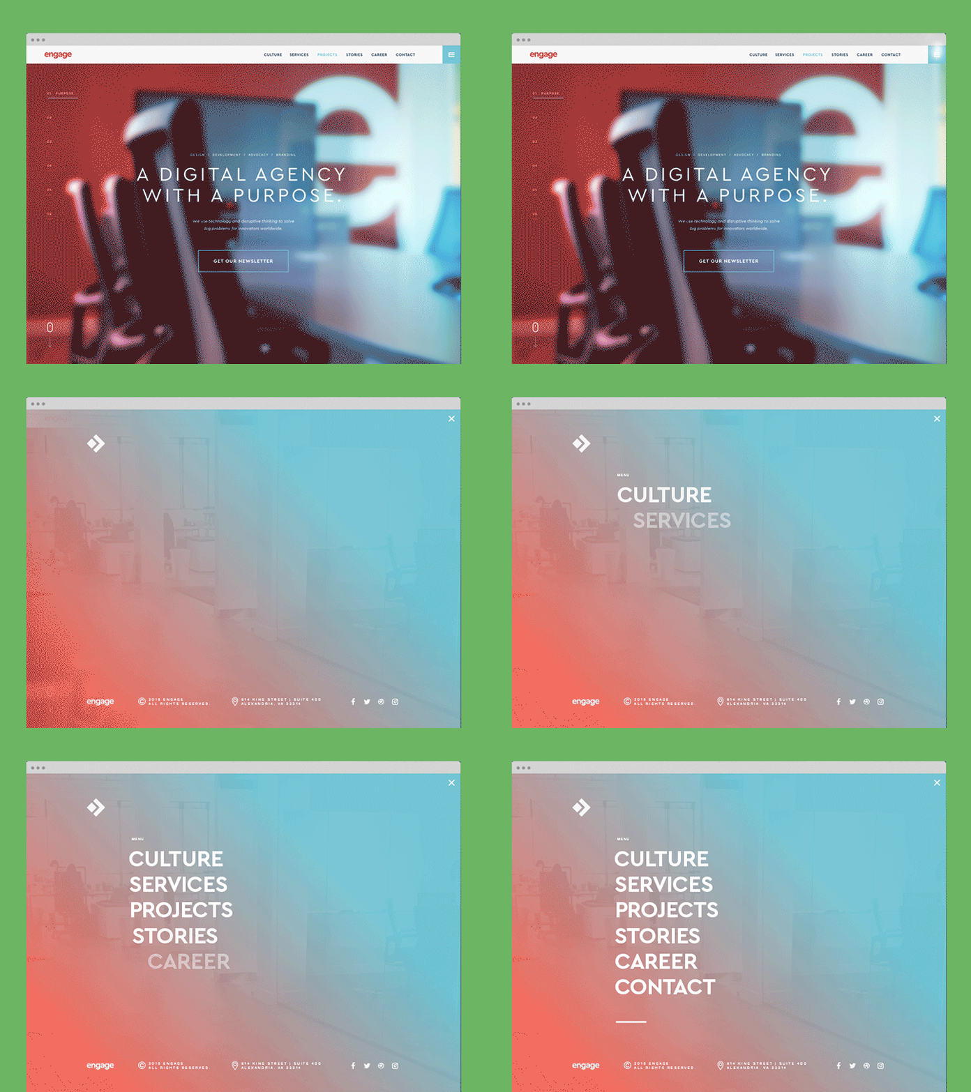
As pointed out earlier in Chapter I, an excellent web design must feature a user-friendly navigation around your web that clients and customers can easily navigate with. Important links should be easy to find and click on labels that are visible and easy to understand. If there are tons of content on your website, a search box should be included so that customers and visitors are able to immediately find the specific product or services they’re looking for.
Simple, Yet Professional Web Design:
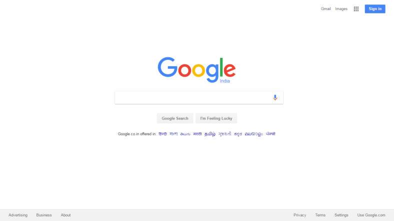
An attractive design is good but too much attraction doesn’t add value to your website. A better website should be simply designed with features that are all usable and fully functional. The aim of your website is to convert visitors and viewers into buying customers and one way of enticing them would be to attract them to your site with simple yet elegant and professional designs. One of the best examples of this is Google’s site which is particularly simple yet very functional and not too bland. Too much bright colors and contrasting font sizes turn users off especially when they strain the eyes. A balance of content and graphics are perfect for a good corporate website.
When visiting your website, your site should load quickly otherwise clients and customers will lose patience and leave before your site even loads. You should try and minimize factors that affect your website’s loading speed like your server speed, the number of traffic to your site and the number of graphics being used for your site. You should try to look for and use a reliable site host, optimized graphic and proper website codes>
Search Engine Optimisation (SEO):
Your website content should include relevant keywords in order for your site to stay on top of search engine pages. Besides that, driving visitors to your site is the ultimate objective that will be possible through search engine optimization which include appropriate link profile, increasing leads through the use of social media sites and SEO friendly backends.

Web Compatibility
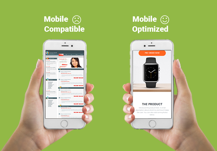
Knowing a truly well-built site is crucial for attracting customers and increasing traffic to your site. Your site should easily be rendered on various platforms including mobile sites. Your website should properly function on these sites especially with the rapidly growing popularity of mobile devices. Most people look for what they need on their mobile phones instead of the usual laptop or PC devices. Having your site mobile friendly can easily be browsed by a lot of people.
These are the six most important features of a website that should be optimized to increase traffic to your site and bring in potential customers. Remember that customers who buy usually visit the site first and look around for any potential offers and products that they need. Knowing how to meet those needs through your site is the most important aspect why your corporate website is there in the first place.
Top Features You Would Want In Your Website
For your corporate website to be successful, the top essential features must be found on your site that can generate interest and increase traffic to your site. While some of these features are already found in some of the sub-chapters, they’re just part of the whole structure essential must-haves for your site. Besides creative and custom web designs, a complete feature guide that should all be found on your site will make it a magnet for visitors and potential customers.
Here are the top essential corporate website must-haves:
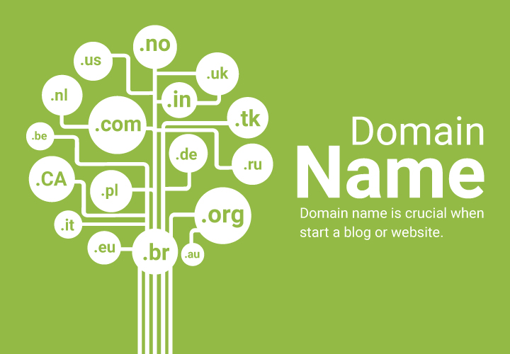
Domain Name – Think of a domain name that is attractive, easy to remember and not too long nor short. It has to represent your website and should be catchy enough that will raise curiosity to potential customers who will be drawn to your site.
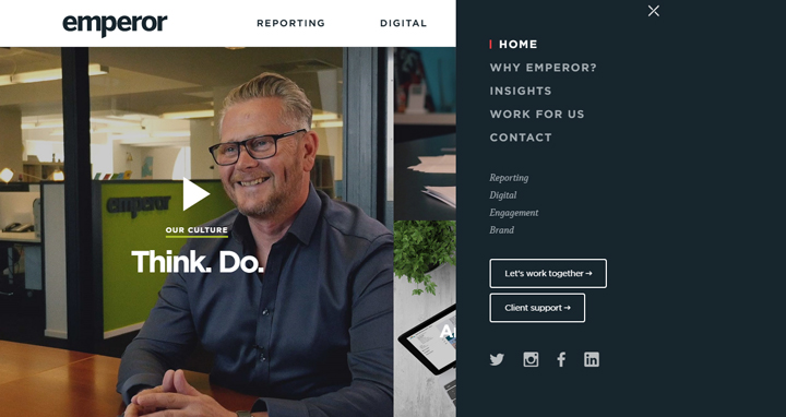
Navigation Bar Placement – When people go to any website, they usually look for the navigation bar that they can use to explore your site. For this reason, it’s essential to have your navigation bar at the top of your page. Once visitors explore your site, they can become customers instead of just visitors.
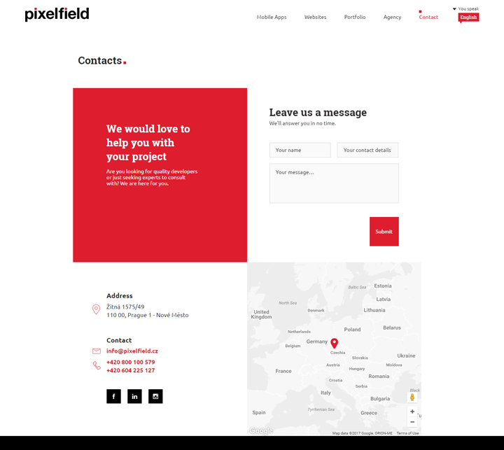
Contact Details – Every company shouldn’t miss out placing their contact information where it’s visible on the homepage. Besides the email address and phone numbers, a detailed map of your location may also be included. If you have multiple branches, a dedicated store locator should also be included.
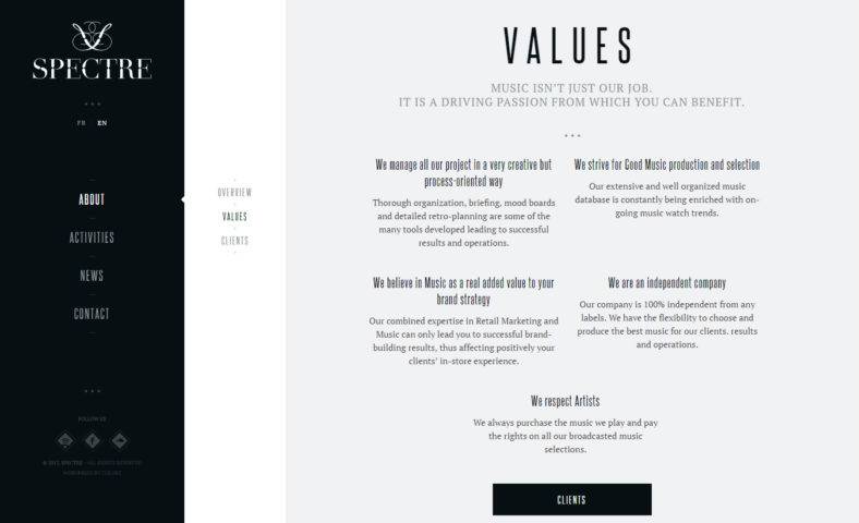
Fresh Content – Many business websites are guilty of putting content without giving much thought as long as they fill their sites. Your site however needs relevant information that will help convert people into customers. Your page should have fresh content that’s easy to read, informative and get people interested. Besides images, infographics are also important to keep them informed through visual aids that are more interesting than just texts.
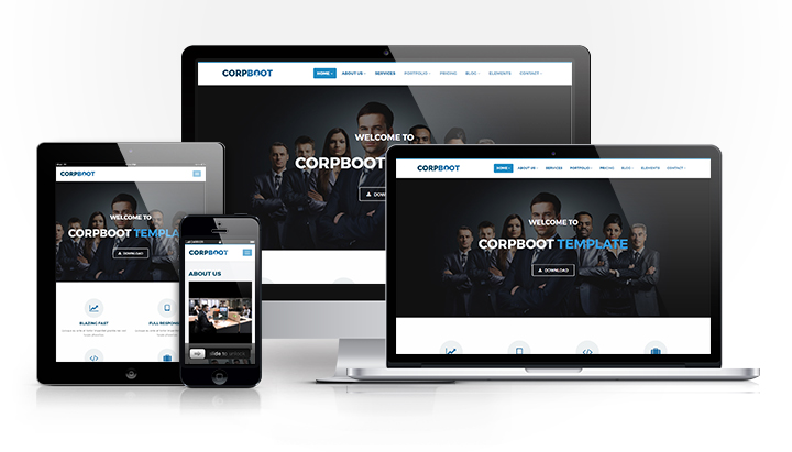
Responsive Website – Since the seemingly unstoppable explosion of mobile phone usage, Google has given preference to sites that are mobile-friendly. In order for companies to increase their ranking among search engines, they have adapted two sites that can fit both PC and mobile sites. This can be done through a separate website with similar URL to your main site or a web development system that will automatically adjust to fit a mobile device’s screen.
Web Design Professional Coding – It doesn’t hurt to hire a professional corporate website designer to make sure your contact form is actually directed to your website, your images are loading correctly and your videos are working. A lot of sites actually get redirected to other sites without the owners realizing it and some graphics and images take forever to load due to the sheer size of their content. In order to avoid these pitfalls, it’s best to seek professional help to make your website run correctly.

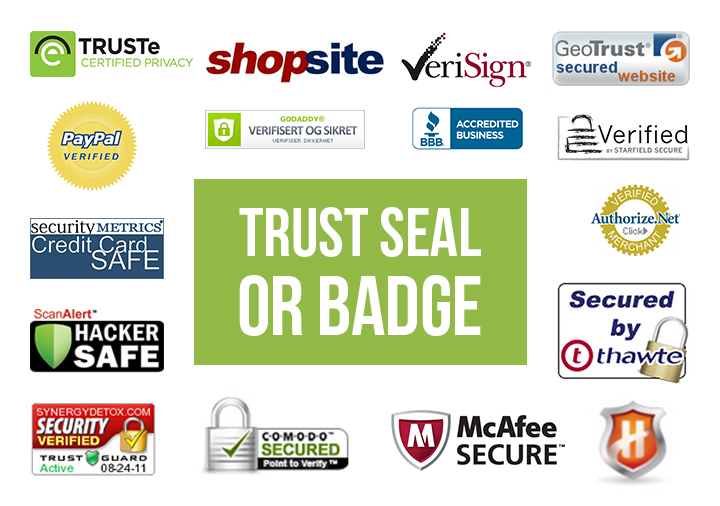
Trust Seal or Badge – The adage “If They Won’t Trust You, They Won’t Buy” rings true in corporate websites particularly in e-commerce. If you haven’t already noticed, most companies, particularly those engaged in e-commerce like Amazon or eBay have seals that are called trust badges. These badges verify that a website is legitimate and not a fly-by-night organization that steals customers’ money.
These seals are marks that the website is secured with a Secure Sockets Layer or SSL that give a secure transmission for customers to safely transmit their credit card information. Since 88% of American online shoppers say they won’t buy unless a website has a trust seal, it drives the importance of secure, trusted sites that your own website needs to follow.
Blog Page (Optional) – Not every corporate website has this so this is optional. This is a good idea however to generate interest and drive traffic to your site. This can also convert traffic into leads and establishing authority. Updating your blog regularly not only keeps readers and potential customers interested, Google also rewards you for updating your blog regularly, by giving you top spot on their search engine.
Choosing good meta tags and appropriate categories also help in driving audiences to your site. You can also regularly keep in touch with your customers this way and respond to them quickly as long as you check your site frequently. You can also hire a freelancer to update your blog regularly to answer comments and queries.
Attractive Versus Informative Corporate Websites
There’s a fine balance between a beautifully created website and one that informs, not just sells its products. Creating your website to perfectly balance between its texts and infographics can do wonders to visitor traffic and lead generation for cultivating potential customers. Knowing how to incorporate these two makes not only for a very popular website, it also drives sales and attract customers who have a need that you’re trying to fill. Making your business successful is also the key to establishing your online presence. An attractive website can arouse the curiosity of viewers and as you would know by now, your website serves as your company’s front row office. It’s a virtual front that would welcome visitors who become prospective buyers. First impressions last, so it’s very essential that they get to like what they see. Despite these facts however, many corporate websites struggle to optimize their sites.
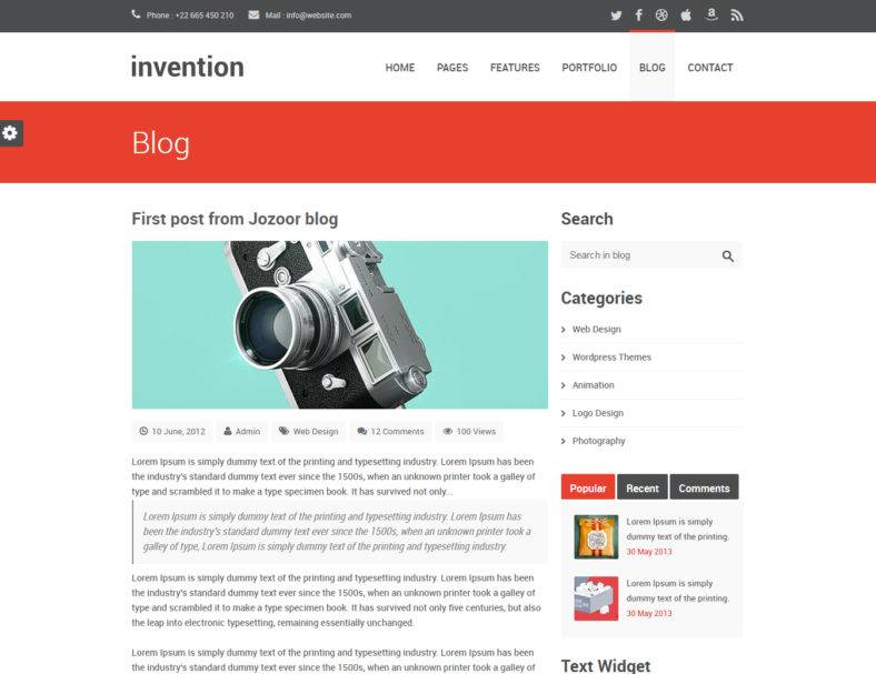
Rather than treating your homepage as just another landing page in a sea of other corporate websites, why not make it unique and attractive? Besides serving as eye candy, it’s also essential that the information contained on your website is fully descriptive of your products or services that you offer so that customers will know what you offer and how beneficial these products or services are to their needs. In this section, we’ll delve into both the informative and attractive aspects of a corporate website and find out the reasons why these two elements are so important and should be together.
Before we continue, here’s an example of an attractive website template:
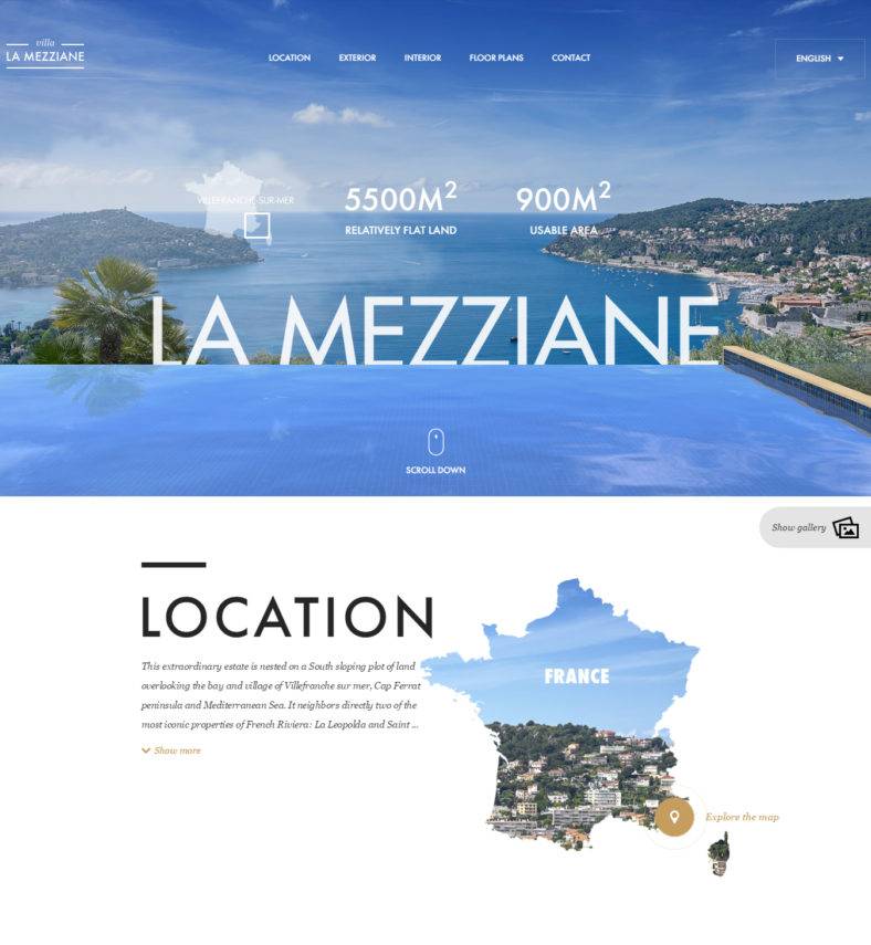
And here’s an example of an informative website template:
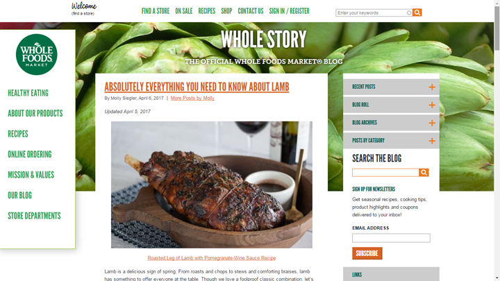
Every visitor to your website is a potential customer so the most important thing is to keep them interested while they’re browsing on your site. An excellent and creative corporate web design may enhance the attractiveness of your site, but keep in mind that every visitor’s attention span is limited, so generally, your website has to immediately inform visitors within a minimum of three seconds about what you have to offer for them, whether you can cater to their needs with your products and services.
Your headline must then be clear, simple and free from all the clutter some websites are guilty of. The same goes to your sub-headline where you offer a brief description of your products and services. This is where the informative part of your website comes in. Every potential customer has a need, the reason why they visit your website. You’re there to fill that need by presenting your products or services that they can use.
Here are the top ways for your corporate website to be both informative and attractive:
- Your website has to act with a clear mission and purpose. Your products and services are important but emphasis should be placed on helping your customers fulfill their need through whatever you can offer
- Take a stand on issues of importance regarding consumer needs and what they want and how you can meet those needs
- Transparent communication without sounding as biased and self-praising as possible of your own products and services. Emphasize importance of customer queries by letting them know how your products are being sourced and manufactured
- Share your vision for the future and how your company will be right there with your customers through whatever phase they’re in. Remember that trust and commitment are two very important things that your customers are very sensitive about
- Openly share your company’s history and heritage to let your customers know how you started and where you intend to go from hereon. This part is where your commitment is emphasized and this is where you gained their trust
- Invite customer participation and be receptive to their requests to improve your products or services. Customer participation has been practiced by top companies and this has led to enormous strides in better product innovation, services and trustworthy relations
- Invite online consumer participation through interaction that they can voice out their concerns. When this happens, customers are more active when they know their concerns are being met and their needs handled in a professional manner. They also tend to buy more knowing their concerns are being met and they have active participation with the products
As for attractive graphics, we all know that people are visual creatures. Creating a template for your website with a background that fits what products or services you’re trying to offer can help a lot with visitor or customer attraction. Include photos and informative videos to help with your website template design but make sure these load fast and not cause your website to lag.
Checklist For Your Corporate Site
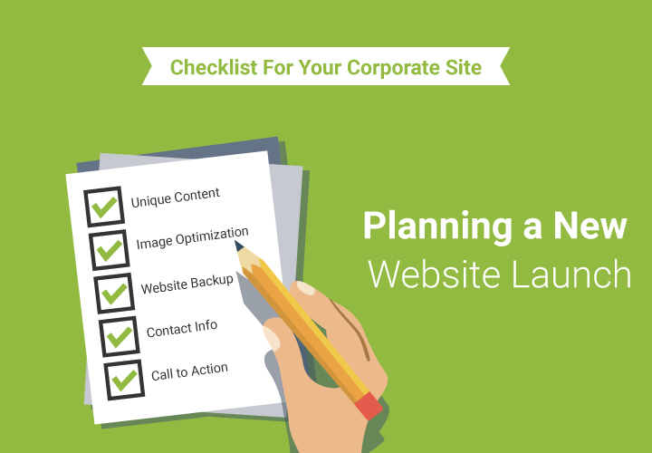
Just like every venture, creating a corporate website design takes every bit of planning and should not be based on hasty judgment alone. Careful planning and determining the purpose of your site should be contemplated as well as defining the basics of your business. Questions like what your website is trying to achieve and what your target market is and your potential for sales in an online setting should be addressed.
In order to help you establish your corporate website and use it to its full potential, this checklist will help guide you on what factors to consider before creating a functional and effective corporate website:
Establish Your Goals
When you browse around different sites, you realize there are lots of websites that either serve no definite purpose whatsoever or don’t make any sense at all. What makes it sadder is the fact that some of these websites are from startup businesses whose target market will never be reached due to the failure of their websites. The problem with these sites ranges from lacking several features like a call to action button which is highly important to entice potential customers, to sites that have no contact details. How some sites fail at these essential elements is baffling considering these are important must-have features that should always be included in a business site. Defining your goals should be established to include the key elements needed for an effective corporate website.
Since businesses vary, any one of these things may be applicable for your website:
- Selling products either directly to consumers or through resellers, whichever gives your business the most impact in terms of profitability.
- If your business centers on services instead of products, finding a correct pathway to generate revenues through subscription to content on your website would be the best approach besides other kinds of professional services
Developing new target markets through your website for your existing business, such that your site might reach a broader audience to maximize its purpose. - Establish yourself as an authority on your business through your website as you welcome queries and other questions regarding your products or services. This highlights the importance of the “Contact Us” button among other things such as a virtual assistant for your site.
- Provide resources to your existing customers even while you build your customer base to attract prospects. Neglecting your existing customers could eventually backfire as your business reputation suffers as a result.
These are just some of the many goals your business must have in establishing a corporate website. Defining your goals and being clear about them will make developing your website a much easier process.
What’s the Demographic of your Target Audience?
Defining your target market is the main purpose of establishing your website to reach a broader audience. Knowing how your products or services will target a certain demographic in the market sector will maximize the effectiveness of your website’s function and direction. Knowing your audience or target market will allow you to take maximum advantage of your website and increase your sales and profitability.
Being able to determine the demographic of your business will determine the customer need that you intend to meet. Such important aspects as what your unique selling point (USP) is, to convince customers that your unique product or service is good enough for them to switch to your brand, and how effectively can you communicate with your customers.
Being able to define your demographic should include the following aspects:
- The uniqueness of your product or services that will make them stand out from other competitors who offer the same kind of brand and service.
- How customers would choose your brand over your competitors and the possible reasons why customers should choose you over the others
- What your product or service’s position in the market is (where do you think you rank compared to your competitors) how cheap or expensive your brand is and how the quality rates over that of your competitors
- What unique propositions you can offer your customers that they can take advantage of
- If you have a unique product or service that’s special or any unique insight that you can offer your customers
When you go through the list above, you’ll have a better idea of the demographic for your website’s target audience. As you build up your corporate website, you’ll have a good idea how to create the content of your web page.
Find Out Valuable Information From Your Competitors And Their Websites
One of the biggest secrets in business is that competitors often tend to eavesdrop on each other. The same holds true for corporate websites. In order to know how your products or services would fare against other competitors, it’s quite wise to research on competitor websites and get ideas about their selling propositions and how they market their brands through their own websites.
When looking at competitor websites and what they do to promote their own products and services, the aim is in any or all of the following:
- Comparing your products or services with theirs and how competitive your brand is compared to theirs
- To assess the demographic of their target market and how effective they are in doing so
- To have a clear view of their products and services and how these can be used as basis for improving your own
- To be able to evaluate what’s effective and what’s not on their websites that you can use for your own
These suggestions are not meant to tell you to copy your competitor’s website. These are meant to give you an idea of the scope of how your website will be effective and how to be on top of your competitors. These also help you meet whatever challenges you face and to better meet the needs of your customers. By having the proper knowledge on how to make changes and improvements on your website, you can have the edge over all your competitors to better capture your target market.
Think Of Any Specific Functionality You Need On Your Website
In order for your website to be doubly effective, you need more than just a call to action button to generate sales and keep visitors to your site interested. You need to have functionality buttons that customers can use like a shopping cart where they can order any one of your product or avail of your services. Some of these functionalities might include but not limited to the following:
- Image gallery for different products or services
- Hosting
- Email marketing and addresses
- Shopping cart
- Payment options
- Shipping
You may also want to incorporate a content management system (CMS) to regularly update your site as well as your blogs to keep your customers up to date on the latest product use as well as new offers that they can take advantage of. There are lots of functionality that you may be able to use on your website depending on how you see fit that can be used to generate interest and generate sales.
Decide On The Best Professional Website Design
Creating a company website design is not done haphazardly in a spur of the moment decision that is a bunch of whatever you can put together for the sake of having a website. What’s important is the website has to be useful that it serves its purpose of reaching your target audience. You need to coordinate with your web developer on the best corporate design templates that you can actually use for your business and a custom web design that is functional and not decorative.
Remember that your main purpose here is to create a website based on attracting customers and potential clients that will help you generate revenues through your site. Your web designer must then prepare a blueprint by which you can input your ideas that are important for your business.
When making your company website design, you need to consider the following:
- What your website goals are
- Any specific access requirements for your target market
- The age demographic of your target market and how your website design will fit your target audience
- Design style that fits your industry
- What style you need to adhere to on your site design depending on the kind of business you’re engaged in
- The accessibility of your site on both desktop and mobile devices
- There are a lot more things to consider when designing your corporate website. The ideal way is to make your site
- Work for you in a way that it will attract your target market better than any other sites
Decide On A Budget Range For Your Website
Given the fact that most startup companies have budget limitations, it’s not uncommon how many businesses who are just starting out would opt to build their websites through free design tools that are available on the internet. Without the helpful advice of a professional web developer however, you may encounter several problems when putting up your website based on your own concept of design. Granted that you may already know the basic ideas on how to go about putting up the website and what content to include, there are a lot more things to consider that only professionals may be able to handle. Your business then must have a budget for your website design that will help you hire a professional web designer that can help you design your site and use it to its full advantage.
Make Sure To Allocate the Time For Building Your Website
This is specifically important for businesses who build e-commerce sites. A substantial amount of time needs to be allocated if you offer several products that customers can buy. Besides writing your homepage and internal page text, you would also need to individually write a description on each of the product you offer. Based on your catalogue of products, you may either be finished in as little time as possible or you’ll have to write for several weeks if you have a large quantity of products that you offer for sale.
You may also have to work with a professional photographer to give your products the best photo quality possible that you can display on your site’s image gallery. Finally, always have a hands-on approach to your site by being actively engaged in it. That way it’s easier for you to track and make necessary changes on your site whenever there’s a need to.
Of course, you shouldn’t forget to your domain name. If your business is on e-commerce, decide on your payment methods and start negotiating for bank merchant accounts since it takes time for approval to be obtained. Don’t forget to write the contents of your terms and conditions, plus returns policy. These guidelines are important in case any of your items get returned for whatever reasons your customers give. Shipping methods are also important to be able to send your products to your customers. Decide on the best and cheapest shipping method available that will not make your customers pay more than they really should, otherwise they won’t order anymore.
Finally, to get the maximum effect and advantage of your business and sales performance, make sure to plan how your other market activities integrate with your online market activity. Don’t just rely on your website especially on the startup phase. Using traditional media to advertise your products or services is still important.
Designing a Corporate Website
Anatomy of a Corporate Website
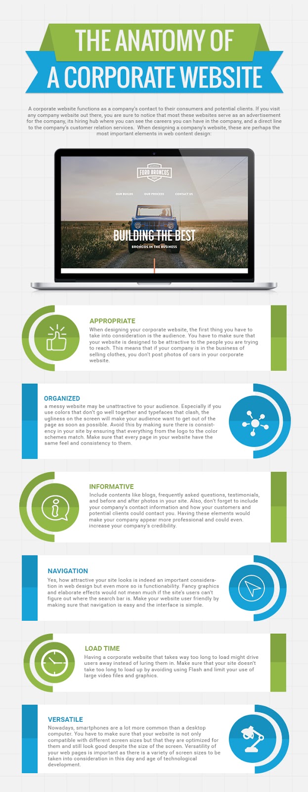
A corporate website functions as a company’s contact to their consumers and potential clients. If you visit any company website out there, you are sure to notice that most these websites serve as an advertisement for the company, its hiring hub where you can see the careers you can have in the company, and a direct line to the company’s customer relation services. When designing a company’s website, these are perhaps the most important elements in web content design:
Appropriate
When designing your corporate website, the first thing you have to take into consideration is the audience. You have to make sure that your website is designed to be attractive to the people you are trying to reach. This means that if your company is in the business of selling clothes, you don’t post photos of cars in your corporate website.
Organized
A messy website may be unattractive to your audience. Especially if you use colors that don’t go well together and typefaces that clash, the ugliness on the screen will make your audience want to get out of the page as soon as possible. Avoid this by making sure there is consistency in your site by ensuring that everything from the logo to the color schemes match. Make sure that every page in your website have the same feel and consistency to them.
Informative
Include contents like blogs, frequently asked questions, testimonials, and before and after photos in your site. Also, don’t forget to include your company’s contact information and how your customers and potential clients could contact you. Having these elements would make your company appear more professional and could even increase your company’s credibility.
Navigation
Yes, how attractive your site looks is indeed an important consideration in web design but even more so is functionability. Fancy graphics and elaborate effects would not mean much if the site’s users can’t figure out where the search bar is. Make your website user friendly by making sure that navigation is easy and the interface is simple.
Load Time
Having a corporate website that takes way too long to load might drive users away instead of luring them in. Make sure that your site doesn’t take too long to load up by avoiding using Flash and limit your use of large video files and graphics.
Versatile
Nowadays, smartphones are a lot more common than a desktop computer. You have to make sure that your website is not only compatible with different screen sizes but that they are optimized for them and still look good despite the size of the screen. Versatility of your web pages is important as there is a variety of screen sizes to be taken into consideration in this day and age of technological development.
Defining Website Layouts
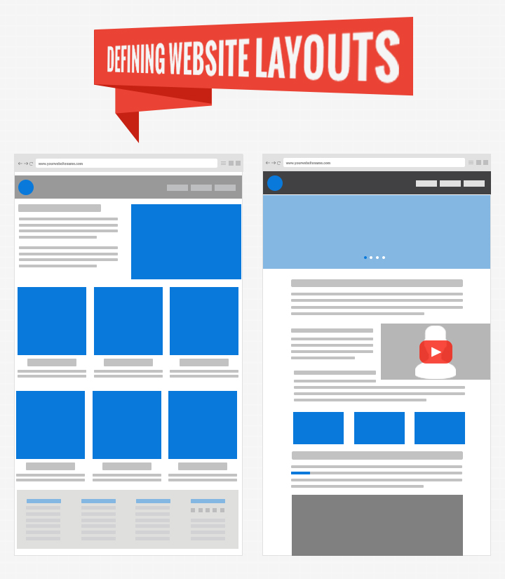
Designing a website is no easy job, especially at the beginning. You start off with a completely blank slate and have to fill it with photos, text, and contents about your company and your products and services offered.
An important element in designing a website is having a good user interface. This can be achieved by having a clean and easily understandable layout. A layout is defined in the dictionary as the way thing or contents are arranged. Mozilla Developer Network, a web developing company, identifies the following as the most common parts of a website layout:
- A header is visible in all the pages of your website. It includes your company’s name, logo, and a user-friendly navigation system.
- The main content takes up the biggest chunk of space in the current page. It contains the most relevant information.
- The side stuff, or basically, an alternative navigation system or links to other contents on the site that are not quite that related to the main content.
- The footer is located at the end of every page. It usually contains information such as contact information or legal notices.
Layout
Website layouts matter a lot when designing your site as the way you arrange the contents affect the attractiveness and neatness of your corporate website.
The one column layout is best used for small screens like smartphones and Internet-capable mobile phones.
The two column layout is best used in tablets and iPads as they are designed for medium-sized screens.
A three column website is only suitable for desktop computers or laptops with big screens.
There is no one way to correctly layout your site. Combining the three different types of layout is up to the creativity of the website designer and the owner. You just have to know your target audience, or better yet, arrange your website in such a way that it would look pleasing whether being viewed through the phone, tablet, or desktop computer.
Incorporating the Right Colors On Your Website
Most people might think that the more colorful a website is, the more attractive it is. Others also believe that less is more. But neither of these two ideas are solid rules that guarantee an attractive or neat website. Imagine a website with a bunch of different colors splashed around. Tacky, doesn’t it seem? Now think of a simple website with no contents but white and black. Not tacky, but perhaps a little boring? No one would want to stay in that site too long.
The thing is, though, is that the number of colors you choose in your website is not what matters, it is whether these colors complement each other beautifully.
1. Consider the Photo/ Image
Your website obviously have pictures in them. These colors can be used as inspiration for the color scheme of your corporate website. Whether the photo is a stock image, graphic, or an original photograph, you can coordinate the designs between them and your layout as your viewers would be able to recognize the color relation at a glance. This creates a strong connection for the viewer of you corporate website.
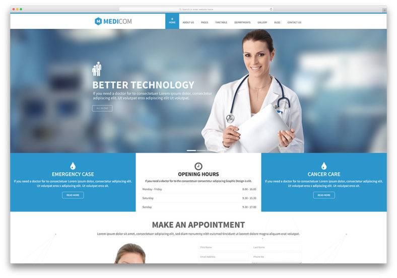
2. Start with a Clean Slate
Build your color palette from scratch if you wish for it to be entirely your own. While there is no rule set in stone about how many colors you should choose, know that the more colors you wish to include, the harder it is to make sure they complement and build a unified design. Most designers use the 60-30-10 rule where
the primary or main color is used in 60% of the page,
30% should be the secondary color which should be contrasting the main color, and
the 10% should complement either the primary or secondary colors.
You can choose to experiment with as many or as little colors as you want to. Stephanie Hamilton, who runs a web design studio, suggests that you start with 5 colors and you could subtract or add colors as you see fit.
3. Keep the Purpose of Your Corporate Website in Mind
One way of choosing the colors for your company’s website is to first identify the goals of your company and the purpose for setting the website up in the first place.
Many marketing experts utilise color psychology to invoke a desired emotion from their target market. If you check out the color schemes of most hotel websites, they usually adopt the color scheme of black, green, white, or blue. This is because these colors give the feeling of warmth, cleanliness, relaxation, and luxury. Other colors commonly used in marketing and their general meanings are:
Red
Red is a color often associated with boldness, passion, excitement, romance, and speed. It also stimulates the appetite and grabs attention. It is thus often used in fast food restaurants, game consoles, cars, and during sales.
Blue
Blue is a calm and collected color. It scores most highly among all others in terms of likability and is thus the most preferred color by both men and women. This might be the reason why blue is also associated with trustworthiness and dependability. Blue is often used in banks, insurance companies, and social media sites.
Purple
Purple is associated with wealth, royalty, and wisdom. It scores relatively high in likability among women and is often used in anti-aging products, beauty products, and chocolates.
Pink
Pink is a color generally associated with femininity and innocence. It is the most used color in products whose target market are women and young girls.
Black
Black is not as widely used as many colors because it is not intended for grabbing someone’s attention. The color black carries with it the feeling of exclusivity, elegance, timelessness, and classical. It is often used in expensive products and luxury vehicles.
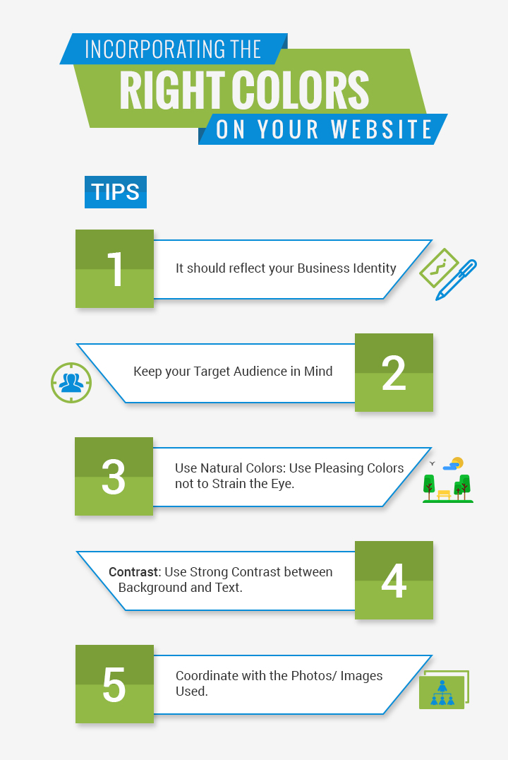
While these three methods are easier ways of picking colors for your website, don’t forget to still keep these tips in mind to make sure that you don’t sacrifice functionality in favor of attractiveness:
1. Use natural colors
Be careful not to use extremely bright colors as these could hurt the eyes of your audience and make them want to leave your page as soon as they can. Find pleasing colors that don’t strain the eyes for your color scheme.
2. Make sure that there is a strong contrast between the background and text
While the best would be having black text on a white background, don’t be afraid to experiment and find attractive combinations. Just make sure that there is a contrast to increase visibility and make reading the text easier for your audience.
3. Take your target market into account
A pastel pink website for a motorcycle company doesn’t make much sense. Neither would a black site advertising bouncy houses for children. Make sure to match the colors you pick for your website with the people you are trying to reach.
Backgrounds
The backgrounds of your company website directly influence the aesthetics of your corporate site as well as the readability of the texts on your site. No matter how great your layout and contents are, a poorly designed background could ruin the appearance of your corporate website.

There are many kinds of backgrounds you should consider when designing your corporate site. It is important to be acquainted with the basic terms and their definitions when designing your site as to avoid any miscommunication during the process. Here are the basic terms you should familiarize yourself with before you begin:
The Body Background – the body background is the “distant background” of your website. This is often an image, illustration, video, GIF, or even a solid color.
The Content Background – the content background is the background of the text, images, or other graphics that are in your website.
The Header or Wrap Around Background – a header or wrap around background is the background of the contents on the sides of the screen. These are contents that are not quite as emphasized as the main content.
As mentioned, choosing a background for your website is a critical decision that could greatly affect your site’s overall appearance. Designing the background of your site is no easy process, but these tips might come in handy in giving you ideas on what you could do with your site’s background:
Sketch
Many corporate websites have abandoned the formal look and decided to give their website a childlike, fun feel to it. Using hand drawn icons and illustrations is predicted to be one of the coming trends for the year. However, use this kind of design with caution. If your company offers serious services or luxurious products, this kind of background could drive away potential customers and clients.
Tiles
Used with the right image with the right arrangement, using a tiled image for a background might give you a great effect. However, done wrong, using tiles for a background will give your site a tacky or poorly-done feel. If you really want to use tiles for a background image, patterns and abstract images that connect are advisable. A full picture is definitely discouraged.
Full Screen Photos
If you decide to use a full photo for a background, make sure that it is a high resolution photo. Using low resolution photographs might make your background appear noisy and blurry, especially in high resolution screens. It is recommended to choose a photo with a resolution of at least 1024×768. Remember the rule of the thumb for choosing photos for backgrounds: the larger the resolution, the better.
Use Layers
If you’re having a difficult time picking out a color for your content that wouldn’t clash with the background photo you chose, you should consider making use of layers. Having a semi-transparent content background would add aesthetic value to your website as well as make choosing text colors an easier task.
Slideshow
Are you having trouble picking just one photo to use as a background? Not a problem. If you want to use a lot of different photos for background, then simply use a slideshow. Slideshows don’t necessarily have to be the kind that changes automatically. Some websites modify the slideshow method by changing the background photo every time the user scrolls down.
Gradient
Most designers don’t like using a gradient as they claim that it has become so widely overused. However, a gradient is the simplest and easiest way to add a touch of beauty in your corporate website. Although many designers scoff at it, gradience has long been used and it doesn’t seem to be going anywhere. If used right, it could be pulled off and produce a subtle touch of elegance to a website.
Two Tone
Two tone is a bold version of gradient. Instead of slowly fading one color to the next, two tone puts two contrasting colors together. This should, of course, be used with caution as some colors end up straining the eyes of the viewers.
Video Background
A video background with subtle movements would no doubt add some wow factor to your website. Sometimes, this might even have induce a craving for your products. Take a look at Pepsi’s website and tell me it doesn’t make you crave for a cold glass of drink right now.
However impressive a video background is, it must still be used properly. A video background would make increase loading time. For those with weak Internet connections, the site might not load or the video might lag or appear pixelated.
Solid Color
Do not underestimate the power of solid colors. A solid color design is safe than other designs, although not quite as awe-inspiring. However, if accented right, a solid color background could add just the right touch to a website.
If you plan on using a solid color background, you could never go wrong with white. Should you prefer a darker color, however, take note of the text color and spacing. Make sure not to sacrifice readability for aesthetics.
Choosing the Typeface for Your Website
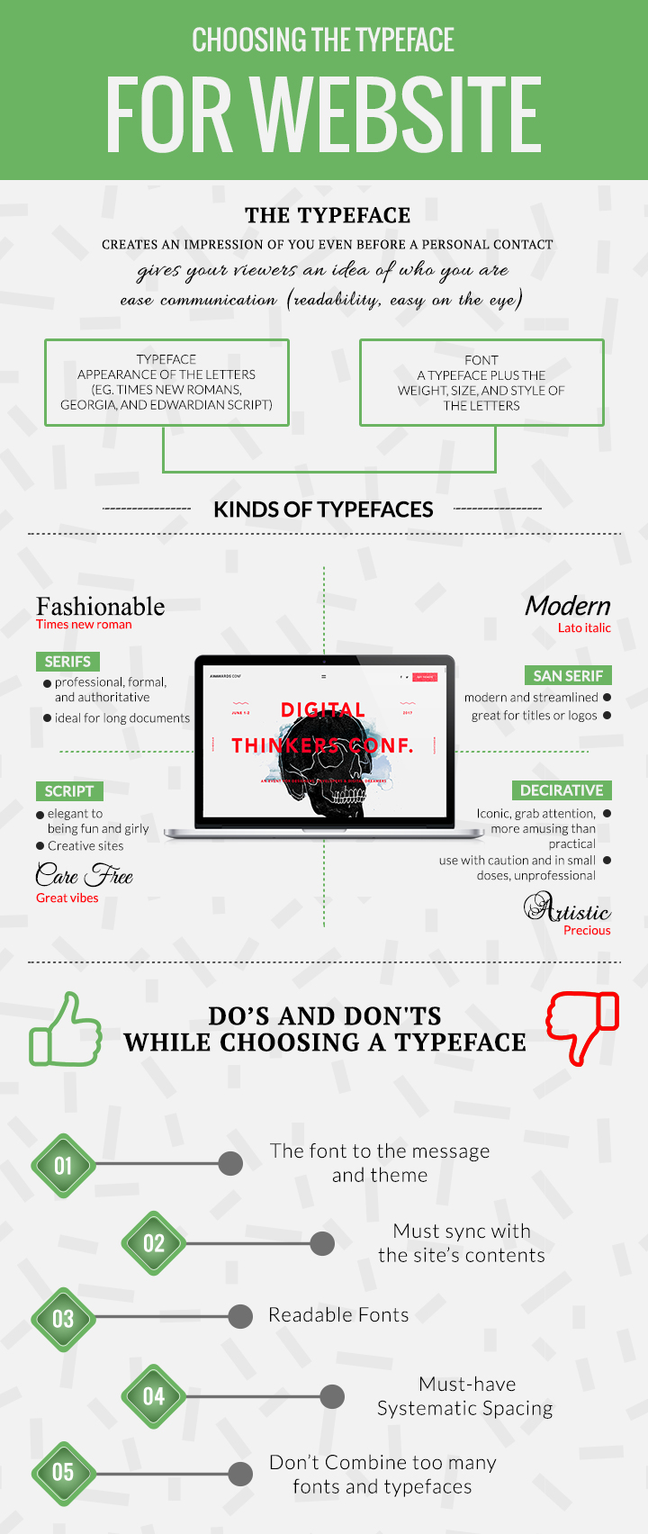
Many reputed designers like Erik Spiekermann and Jessica Hische have likened choosing a typeface to choosing your outfit. It gives people an impression of you before they even have any sort of personal contact with you. Similarly, choosing a typeface for your company website gives your viewers an idea of the kind of business you are in before they even read through your contents.
The Difference Between a Typeface and a Font
Although the two terms are often used interchangeably, in the world of graphic design, this is a huge no. It is important to be able to make the distinction between the two, especially as you work on the design of your website:
- A Typeface is the appearance of the letters. Times New Romans, Georgia, and Edwardian Script are all examples of typefaces.
- A Font, on the other hand, is a typeface plus the weight, size, and style of the letters. In short, a font is the entire package.
Kinds of Typefaces
There are a lot of typefaces online, and majority of those are classified by a general classification. It is important to be able to identify the different kinds of typefaces to ease communication in the designing process of your website.
Serifs
Serif typefaces are those whose letters have little “feet” in them. These typefaces are theorized to be ideal for long documents as they are more visually appealing and help the readers navigate through letters better. They also appear more professional, formal, and authoritative than most other fonts.
Sans Serif
Sans serif literally means without serif or without feet. Sans serif typefaces are not too great for lengthy contents. Because they are thin and small, they also do not look all too well in websites as they tend to appear pixilated, but are pretty great for titles or logos. They also appear more modern and streamlined than other types of typefaces.
Script
Script typefaces are what is known as cursive. Script typefaces have letters that are connected to each other. Typefaces like these can range from appearing elegant to being fun and girly.
Decorative
Decorative typefaces are the iconic kinds that seek to grab attention. They pop out and are more amusing than practical. When using decorative typefaces, use with caution and in small doses as they might cause your website to appear unprofessional and annoying.
Why Does Typeface Choice Matter
As stated earlier, your typography design can speak loud volumes about your company and brand. The typeface you choose and the arrangement of your words can lead to the “at first glance” first impression, and you want this first impression to be great. Choosing the wrong typeface can give the viewers of your website the wrong impression of your brand, which means that the message you are trying to send has a high probability of not being received or conveyed properly. Make sure to avoid this mistake by being very careful about your choice in typography.
Choosing the Font for Your Website’s Contents
How you say something is just as important as what you are saying. Just like how no one would believe you when you say your are happy through gritted teeth and and a grouchy snarl, it is difficult to trust a website whose design does not reflect its message.
So, when choosing the font for your website, remember the following:
1. Match it with the message
When choosing the typography of your website, make sure that the font matches the message of your website and its theme. Consider how a website with a serious theme would look with a ditzy script typeface. The contrast would make your website’s viewers question the intention and believability of your website, thus, negatively affecting your company’s credibility.
2. Consider the contents and the viewers
Your website would be rendered useless if no one visits it. Thus, it is of utmost importance to consider the audience of your site and how comfortable they are with your layout.
Furthermore, the typeface and font you choose must also be in-sync with the site’s contents. For example, if your site includes blogs or has a lot of words, it might be advisable to utilise serif contents to improve readability. A site targeted toward young children might benefit from using less serious typefaces and relatively larger and more colorful fonts.
3. Take note of the font’s readability
Sizing and spacing play huge roles in choosing fonts. Too small a size and space might appear too cramp and irritate your site’s readers while too large a font and space leave your site looking either empty or amateurly done.
When choosing a font size, it is important to consider where the site will be viewed. The size of the font must be in context to the contents and its message. Titles should be sized larger than the text. Test the size of a typeface by opening up a word processing software, typing a few lines, and decreasing the size. If you are still able to make out the words at a tinier size, then it is still most possibly legible even in smaller screens.
Generally, big spacing improves readability but be sure not to overdo it. Huge spaces leave a lot of negative space in your site which viewers might see as distracting. Also, it is not very attractive to see small text with too big a space between them. Space appropriately.
4. Choose Typefaces that Match
When combining fonts and typefaces, make sure that what you chose match with each other. It would look hideously unattractive in your website if the typefaces you pick clash. Picking two different fonts that are just right for each other is like finding two people in the world that are perfect for each other – it involves a lot of trial and errors.
25 Famous Typefaces and the Companies Behind Them
ITC Serif Gothic and Serif Gothic are typefaces designed by Herb Lubalin and Tony Di Spigna in 1972. These are the fonts used by George Lucas’ Star Wars movies and is perhaps the reason you could recognize the font in a second.
The Coca Cola font is actually based on a real handwriting. This type of script, the Spencerian Script, was developed by Platt Rogers Spencer in the second half of the nineteenth century. It was first taught in business schools and was used when writing business correspondence, but eventually found its way to primary schools.
The Lufthansa typeface is sans serif typeface designed by Max Miedinger and Edouard Hoffman called Helvetica. Aside from Lufthansa, Helvetica is also used in the Crate and Barrel logo, the American Apparel logo, and the New York subway system signages. A type of Helvetica called Helvetica Neue is used by Apple.
The Gone Girl font may seem familiar to you if you’re a movie buff. The typeface is widely used in Hollywood movie posters and movie titles and TV shows like American Beauty, Gravity, Lost, and Sesame Street. The typeface, called Futura, was designed by Paul Renner in 1927.
Well-known and well-used, the Garamond typeface used in the Abercrombie & Fitch logo is one of the oldest typefaces that stood the test of time. It was designed by Claude Garamont during the revolutionary era of France. It is still widely used today especially in French publishing.
Designed by Giambattista Bodoni in Italy, Bodoni was a typeface used mostly by dukes and Italy’s noble families. This serif font is now prominently used in both the private and public setting. It is most known for its use in the Mamma Mia! posters and in Vogue Magazine’s logo.
In recent years, many Eastern European nations have begun to become the top tourist destination. Amsterdam, a city in the Netherlands, in an attempt to lure in tourists, developed the I amsterdam slogan as their newest marketing strategy. It utilises the geometric sans serif font Avenir that was created by Adrian Frutiger. Aside from being Amsterdam’s new official typeface, it is also a highly recommended typeface for formal documents and is the typeface used in Apple’s Maps app.
There is perhaps no typeface better known than the serif Times New Roman. A font with a reputation for being one of the least resistance, the Times New Roman requires no more introduction. It is most used in schools, publications, and newspapers.
Georgia is a serif typeface designed by Matthew Carter for the Microsoft Corporation. It was intended to appear elegant but legible even in small point font sizes. Although it does not bear the same weight as Times New Roman, Garamond, or Avenir, Georgia is one of the top typefaces recommended for formal situations or elegant logos.
Unlike the other typefaces in this list, Comic Sans is more infamous than it is famous. It is a sans-serif typeface designed by Vincent Connare for casual situations and for children. However, the typeface became so widely used, even in serious and inappropriate situations. A ban on the typeface has been called many times and a movement against it was started by two American designers. The typeface, once a favorite among many, has now been reduced to being an Internet joke.
5 Websites To Download The Best Typefaces
Word processing softwares and computer operating systems only come with so many kinds of typefaces and styles. Eventually, we need a certain typeface to fit the message we’re trying to convey. Here are 10 websites you should definitely check out if you ever find yourself short on typefaces.
1. Urban Fonts
Urban Fonts is an easy to access to website offering free typefaces. The files are arranged according to style so it would be easier for you to search around the site for the kind of font you are looking for. Plus, it’s a great place to find new fonts as designers regularly upload their works here.
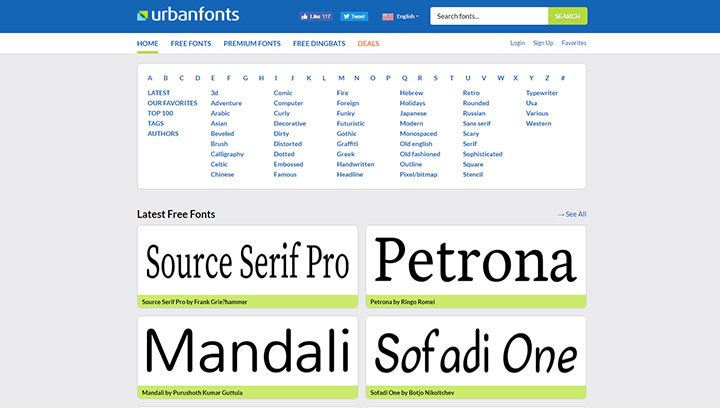
2. Font Squirrel
What’s great about Font Squirrel is that aside from the attractive layout of their website, it is so well-organized that finding the typeface you need wouldn’t be a problem. You could filter what you see according to many different and very specific categories and tags as well as the kind of license you need to use the typefaces.
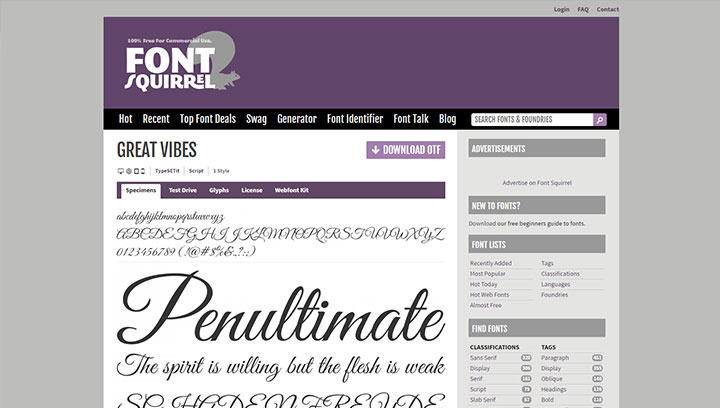
3. 1001 Free Fonts
Personally, 1001 Free Fonts is my favorite. Upon entering the website, you will be greeted with the featured fonts of the day. They have an easy navigation system which allows you to filter the typefaces you wish to see according to their rather extensive classification system. Furthermore, the preview is large enough for you to be able to notice it at a glance yet small enough for it to be able to display enough fonts per page.
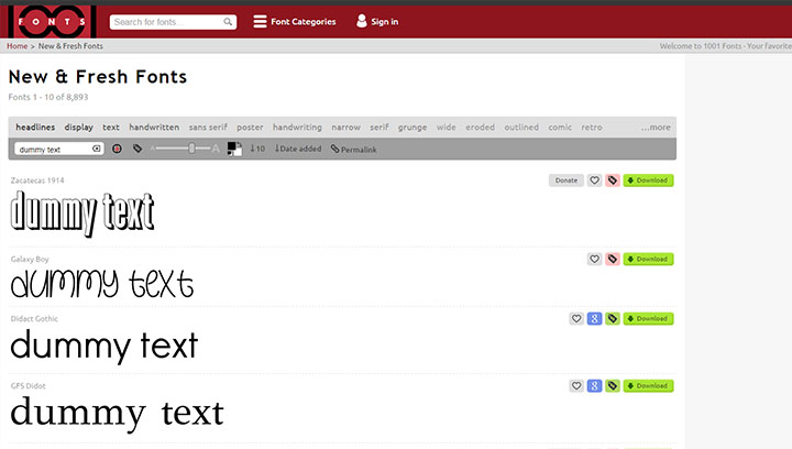
4. Font Cab
Scanning through pages upon pages of different typefaces could easily steal a couple of hours of your time. Font Cab’s simple web layout and easy navigation system helps you find what you need in an instant. It also has thousands of typefaces available and even allows you to search for the typefaces by name.
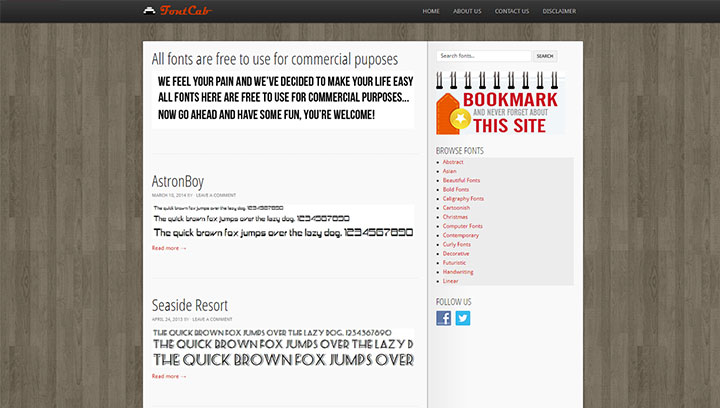
5. DaFont
Also a personal favourite, DaFont has the same text preview as 1001 Free Fonts. They, too, feature large enough and small enough textbox previews to be able to notice the typefaces at a glance and, at the same time, contain enough in a page for quick page turnover. They have an extensive collection of typefaces all classified into a number of various, very specific categories.
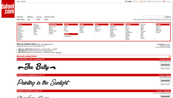
Trending Design Elements of 2017
A year filled with the passing of many beloved celebrities and renowned personalities all the way til the last few days of the calendar, it is with a sigh of relief that that we bid 2016 adieu. And as we finish reminiscing the highlights of the year, it is time to move on and look forward to what 2017 has in store for us. This next section is dedicated to the top designs and predicted trends this 2017.
Loud and Proud
In the year 2016, we fell to our knees for muted and neutral colors. However, this 2017, we will shift from blacks, whites, and greys and use bolder and louder colors.
Creative Typography
Simplicity may have been beauty, but it’s can’t be denied that creativity attracts. With the rise in the interest in pen and brush calligraphy also comes the appreciation for creative typography. This year, it will not be enough to have the right message. Your delivery of the message will play as much a role as the message itself.
The Right Typeface
With disdain for Comic Sans growing, the typefaces that came free with your software probably would not be enough this 2017. You might want to invest in typeface bundles or check out free typeface downloads. Just make sure you review the copyright license before using typefaces for commercial purposes.
Authentic Photos
Consumers now appreciate having your own photos and graphics uploaded instead of those taken from the website. Instead of stock photos that look generic, it is more impressive for the consumers to see photos that would reflect the personality of your brand.
Hand Drawn Graphics and Icons
This year, expect a shifting preference from formal icons to the more casual and hand drawn kinds. Cute graphics and infographics will surely be a hit this year as they provide a fun way to get information at the same time add some sort of life into your website.
Duotones
Duotones is the use of two different, usually bright and contrasting, colors in a single image. While it requires exceptional skill to be able to pull this off, the finished product is sure to look attractive and attention-grabbing.
Top Corporate Websites and Why They’re On Top
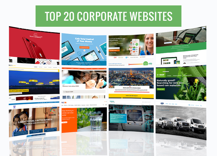
Corporate website designs do not take into account the bells and whistles kind of thing that make up a fancy website. In fact, for the untrained eye, there’s nothing elegant about some of the best corporate websites featured here. In judging business websites, the criteria is different, based partly on the website’s accessibility as well as its functionality. The majority of the websites selected here have their concentration on demonstrating a unique approach that’s very effective in converting visitors into buying customers. It’s called converting a target prospect through intelligent branding. Of course, such things as being readable in all devices plus being able to load fast is also considered.
Here are 20 of the best websites and why they were chosen:
Apple
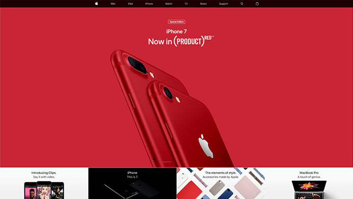
As one of biggest tech giants around, it is no wonder that Apple would top this list. Apple’s website embodies the same layout that made their MacBooks, iMacs, iPhones, and iPads some of the most beloved and demanded gadgets today. Like their products, Apple’s website is clean, sophisticated, and user-friendly. The navigation bar at the top of the screen includes tabs to make site navigation easier. The main content of the homepage is a slideshow displaying Apple’s newest products. Clicking on the tabs on the navigation bar will lead you to the different pages of the site, all of which are as clean and organized as the homepage. Apple definitely did a great job with their corporate website, no question about it.
YNAB
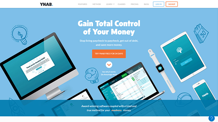
You Need a Budget (YNAB) designed their website both to be innovative and functional at the same time. Their slogan “Give Every Dollar a Job” is both effective and very popular with its users. The site is laden with easy to navigate buttons and are filled with information that you can actually use and thought-provoking enough to make users think of ways to save their money especially when on a budget. The features are very convenient for users and the site is actually very helpful for learning how to use their tools even for first-time users. The categories are placed where the list is relevant for those who really need their services. Overall, it’s one of the top websites in terms of clarity, solution and functionality.
Quizzle
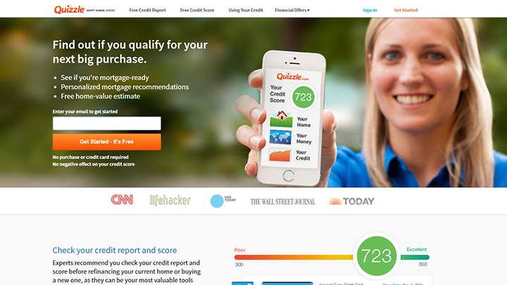
The personal finance and software site Quizzle is next on the list. This is partly due to its functional simplicity on its website. The helpful, easy-to-use design for personal finance handling is aimed to help users repair their credit and report problems. The catch-on phrase “Get Started – It’s Free” entices users with its slogan with a promise for service in return for getting their services. This is what most sites and customer satisfaction ratings look for in a website. They need a site that makes an effort in letting users know they’ve come to the right place. The overall design is straightforward but users know what they want, not some fancy website, and Quizzle has accomplished this even with a simple website design.
FarmLogs
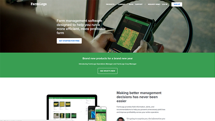
FarmLogs is a crucial website for farmers who are dependent on agriculture for a living. The site’s premise offers valuable information for farmers on such factors as tracking rainfall for specific areas, monitoring local grain prices and market watch on all farm products. The website informs users all these in a single page with a proposition of making farming more efficient. Plus it goes with a guarantee that it will not make decisions that don’t benefit farmers. What more can the user ask for? As discussed earlier, one of the most important aspects of enticing customers to your site is through presenting a solution to a need, and FarmLogs effectively addresses that on their website. As with all top sites, there’s nothing fancy about their website either. It’s the functionality that matters and the easy navigational buttons coupled with a very visible space for signing up to their site that’s very important to users.
Eni
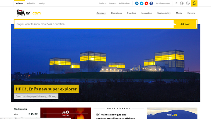
Italian oil and gas energy giant Ente Nazionale Idrocarburi or ENI for short, has one of the most elegant corporate websites with its balanced color design and beautiful layout. Yet underneath these features is a fully-functional, no-nonsense website that caters to anybody either seeking information or just plain interested in what the website offers. The layout shows you immediately what you’re looking for and its goals are outlined on its main page just underneath the headlines that are changed from time to time. The site keeps visitors up to date with its activities, balancing both attraction and information at the same time.
GSK
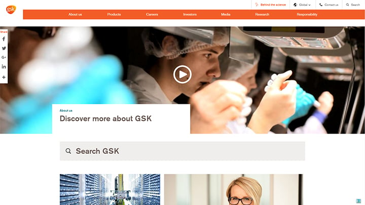
British pharmaceutical giant GlaxoSmithKline’s corporate website reflects its status as a world leader in the pharmaceutical industry. Its tagline underneath the “About Us” section reads, “We want to help people do more, feel better, live longer”. That message alone already affirms a company’s commitment that makes a big impact on users, customers, and even site visitors. The homepage is simple but the news and press releases offer very important information. Overall, the site is quite sophisticated with a feel that the company really means business. The tabs make navigation easy and the overall, the site is very well organised with all the relevant information on the homepage.
Shell
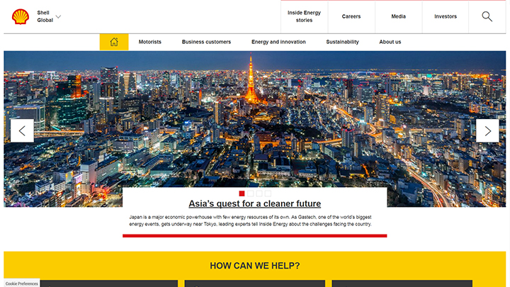
The first thing you notice about Dutch energy giant Shell company’s website besides its iconic giant yellow clam shell on its website, is its call to action tagline that reads, “How Can We Help?”. It’s a very effective tagline that every visitor would appreciate when browsing through their website. The website’s layout is such that you’re immediately shown what you need to look for through the tabs that are presented. There are no fancy stuff on the website except for graphics that show relevant content related to energy projects, innovation and community projects. Overall, it’s one the best websites in terms of content and practical design. Their committal to environment and sustainability projects are a big factor that most companies should emulate. This creates a positive impact on their reputation as an energy company who takes care of the environment.
BASF
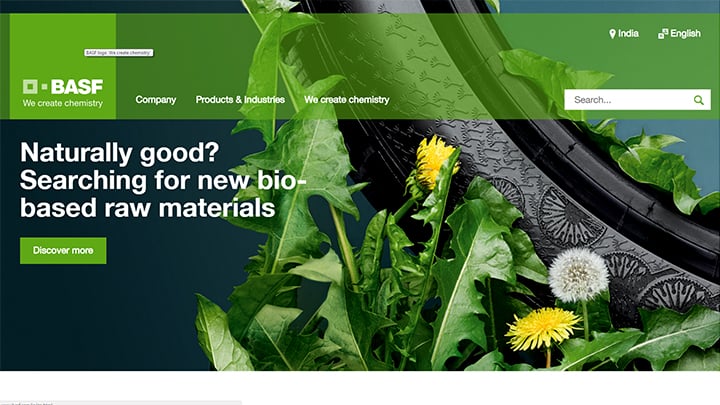
German chemical company BASF’s website has been ranked as one of the top websites by Bowen Craggs & Co. in their website indexing results based on how well the sites serve its customers and visitors. Besides its position as a world leader in chemical products that has a wide range of uses in pharmaceutical, construction, textile and automotive uses, BASF’s determinant aspect is its commitment to environmental causes that shows in their website’s content. Of course, it helps that BASF has been consistently praised by the Climate Leadership index for their excellent efforts in climate change and reducing greenhouse gases. As seen on their news site, it has set a large portion of their Research and Development on environmental conservation, something most site visitors agree would give a positive impact to the site aside from its excellent overall layout.
BAYER AG
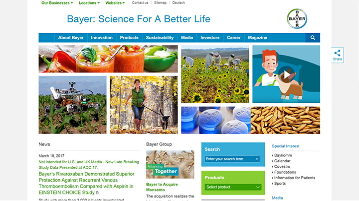
The first thing you notice when you open German pharmaceutical company Bayer’s website is the tagline that says “ Science For A Better Life”. That’s a very direct, business-like, no-nonsense approach to health. It conveys a positive message both to casual site visitors and customers that the company is committed to the improvement of health for everyone. Besides the positive impact its tagline conveys, Bayer’s website immediately shows you you’re in the right place. Besides visual content and well thought of content messages, the news section offers a glimpse of all the efforts the company has been exerting to improve the lives of millions of people through its biochemical research and advances in medicine technology. Not only do the photos in the website show visual clarity, they can be clicked for news depending on photos that you choose. Overall, the website conveys to its viewers that the company is very well committed to the improvement of people’s lives.
Maersk
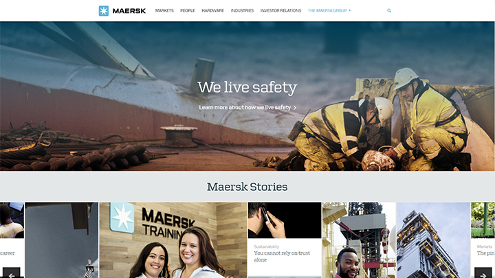
While it can’t be denied container shipping and logistics company Maersk’s website is visually stunning, its tagline “Charting a new direction” is also an effective message to its clients and visitors to the site. It sends a message of commitment that assures of trust and dedication that is emphasized by its core values placed strategically on its homepage. Besides the usual layout of news and graphics, one prominent feature serves a huge interest for site visitors aside from customer relations on its page: the careers section. It’s a very tempting invitation for people who are looking to be employed. This serves a balance between commitment and offering opportunities for those looking to become part of the largest container shipping company in the world. Overall the website is both visually excellent and informative, well balanced and organized.
Siemens
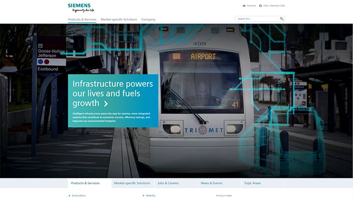
German technology giant Siemens has one of the most visually-stunning websites ever created for a corporate website. Their tagline “Ingenuity for life” shows their engineering and technological capability. This signifies a very able company that conveys a strong message of stability and trustworthiness. Its product index is complete from A to Z, something most companies can never brag about. Their product index that covers all letters in the alphabet signifies its wide array of complete products in both science, technology and engineering. Its stunning layout design provides an excellent visual attraction as well as an information-laden flip-page design that leads to navigation bars that give comprehensive information to its clients and viewers. Overall, it’s an excellent web design for both creativity and communication.
L’Oreal
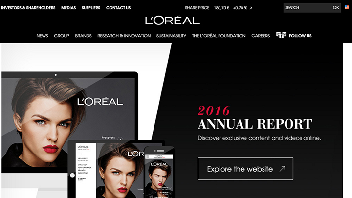
Paris-based cosmetics company L’Oreal website is attractive for a lot of reasons besides makeup and Hollywood stars that grace its homepage: It’s filled with relevant information that directs visitors to its tons of activities besides product offerings. The message L’Oreal wants to convey is relayed both through visual and text contexts and first-time visitors already feel welcome and know they’re in the right place. While the website is filled to the brim, there is never any feeling of clutter since the layout is beautifully organized and the navigation bars are very user-friendly. Overall, the website construction is both attractive and coherent.
Unilever
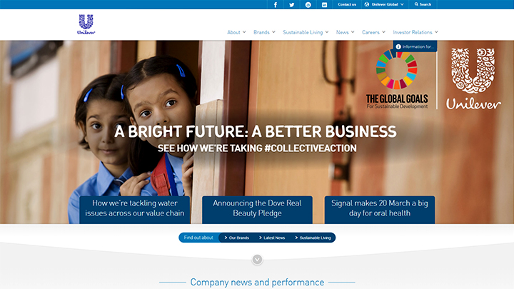
Dutch- British transnational consumer goods company Unilever’s bold tagline “ A BRIGHT FUTURE: A BETTER BUSINESS” and a call to action underneath it that reads “SEE HOW WE’RE TAKING #COLLECTIVEACTION” is one of the most impressive lines that is very effective for visitors to click on the site. Unilever’s equally impressive graphics design is both bold and stunning with several content messages that deliver news and features that emphasize the company’s goals of sustainable development, helping people improve their health and well-being. With these features on their site, Unilever is able to deliver its message to different groups not just to their consumers. The navigation around the site is both easy and informative. Overall, Unilever’s site is a balance of well-placed informative features, great visuals and a clean, sophisticated user-friendly page.
ING
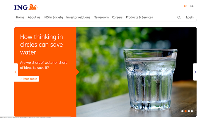
Dutch multinational banking and financial services company ING’s website is relatively minimalist by design but very functional. All the bars are evenly placed and navigation is effortless. There is no clutter and the designs all serve a function. The news is presented in an infographic descriptive layout, keeping viewers both interested and informed at the same time. With its easy organization, minimalist design and clean layout, ING’s website manages to be simple and informative at the same time. There are no sexy graphics in the web design but communication is relayed through appropriate context.
Total
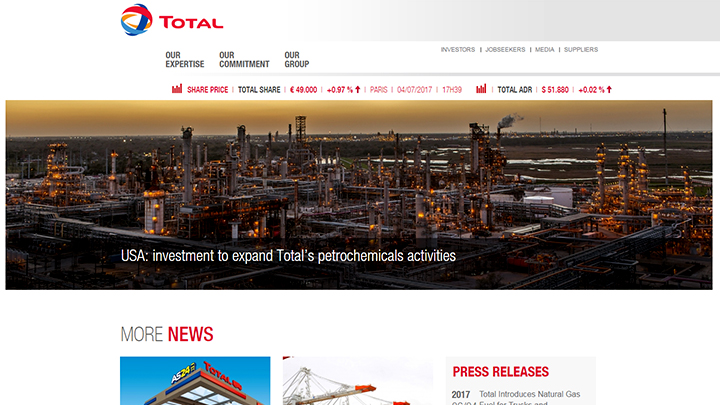
French oil and gas company Total’s website’s graphics is portrayed realistically with very little images portrayed outside the main aim of its business: oil and gases. It’s not what you would call a sexy website nor is it anything extraordinary. What makes this website rate high on the index list is its conventional and easy navigation, plus its firm commitment to social and environmental responsibility that is both dedicated and admirable.
SAP SE
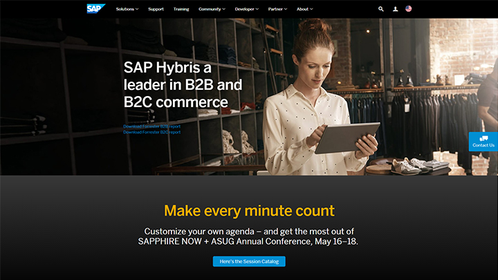
German multinational software corporation SAP’s website is admittedly not navigational friendly but it still rates among the top websites. This is largely due to its innovative design features that lend coherence over navigation in its design. The graphics and headings change from time to time, but these are relevant to the topics and news offered to update both clients and visitors to the site. The look and feel of the site are appropriate, and the site tackles important issues within the context of its business.
Ford
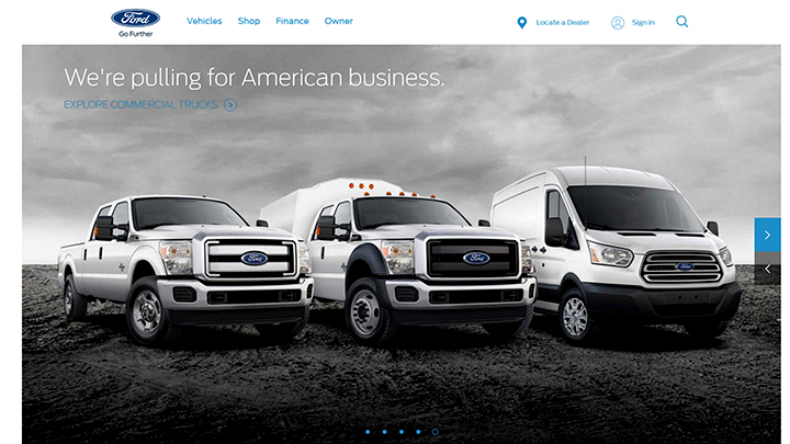
American automobile giant Ford company’s website is another one of those beautifully laid out sites that are quite pleasing to the eyes of car lovers. Navigation around the site is a bit tricky however although its sustainability report is quite exceptional. Being an established automobile company has its perks and oftentimes, customers and visitors to the site don’t exactly mind exploring around the site. Admittedly, auto websites often attract lots of viewers, either out of curiosity or by car enthusiasts. While it may be biased to think that Ford’s site is chosen among the top websites due to its new vehicle selection, the information bars still give it an edge over graphics and all of its vehicle designs.
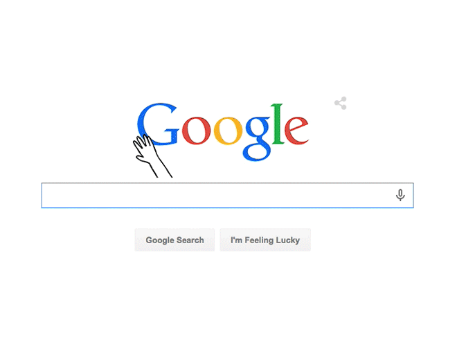
If there’s a website famous for its simplicity while attracting viewership by the thousands every hour, it has to be Google. Google’s website is the best example of a less visually complex website that actually works in attracting lots of viewers. It may be because Google presents a solution to a need, but then again, that’s the goal of every corporate website, to present a solution to a need and take it as an opportunity to translate it into sales. Its low complexity style with minimal colors and almost non-existent graphics plays well with its aim of optimizing communication in place of visually appealing graphics. The navigational buttons are very well laid out and very visible, even a toddler would know the buttons.
IBM
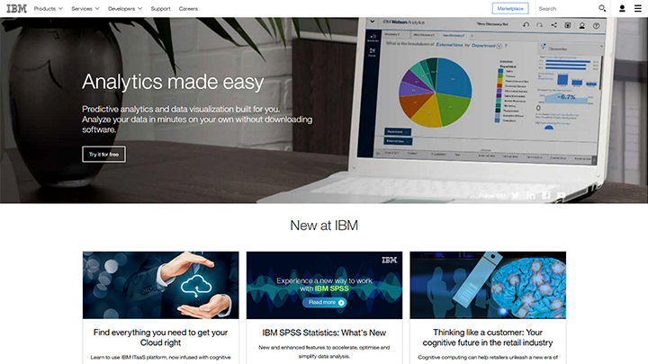
American technology company IBM’s website has been redesigned to focus more on services to its customers. From its products to opportunities for job seekers, the website design is pretty solid. The navigational bars are pretty big and are easily visible to those who browse around the site. The marketplace button is the first thing most visitors to the site would see, in line with its aim of selling content to clients. The layout is very intelligently crafted, with less on graphic design and more on functional composition. Overall, the IBM site is both informative and intelligent with less on superficial graphics and more on rational design.
Microsoft
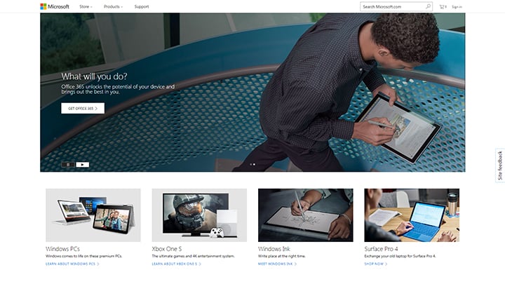
American technology company Microsoft’s website may seem a bit fragmented compared to other websites, but it delivers its message perfectly. Customers are easily guided on the kind of product they need with navigational buttons and new software offerings that present a video of how they work. This means it makes it easy for customers and site visitors to go exactly where they need to go without being lost amid the jumbles of graphics other sites are prone to do. Overall, the design is both clean and sophisticated and the website gives a feel of direct, businesslike approach. This gives a positive message to customers and visitors with the impression of the company’s commitment and dedication to their products. It also gives you a message of Microsoft’s trust and adherence to service.
10 Websites You Should Check Out for Inspiration
As with everything you meet in many aspects of your life as you go around, meeting a person, going to a place or exploring a website always gives you an impression on the first meeting. So it is with websites when visitors come to your site and look around. Sure, very beautiful graphics and sexy designs may attract viewers, but eventually, it comes down to content and how visitors can become potential buyers and most importantly, how your site can generate revenues for you.
Visual and message contents may go hand in hand but you should know what the visitors want. In looking around your site, your visitors should immediately know what they want and what your site has to offer. If you’re as clueless as your site, they won’t stick long and chances are, they’ll never come back. To avoid this, you must realize that ease of navigation, functionality, communication, value proposition and optimization must all work together on your website.
To give you an idea how all these elements are working together to create a functional and relevant website, here are ten of the best website examples to inspire your own:
Airbnb
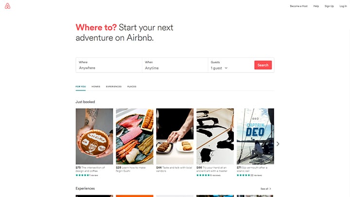
Airbnb’s homepage is a great enticement for those who want to experience its services. Graphics are meant to lure potential customers rather than just a display of attraction. Since Airbnb is a hospitality service, their video for first-time visitors delivers a positive impact of how availing of their services is the right choice. The video portrays humanity and authenticity that shows sincerity rather than aesthetics. The navigation bars are very visible, and the search button is a great enticement to visitors who want to experience their services. Overall, the call-to-action button is a great promotion and the website reflects Airbnb’s successful business venture.
Evernote
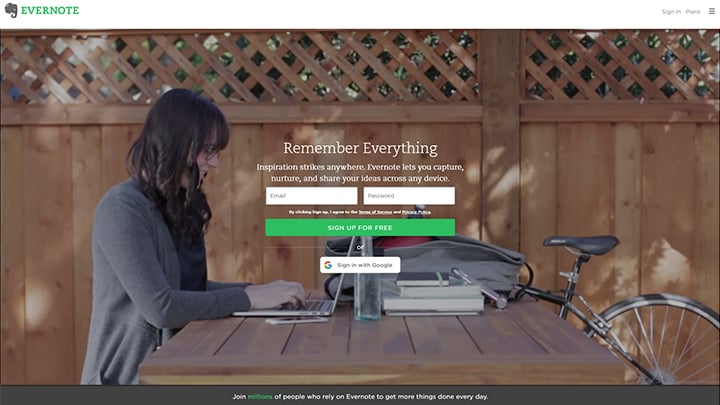
Note-taking app Evernote’s website effectively brings together in one homepage, all their packages that bring their message across to thousands of clients and potential customers. Their tagline “Remember Everything” and call-to-action line “Sign Up For Free” is a great come-on to first-time visitors who feel the need to give their services a try. Their video is meant to relay a message of practical solutions to everyday nuances that may be needed later. Their official color green is highlighted on their website’s call-to-action bar signifying peace of mind that all your notes are in one place. Overall, Evernote does an excellent job of offering solutions in one neat package.
Mint
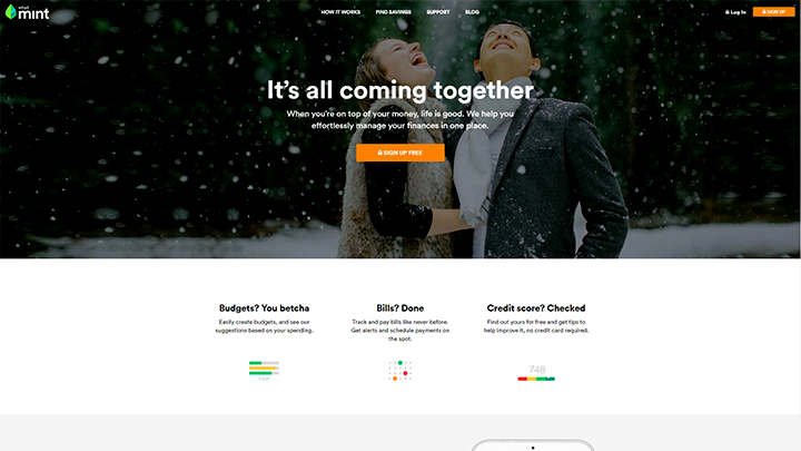
Personal financial management company Mint’s website has a strong tagline which proclaims, “That Horizon Might Be Closer Than You Think”. Their website is relatively simple and free from being plagued with aesthetic graphics or videos that other sites are filled with. It projects an image of clarity and balance, something the company highlights to improve their client’s financial standing. Their homepage emits a sense of security which is essential for a company that handles financial information. Their sub-headline reads, “We’ll help you get there by managing money and budgets better everyday”. That line is very effective for first-time visitors who have yet to decide on whether to avail of their services, but the message is clear: They mean business and they’re committed to help their clients.
TechValidate
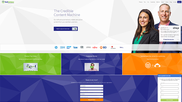
Software content provider TechValidate’s site makes use of simple colors with all the navigation buttons neatly arranged in a clean and user-friendly design. All the software content’s brands are laid out for clients to check out. It’s a novel way of categorizing different brands into one single website dedicated to content automation. The website’s white space and contrasting colors are designed to be minimalist so as not to interfere with their clients’ intentions. It portrays a no-nonsense, all-business approach to its customers that need a reliable partner whom they can trust. Overall, it’s a well-designed website that gets the company’s message across clearly and effectively.
Basecamp
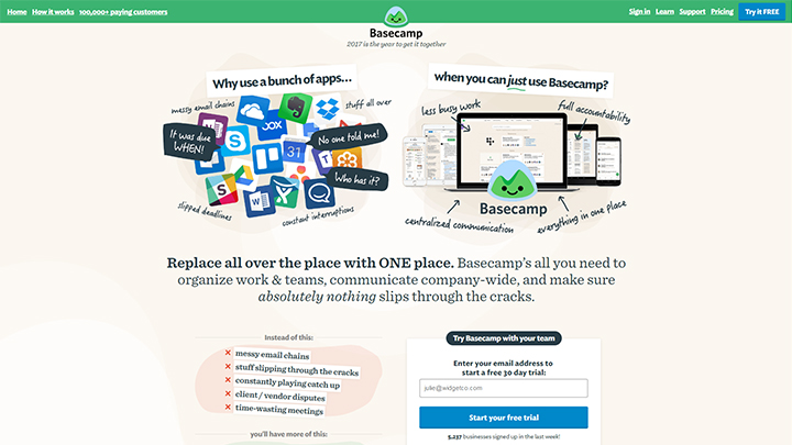
Project organizer site Basecamp website has always made catchy attractive graphics on their site, but not overdone to the point of being a distraction to their clients and visitors. The graphics are made in sketchy cartoons that serve as infographics that deliver a message of keeping things organized for their clients. The homepage is brilliantly laid out with minimal colors and an instructional video of how they keep things organized from files, meetings and schedules to emails and all PC files that need keeping without having to worry about additional space. They convey this skillfully and coherently in one outstanding website. This site manages to bunch together their message without fragmenting their homepage while still managing to look clean even with their cartoon-like sketchy graphics. The navigational bars are easy to find and use, and the headlines are clever and witty. Overall, Basecamp managed to pull off both visual and text contents into their homepage in a blog-like setup.
Dropbox
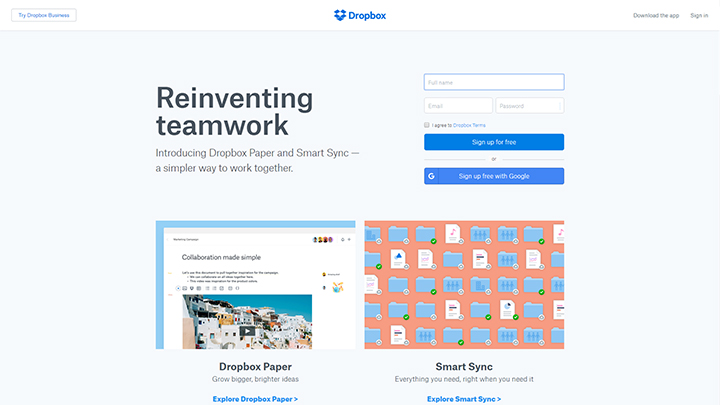
File hosting service Dropbox’s website has a catchy headline that reads, “Dropbox works the way you do”. This is quite an effective marketing campaign that reaches to its clients in a positive manner. It’s a come-on that requires no further persuasion. The graphics are simple and the call-to-action buttons are immediately visible and strategically placed for those who want to use their file hosting service for free. Like other effective websites, Dropbox has opted to use white space and minimalist designs to portray its business-like attitude. The Google-enabled sign-up feature has been made easier without the lengthy registration forms we so love to hate. Overall, Dropbox managed to pull off an example of simplicity while conveying a businesslike manner of professionalism and service with a powerful headline and sub-headline that exudes a trustworthy attitude.
Dropbox Business
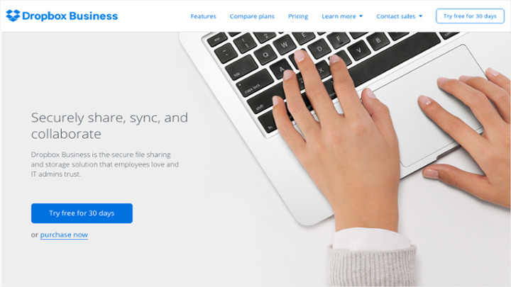
The Dropbox Business website sill retains the simplicity of its sister site Dropbox basic, retaining the white backdrop with a minimal blue color on their navigational buttons. The tagline “Securely share, sync, and collaborate” and their subheadline offers their clients a guarantee of a secure site. Ease of making contact and use of a virtual customer service representative makes for a dedicated site. This service delivers its message to its clients of its receptive service that answers any questions on time. Additional security features indicated further on their website offers solid commitment, a virtue worthy of emulation from other startup companies who need to get a clue and need an example of how dedicated sites are being set up. Overall, Dropbox business delivers its premise effectively on securing files with enough guarantees backed by professional service.
FreshBooks
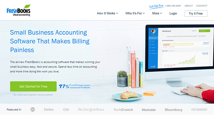
Accounting software website FreshBooks’ website has a novel design that has full of content. The site is extensively designed for clients who need to get complete details of what their services can offer. The alternating use of contrast and positioning and call to action, plus convincing informative pieces would make a foolhardy visitor become a client in no time. While the verdict is still open whether a long homepage would keep visitors to the site interested, FreshBooks nevertheless went ahead to deliver as much content as they could without sacrificing space on their homepage. The site’s message is clear: They want to convince clients why FreshBooks is the right choice. Their compelling headline and sub-headline deliver their message clearly. Overall, despite its long homepage, Freshbooks effectively delivers its message in a clear and coherent manner.
Telerik
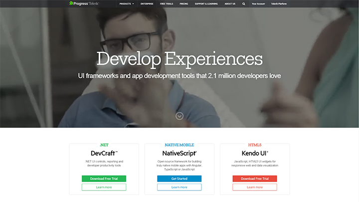
Software tools application developer Telerik’s website offers their technology products effectively in one site without the cramped feel of other websites. Their bold color designs are impressively laid out in a pattern that reminds you of Google’s design. There’s a fine balance of visual graphics and content without overdoing both features. The overview of their product offers is both bold and visible in color-coded navigational bars. It’s a clear way of communicating their products without sacrificing the design of their site and the information is both light and descriptive enough for their message to get through perfectly.
Boxbee
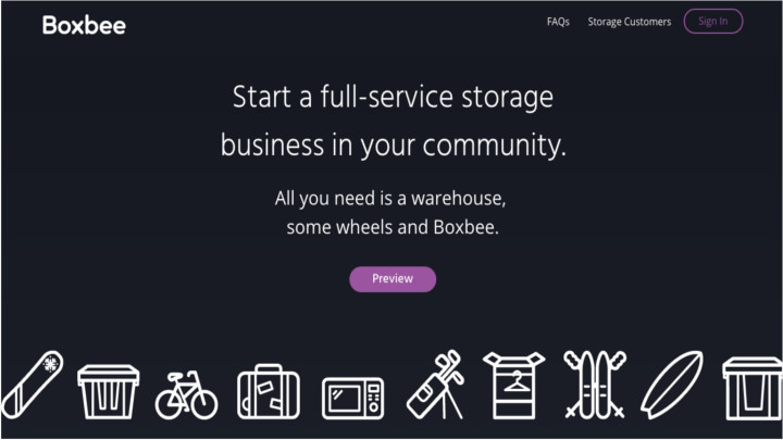
Storage logistics company Boxbee’s website is presented in simple white designs on a black background. This makes the site’s features both functional and simple, yet classy enough to look pleasant. The taglines and sub-headlines suggest a subtle call to action with a single preview button that’s very visible, since it’s the only different color in the midst of a two-tone background. It’s both a display of effective communications and visual graphics that’s both minimal and sophisticated. The website’s attraction is its simplicity and the headline says all that it needs to say sufficiently and convincingly.
Best Corporate Websites 2017
Every business can set up a website. However, not every corporate website can be considered exceptional. In fact, some corporate websites do not have a clear direction of where their sites are leading to. In order not to fall into these pitfalls that most websites have woefully become, it’s important that companies should have a clear view of their site’s presentation since their websites are a reflection of their business.
As frequently mentioned throughout most of the chapters in this article, an excellent corporate website must be able to convert a sizeable number of its visitors into customers. Having an excellent conversion rate will ensure the success of your site and is an important indicator of how your corporate website is able to serve its purpose. Besides conversion rate, of course, your corporate website should have a combination of great content, intuitive of customer’s needs, regular updates on blogs and news feeds, and most importantly, easy navigation.
So how do you make your corporate website one of the best among other online business sites? The following tips should help ensure your corporate website will be among the best performers and possibly one of the online top sites comparable to other excellent sites:
Optimize Your Site For Search Engines
This means your corporate website should pop up among the top sites when potential customers search for the item you’re offering. You can optimize your website through search engine optimization (SEO) by using relevant keywords that you repeat in your content for emphasis. If you’re offering a product like an antivirus software, you have to make sure that the content on your site will put in the relevant keywords several times when potential customers search for “antivirus software” on their search engines. The better optimized your website is, the higher your search engine ranking will become. You can try researching on your relevant keywords by using Google Adwords to learn further how to be ranked highly in search engines. Keep in mind, however, that most web pages are limited to a total of 350 words and placing keywords over the applicable limit will not only get you penalized by Google, it will also turn off potential customers who will see how poorly written your site’s content is.
Getting links to your site from other sources is also a good indicator that your site is a reliable source. It’s also a feather in your cap knowing other sites are linking to you. This is known as backlink and sites that link to you will help push your site up in the search rankings further. This shows how important keywords are to your website and the backlinks that you receive will ensure your site will be at the top of every search engines rankings.
Make Your Website Sell To Your Target Market
Remember that web visitors are always looking out for either good finds, bargains or products that they can actually use. In order to sell your product, it’s pertinent that you should reach out to potential clients and visitors and answer all their questions. Besides your FAQ page, encourage site visitors to contact you in an enticing call to action bar that should be very visible on your web page. A majority of corporate websites owe their success to customers who become loyal and devoted to their brands due to how these companies treated them in their queries about the products or services offered.
It’s one of the biggest open secret strategies that most companies have failed to exploit. Most visitors to your site are not just on the lookout for products or services they can use. They want further information from what you have to offer them. If you don’t give them the necessary information that they need, or if they are not satisfied with your customer service, they look somewhere else and will never go back to your site.
Since you know your own products or services better than anyone else, try putting yourself in your prospective customers’ shoes and think of every question you can possibly field about your products or services and strategize on the best ways to answer those queries. That way, you are well-prepared for any kinds of questions they will ask and you have a better chance of converting them into buying customers. When you finally reach out and interact with potential customers, you help put them at ease by answering all of their questions and satisfying their concerns about the product or service your offer.
That will help put trust in your brand and convert them into buying customers. They will then be your endorser as they spread the word to their friends and most of who they know to buy your product or service. Remember that a satisfied customer is equal to ten customers since they tend to recommend you to everyone they know.
Quality Content Make Good Sales
Another one of those often-neglected aspects of an excellent website is the availability of good copywriting that translates to quality content. A website that has lots of typographical error often raises suspicion from target customers who are not sure if the website is legitimate or can even offer quality products or services. One of the biggest problems facing customers and most online users is the issue of spam or phishing efforts. A website whose poor spelling is blatantly displayed on its page immediately raises suspicions. When this happens, a legitimate website would become practically worthless as soon as potential customers ignore it due to poor spelling on their content. A website who suffers from trust and credibility issues due to as simple as poor spelling could suffer disastrously in terms of lost sales and losing potential customers- all because of spelling issues.
Quality copywriting isn’t just about spelling however. If you decide to hire a copywriter instead of writing your contents yourself, make sure he is well-versed with your brand and products or services. The only way to bring in your target customers is to have a good copywriter who has a solid understanding of what your corporate website’s goals are. Only then will he be able to piece together a good content that will help lure in potential customers.
Always Put In Fresh Content
Not only do potential customers and site visitors like fresh content on a site, search engines also rank high those sites that are always kept updated with fresh content. The best way for customers and site visitors to become interested in your site is to update your blogs and news features that are related to or directly part of your products or services. Any company activity should also be featured to show a human side to your site. A company is not always business but has responsibilities to society too. Any newsworthy company initiative to give back to its community is always well appreciated by site visitors who see that the company is civic-oriented besides being engaged in business.
Communicating with customers through blogs and news updates make both customers and site visitors interested. While it’s advisable to write your blogs and news updates yourself, you can also outsource your blogs to a content writer who knows how to write exactly in ways that will keep customers and site visitors interested. This way your conversion rate will be excellent and visitors will be convinced enough into becoming paying customers.
With all those things in mind, let’s now take a look at the best corporate websites of 2017:
Apple
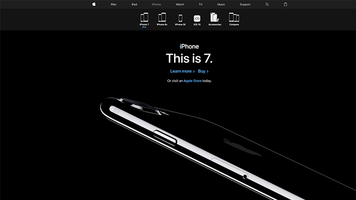
Apple has consistently been one of the top websites for several years running. This is largely due to the fact that Apple is one of the most successful businesses due to their products that have a universal worldwide appeal. More than its products, Apple’s creative corporate web design is both simple and sophisticated with a touch of class that’s hard to ignore even to casual visitors to its site.
Apple uses a runabout of photos on its main web page that attracts site visitors looking for gadgets that are not necessarily looking for Apple products. This is a good indicator when even visitors become interested in their site. The conversion rate into buying customers is greater the more they scan the site’s pages. Apple also uses videos on their product offerings to enhance the appeal of their products. Their homepage may be short but once the visitor clicks on any of the product offering buttons, they’re immediately taken to a tour of the items in a long-scroll design.
Hyper Island
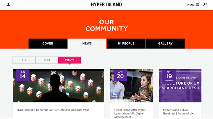
Creative business school and digital technology industry company Hyper Island’s web page design shows an uncomplicated balance of visuals and text. The page is both lively and inviting in a web design that’s an effective come-on to the site’s visitors. It’s one of the few sites which successfully combines large images and bold colors that manage to be pleasing to the eyes without being overdone. The call to action bar is large and immediately noticeable and the main page contains a sizeable amount of information that also contains the company’s story.
While being colorful, the fonts still manage to give off a professional feel and the branding is being consistently current and modern all throughout. The layout is both simple and colorful with a long-scrolling design that sways users towards its offerings and brand’s story.
Red Door
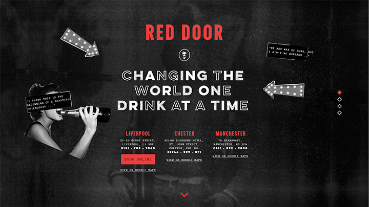
This English Bar based in Liverpool and Manchester offers a unique experience far different from any other bars with its unique cocktail drinks and a theatrical element to its setup. Not surprisingly, Red Door’s website is full of pleasant surprises that would make even the hardiest of visitors become curious of the site’s Narnia-like features. Remember that movie where the characters open a door to another world? Red Door’s website works on the same principle, with an almost classic 50’s Hollywood-style retro design coupled with minimal black and white, interspersed with red colors. Their website is a great come-on to both customers and visitors who are invited to the site’s virtual doors that give a sneak peek of what the bar inside is like before they decide to go. This works as both innovative and an effective advertisement to the establishment.
The website successfully combines an aura of mystery and excitement that provokes the curiosity of first-time visitors. That coupled with flash animation, motion graphics and retro images ensure the site’s appeal as well as its ingenious features make Red Door’s website one of the most visually-appealing and best corporate websites of 2017.
Nike
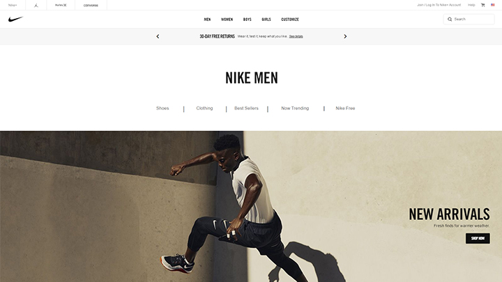
Nike has come a long way from being just a sports and fitness outfit retailer to a fashion brand recognized the world over. Its website not only conveys the message of sports and fitness, it’s also very functional and divided into several categories for clothing and footwear. Each category has its own section that is different from Nike’s other e-commerce site. This way, customers are able to get the chance to fully decide before buying an item.
Pret A Manger
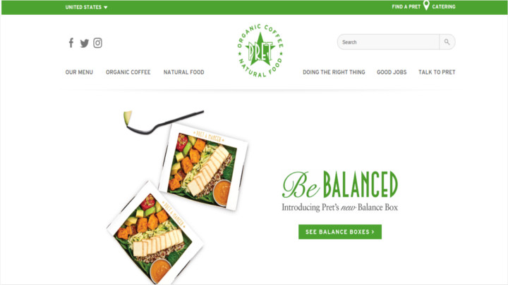
Pret A Manger’s success is found not only in their drive to give customers whole natural organic foods, but their website reflects their drive and enthusiasm as well. It has a responsive corporate website design with interactive menu. The website is both appealing and useful with features such as flicking through the menu. The colors are pleasant and the layout is generally attractive and inviting.
CH Haussmann & Co
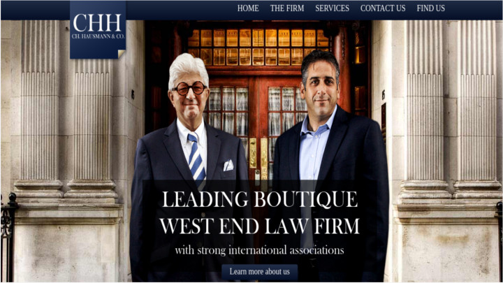
Looking at their corporate website, it’s easy to see why they’re one of the best sites not just for 2017, but in the succeeding years ahead. Besides an impressive resume, their prestigious website exudes professionalism that assures clients they’ll get the job done. The impressive and fashionable web layout is both attractive and voguish.
Pixar
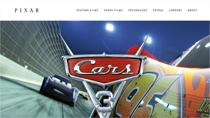
Pixar’s bold and animated website shows why it’s a major force to be reckoned with in film animation. While their website is simple itself, Pixar nevertheless manages to keep their site interesting with its feature film for the season advertised boldly in front it’s very visible to its site visitors. Besides that, there are screenshots of their film features which you can choose on and click whichever you’d like to see.
KFC
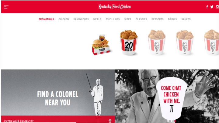
It’s hard not to be tempted with KFC’s mouthwatering website. The sight of delicious grilled chicken is thoroughly irresistible and the site just oozes with chicken made with the colonel’s 11 secret herbs and spices. It’s not every time that a fast food brand makes it to the best website list but you’ll know why the moment you check out KFC’s site. It’s thoroughly responsive and the videos of the colonel are worth checking out.
Innocent Drinks
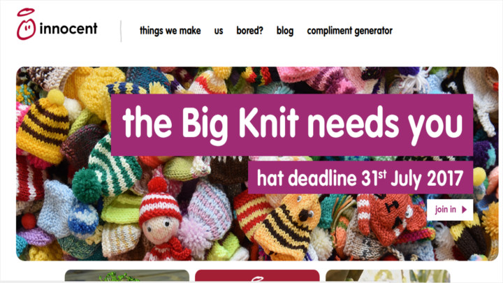
Innocent Drinks’ website is not only an organic foods’ enthusiasts’ paradise, it’s heartwarming to know they donate 10% of their profits to charity. The website is clutter-free and full of tasty fruit juices that are full of goodness and pleasant to look at. Easy, clean, simple to navigate and informative ensure this website is everything all websites should emulate.
Acme
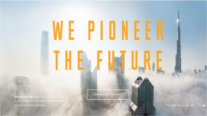
Probably the best interactive website ever produced with each click bringing the reader farther into Acme’s world. One of the best-featured websites ever produced includes intriguing motion graphics that makes you scroll to uncover the company’s story.
Social Media and the Corporate
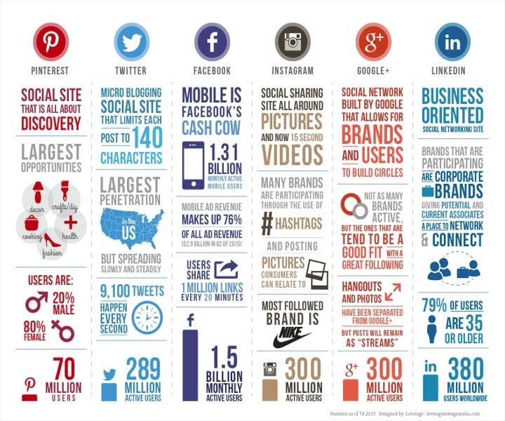
One of the challenges facing most companies today is how to incorporate social media to their websites. While most naysayers are predicting the end of corporate websites due to the proliferation of social media, the innovative ones are finding ways to take advantage of the changes social media brought to the internet. Instead of competing with social media, companies are partnering with social media to work together so that both can benefit from each other.
In today’s tough, competitive environment, being able to adapt is the key to survival. Without diversifying, companies miss out on potential interactions with prospective customers and the sales they may be able to bring. Looking at the explosion of social media sites, It’s easy to see why it’s very necessary to hook up with social media sites.
Looking at the graph provided by LiveChat, a breakdown of the social media sites indicate why it’s imperative for companies to get on the bandwagon of social media sites. In the following breakdown, we look at these major social media sites and how their reach can be advantageous to companies looking to expand their business to millions of online users:
Fast Facts :
Has 1.31 billion mobile users worldwide
Up to 1.5 billion active users every month
Mobile ads make up 76% of Facebook’s revenue
1 million links are shared by users every minute
Advantages of Having a Business Profile on Facebook :
Timeline. Facebook’s Timeline allows you to structure important events and highlight posts. This is helpful to feature products and your company’s events that you can announce to customers. You can even back-date posts to make sure your product history is visible.
Nurture Close Communication. You can easily engage customers and maintain close contact through the comments and messaging section. Besides customers being able to like and share your posts and products, they can also comment and make suggestions. That way, improving your product is easier when customers make the suggestions themselves.
Building Your Brand. Useful especially when your company’s just starting out. Facebook is one of the best starting points to create a following. You can invite friends and employees to like the page and enlist them to invite their friends to like your page until you’ll have a following. Creating an initial network is one of the most important steps to grow a following and build your brand on social media.
LinkedIn is one of the foremost business-oriented social media sites that can help you build connections with some of the biggest brands and professions throughout the world.
Here are some fast facts about LinkedIn:
Has more than 380 million users worldwide
79% of users are 35 years old and older and most have senior management positions, corporate heads and professionals
Most brands that participate are big corporate brands
Advantages of Having a Business Profile on LinkedIn:
LinkedIn Tabs. LinkedIn’s tabs allow you to open pages on insights, services and products. These help diversify the page and allows you to post jobs or recruit prospective employees, and makes it easy to explain and communicate your brand.
You Can Create A Group. LinkedIn is one of the best social media sites to put content and encourage other people, colleagues and employees to join. You’ll have the exclusivity of a closed group where you can have discussions regarding your business and can welcome inputs from everyone to improve your brand.
Network Discussion. LinkedIn has a lively community that primarily talks about business matters and is backed by solid credentials from its members. By including your competent employees in the discussions, they can help you spread your brand among the community where connections are far-reaching. This will help build a solid base in spreading the word about your brand and product within the community.
Google+
Google’s own social networking site allows you to build your profile and feature content, your brand and product which you can share with different groups in the community. With over 300 million active users worldwide, you can spread your brand among the many groups that have specialized interests. The best thing about Google+ however, is its ability to put your content in its search engine that has the widest reach among all search engines worldwide.
Here are other social media sites that can help you build your brand:
Fast Facts :
Is the largest social media site with the biggest penetration in The United States
Spreading steadily worldwide and one of the most preferred site for actors and prominent individuals like President Donald Trump and Tesla’s Elon Musk
Has 289 million active users and growing steadily
Most major brands have their own accounts on Twitter
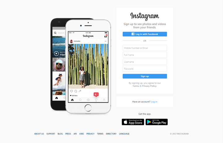
Fast Facts :
Has more than 300 million active users
The effective use of Hashtags has lots of major brands participating who use them to promote their products
You can share pictures and videos of your products which consumers can relate to on the website
Nike is the most popular brand with the most customer following
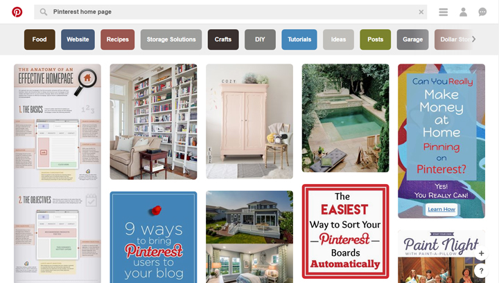
FastFacts:
Offers the largest opportunities for products such as food, fashion, DIY, crafts and decors
More than 80% of its users are women and products aimed at women will find this site very useful for promoting their products
Has more than 180 million users
Best Sources for Web Design Templates
Top 10 Sites to Get the Best Website Templates for Free
Searching for templates in the Internet will lead you to pages upon pages of results, many of which might not render the results you wish. I’ve taken it upon me to do the search and here are the top websites you could check out for both free and premium website templates with stunning visuals and modern features.
Wix
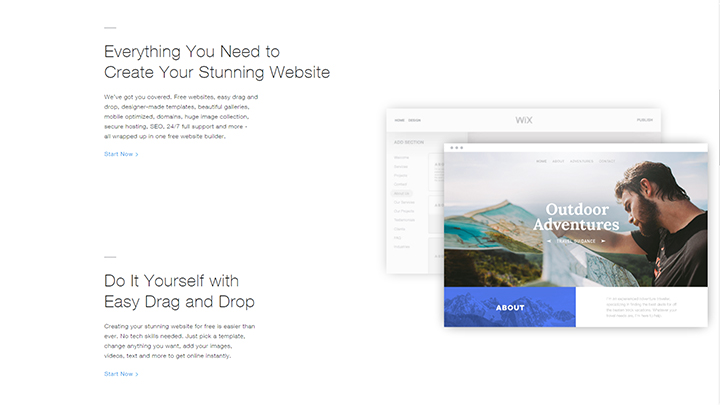
Wix is a great site that offers free stunning website templates you could use. The templates are organized categorically, making navigation both easier and faster. While the download and use of these templates are free, they also offer premium subscriptions that help you out in maintaining and running your website.
FreeWebTemplates
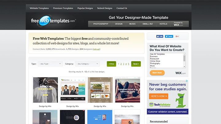
FreeWebTemplates has an extensive collection of website templates they’ve gathered from all over the Internet. The templates aren’t arranged in any way but they quite a few of them are free. Most would require you to have a premium subscription so to be granted access.
ThemeFisher
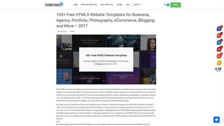
ThemeFisher has hundreds of visually stunning corporate website templates for businesses involved in a variety of different industries. The templates all have very modern features and appearances that are predicted to be the trend this year. The templates have non-premium versions available to be downloaded for free and premium versions that you can download for a price. I suggest that you take advantage of the free version and if you like it, buy the template for the price posted.
TemplateMonster
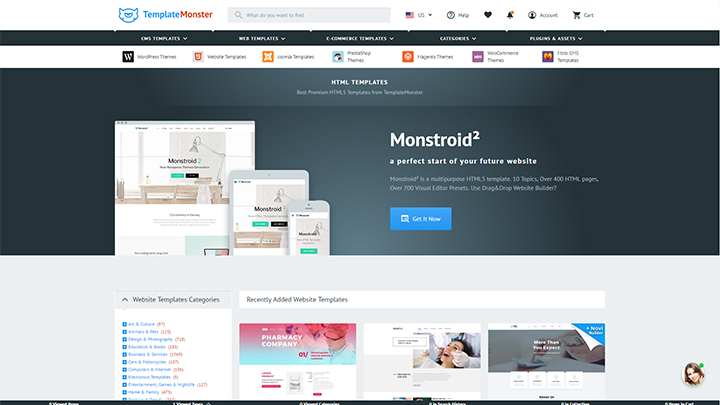
TemplateMonster categorizes the templates according to the industry your business is in. It helps you find appropriate templates faster and easier. Additionally, you can also filter what you see on your screen according to the kind of style you want your website to adopt such as Urban, 3D, or Retro.
FreshDesignWeb
Don’t be fooled by appearances. While FreshDesignWeb’s own website template is not the most attractive out there, they do offer a great variety of corporate website templates, both free and premium. Many of the website templates they have collected are fresh, modern, and attractive, and includes many enviable features that will surely make your corporate website a big hit.
StyleShout
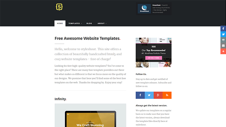
StyleShout does not have an extensive collection, but so far, they are the most informative. Under each template, they describe exactly what kind it is and tags the templates according to their features and functions. Like most other websites, they also feature both free and premium templates.
CSS Author
CSS Author has a large collection of website templates that you might find useful. They have many beautiful and modern designs that have features predicted to be the trend this year. Additionally, they also have a Live Demo feature which lets you test the template so you could see exactly what the site would be like should you choose to use a certain template.
BootstrapMade
What’s great about BootstapMade is that the website is so organized that it makes navigation so much easier. You could search for themes based on the industry your business is in, by theme, or even by the colors you want in your corporate website.
Webdesign Inspiration
WebDesign Inspiration’s homepage would take you to a list of their featured templates. They have an extensive collection of beautiful, attractive, and modern designs that could be used as inspiration for creating your corporate website. While there is no particular arrangement for the templates, which makes it relatively difficult if you’re searching for a certain theme, they do have tags that you could employ to make navigation relatively easier. WebDesign Inspiration comes in two languages, which you could switch around in the bottom of the page: English (represented by an icon of the American flag) and French (represented by the national flag of France).
Futhermore, WebDesigns Inspiration lets you visit the websites on the page so you could get a feel of what the site would look like. While there is no visible download button, it is a pretty great place to get an idea of the appearance, features, and functions that you want for your corporate website.
Colorlib
A website that in itself is already attractive, you can expect beautiful website templates in it. The templates in the Colorlib are classified into two categories: Free and Premium. This makes navigation easier, especially if your budget only allows for free templates. Upon clicking on a template that has caught your eye, you can choose whether you want to test it out or download it right away. Colorlib’s collection of corporate website templates aren’t as impressive as others but they definitely have eye-catching ones available. While chances are small that you’d find a corporate website template you could use here, it’s definitely worth checking out as it could help you find inspiration for layout and graphic display.
>Conclusion
In the age of social media and the explosion of their popularity, many have predicted the end of corporate websites. What these doomsayers failed to predict was how adaptive businesses are and how most companies managed to survive even before the age of the world wide web. Businesses survive primarily because they do advanced forecasting and adapt accordingly. Paradigm shifts in business are as important as survival instincts in individuals. The means to survive is not just based on a paradoxical scheme of baseless theories, but grounded on the fundamentals of survival through a well-planned business gamble with maximum profit and minimal losses.
Investing in both an institutional website and social media is the key to survival. Corporate websites may be stand-alone entities, but they work well with any avenues to further promote their products and services. With social media, what better way to take advantage of that opportunity than by jumping into a platform of free publicity with minimal costs. Even before ordinary individuals realized the potential of social media, businesses have long established that any form of free publicity is an advantage that must be exploited. Advances in technology called for different approaches on every device that supports optimized web pages that can fit on any tool of communication.
Corporate websites are here to stay and those who spelled their doom must be eating back their words by now. The adaptability of websites to any device ensures they will stay on for many years to come. It is important for readers of this guide not to be swayed by those whose shortsighted views are hampered by their inability to recognize the power of business flexibility. We live in an age where the possibilities are boundless. Yet let’s not forget the age-old adage that any publicity is good publicity. In that aspect, both your corporate website and social media are powerful tools by which your business will be disseminated effectively. We live in interesting times, Confucius has said. In those words are the true meaning to advance your business interests, at a time when it’s easy for your clients to see, both through social media and in your home, your very own corporate website.


