


238+ Sample Chart Templates
Chart templates refer to the different pre-structured patterns of chars, where relevant information is inserted to obtain a well-organised informational pattern. It is a form of visual representation of data with rows and columns. Different industries incorporate various types of charts in order to make their presentations better presentable and simplified. Here are the different types of chart templates:

> Gantt Chart Template
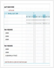
A Gnatt chart is a variation of a bar chart. It is used to present a project schedule. It focusses on the starting and finishing points of a project. It can also summarize the project. The summary and terminal elements are used to interpret the data vividly and show the relationship between different activities. (9+ Gantt Chart Template)
> Run Chart Template
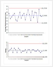
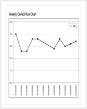
These templates are used to observe data over a certain period of time. these are incorporated to represent the relationship between production and the relative time. There are random drawings with a fixed location and fixed distribution. The scales are also fixed in these charts. One can easily detect the outliers. (5+ Run Chart Templates)
> T Chart Template
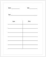
These templates are used to represent a family-tree-like presentation. There are a number of boxes along with the labelling in these charts. Horizontal and vertical structures meet each other in these templates and are used to present a combination of text and numerical data. It is used to show relationship between two or more entities. (13+ T Chart Template)
How to create chart templates in excel?
MS Excel enables the users to create different types of chart templates. There are different variations among these charts. Line charts, bar charts, graphs, pie charts and several other types of charts can be created on this platform. If you want to create a chart template in Excel, you need to execute the following steps:
- First of all, you need to create a table with all the data in the excel sheet. The type of chart depends on what type of data you enter and the type of assessment you wish to do. It may be a single data series or a multiple data series. Based on these aspects, you need to determine the parameters. the row and column format goes well with numerical data analysis. You may incorporate stock market data, billing data and production values in these templates.
- Now, when you have entered the data, you need to select the cells along with the information, based on which the chart will be created. The cells have to be selected. You can drag the pointer over the cells to select them. Sometimes, you may want to make separate charts for different sections of information in the template. In these cases, select only the required the portion of data.
- When you have selected the data, you have to choose the particular type of chart that you require. Go to the ‘Design’ option and you will find a number of charts. Make sure that you choose the right type of chart for your purpose. You may go to the option named ‘Choosing the right chart’ to incorporate the data in the most suitable chart. This will optimize the graphical representation of data.
- Now go to the ‘Layout’ option and choose the design for the chart. There are a number of options related to fonts, colours and so on. Resize the chart and label the axes and place the chart in the area you would want it to be in.
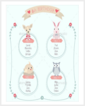
> Blank Family Tree Chart Template
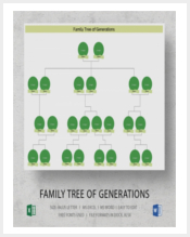
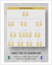
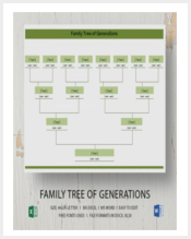
Family tree charts are used to represent the relationship between different objects or persons based on classification. Here, the boxes are connected with arrow marks and lines. It helps to understand how the things are divided after they originate from a similar place. (31+ Blank Family Tree Templates)
> Process Flow Chart Template
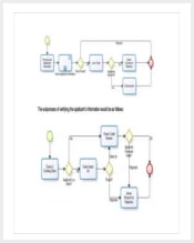
Process flow charts are used to represent data that are arranged in a synchronised manner. This flow may be unidirectional, while in some cases it may flow to the other direction. It describes a process, like a manufacturing strategy. There are rectangular boxes in different sections and these are connected by arrowheads. (12+ Process Flow Chart Template)
> Bubble Chart Template
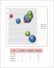
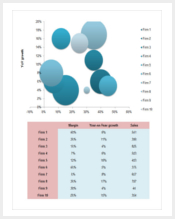
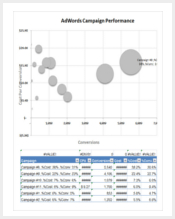
These charts are used to depict data related to finance. There are circular structures with numeric information in them. Thin lines are used to connect these bubbles. Different colours make the bubbles attractive and companies use these templates to present data related to budgeting and planning. (6+ Sample Bubble Chart Templates)
> Medication Chart Template
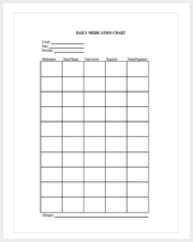
People dealing with medicines often use these charts. The rows and columns are customized to present a dense meshwork of grid, and the names of medicines, quantities, dosage, prices and related details are incorporated in these charts. Retailers pharmaceutical employees often use these chats. (11+ Medication Chart Template)
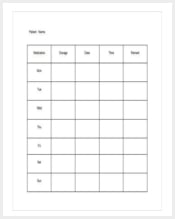
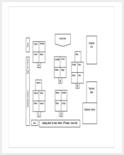
> Seating Chart Template
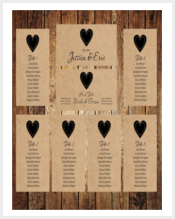
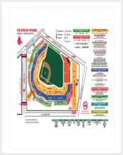
In a seating chart template, the arrangement of seats in a particular area is presented with clarity. These charts are used to determine the sitting arrangement in examination halls. In theatres and movie halls too, online booking is done with the help of a seating chart template. (17+ Seating Chart Template)
> Waterfall Chart Template
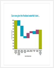
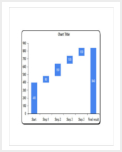
The rise and fall of figures are evident on analysing a waterfall chart. These charts show a starting value, and then the rise and dip in the trends are visible on assessing the chart. Different colours are used to mark the high and low points. One can also get an idea about the average trend from this chart. (9+ Waterfall Chart Template)
> Classroom Seating Chart
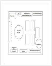
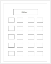
Classroom seating charts are often incorporated to structure the sitting arrangement in the educational institutions. It helps the planning authorities to position different instruments for education in the classroom, so that all the students can enjoy equal view from their respective places. (10+ Classroom Seating Chart)
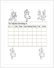
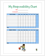
> Behavior Chart Template
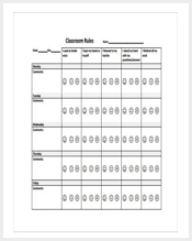
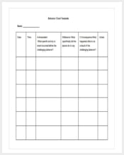
Behaviour charts are used in academic institutions and offices. These charts are used to take a note of the overall behaviour of a candidate. The data is accumulated over a specific period of time and the required action is taken, based on this information. The boxes in these charts contain a number of criteria. (12+ Behavior Chart Template)
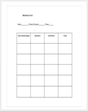
> Reward Chart Template
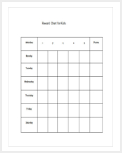
Reward charts are needed when the candidates are to be rewarded on the basis of certain parameters. The qualities of the people are noted in these charts and analysed to yield the extent of goodness. When the data is analysed, it shows whether the person has been able to live up to the expectation. (13+ Sample Reward Chart Templates)
How to Create an Organizational Chart?
At the outset, you need to identify the people associated with the project. Identify the staff and personnel who would be involved in the work. You need to be clear about the functions of each of these persons. For instance, if you deal with marketing, you need to identify the persons associated with sales, consultation, advertisement and so on.
You should place the personnel in different sections, based on the task they perform. In other words, you need to create water-tight departments for each of these sections.
If you want to create an organisational chart, follow the steps given below.
- First of all, you need to open a new document in Excel to create an organizational chart. From the options that you will find, go to the ‘Insert’ tab and click on the ‘Smart Art’ option. Then click on ‘Hierarchy’ and you will find a window opening up with different Smart Arts. Choose the one that you will be compatible with. having done, click on the ‘Ok’ option and it will be inserted in your document. It is a blank document and you will be able to edit it as required.
- Now, you need to fill up the names of the employees in the chart. Click on the area marked ‘Text’ and add the names of the employees.
- You can ass more shapes by right clicking. Go to the option called ‘Add shape after’ to get the desired results. You may use the option ‘Add Shape Above’ to add the name of an employee above the present one. You can also go for the ‘Add an assistant’ option to add a name below.
- You can also add pictures to the chart if you want. It will make the presentation vibrant. This can be done by clicking on the picture placeholder in the different shapes.
> Patient Chart Template
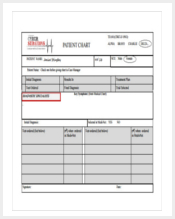
Medical institutions like hospitals and dispensaries use these charts to maintain a record of the patients. They are listed up according to the serial numbers and their age, along with other personal details are written by the sides. The charts may also include their ailments. (10+ Patient Chart Template)
> Reflexology Chart Template
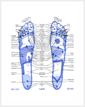
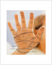
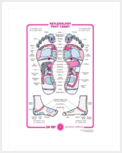
Reflexology charts are widely used for medical purposes. It is an art of treatment based on pressure points. Different parts of the body like the hands are feet are examined in the process. There are different sections, with various colours to show the areas in these areas. (11+ Reflexology Chart Templates)
> Diamond Quality Chart Template
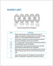
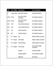
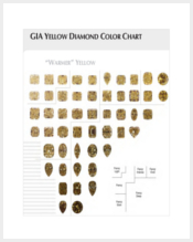
Diamond quality charts are widely used by professionals dealing with jewellery. Diamonds are different qualities and the extent of gloss they emit depends on the angles at which the edges are cut. In these charts, these details are incorporated and help in assessing the value of the gems. (7+ Diamond Clarity Chart Templates)
> Pareto Chart Template
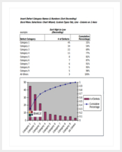
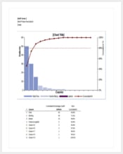
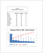
Pareto charts are used to present numeric data, especially when there are a number of problems. It helps to identify the most important one from these problems. You can have a look at the specific components and come to a conclusion. The frequency at which these problems arise are also shown here. (8+ Pareto Chart Templates)
> Pedigree Chart Template
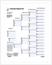
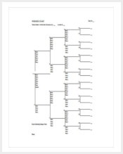
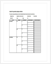
These charts are used to determine the traits of humans. Researchers use these chats to analyse the inherent traits within the members of a family. These charts are wide by psychologists to find generic differences and similarities between people. One can customise these charts as per the requirement. (9+ Pedigree Chart Template)
> Color Chart Template
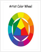
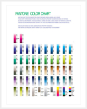
In a coloured chart, a particular component is attributed with a specific colour. it helps to identify it from the chart by looking at the colour. You need not go through the detail of what is written in the chart. It reduces the time to analyse the data presented in these charts. Small boxes of various sizes make up these charts. (11+ Color Chart Template)
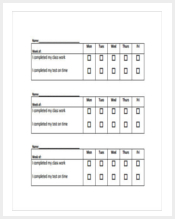
> Kids Chore Chart Template
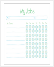
The chores are important for kids. Doctors prescribe them with specific diets and recommend a time-chart to follow. These can be easily incorporated in these charts, thereby reducing the possibility to forget the timings. It helps the mothers to remember what to feed the child and when, along with the quantities. (7+ Kids Chore Chart Templates)
> Blood Pressure Chart Template
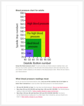
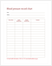
Blood pressure charts are vibrant and consist of many colours. There are two figures in the blood pressure reading of a person. These figures are incorporated in the charts to ensure accurate treatment. Doctors often use these charts as it is easy to present the data through these charts. (7+ Blood Pressure Chart Templates)
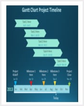
> Timeline Chart Template
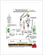
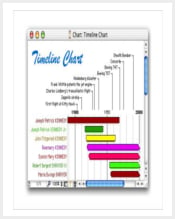
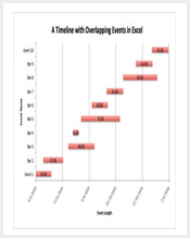
Timeline charts are used to present the relation between a variable with time. These are used in various industries to assess the increment in production from time to time. The values in the charts represent the status of the variable at different points of time. The highest and lowest points can also be assessed from these templates. (9+ Timeline Chart Template)
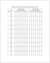
> Height Weight Chart Template
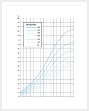
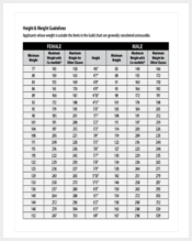
The height-weight charts have been used by doctors and dieticians over a long time. There are separate height-weight charts for males and females. The chart contains the heights that are appropriate for different age groups. It helps to determine whether a person is overweight, underweight or have perfect health. (12+ Height Weight Chart Template)
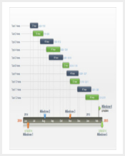
How to make Gantt chart?
Creating a Gantt chart in MS Excel is easy. horizontal task bars are used to present the information in these charts. Follow these steps to create the chart.
- Firstly, you need to create a project table with all the relevant information. Include the start time, finishing time and other essential details in the template. You need not include the duration, as it will be visible in the chart.
- Based on this information, you have to make a standard bar chart in Excel. Insert the dates, select them, go to the ‘insert’ option, visit the ‘Charts’ group and find the required design for this purpose.
- Now, you have to add the duration to the chart. Go to the ‘Select data source’ option and add the duration. If you want to add more duration to the chart, click on the ‘Add’ option and you will be able to add more data, or duration to the chart.
- You will find the ‘Edit series’ option. Under the ‘Series name’, edit the box with the words ‘Duration’. Now go to the ‘Series values’ option and select the range. When the small window opens, you will have to select the cells by dragging the mouse over them. Now go to the ‘Ok’ option below the ‘Series values’ option and click it. thus, you will be able to select the range.
- You will be back to the chart. Now you need to add task descriptions to it. After performing this task, you need to convert the bar graph that you had previously created into the Gantt chart. Click on any blue bar in the chart and go to the option called ‘Format data series’. Click on ‘No Fill’, ‘No Line’ and ‘Reverse order’ one after another.
Your chart is completed. You will have to improve the chart by adding the required dates, removing excess space and performing other related operations in the chart.
More in Business

