5+ Pareto Chart Templates
A Pareto Chart is a commonly used term in statistics and has been named after Vilfredo Pareto. The chart is a combination of both line and bar graphs. In the chart, the net total or cumulative total is usually represented through the line graph. For those who aren’t familiar with the uses and types of pareto chart, these Chart Templates could come in handy. These give an accurate description of what a pareto chart looks like.
Six Sigma Pareto Chart
 asq.org/sixsigma
This is one of the supreme examples of a Pareto chart. The graphs are neatly displayed for you to understand and follow and you would even be able to personalize the chart.
Pareto Run Chart Template
 thequalityportal.com
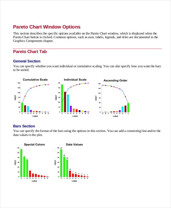
This Pareto chart template serves as a great sample for you while you design your line and bar graphs. Also, the chart template here is fully editable and customizable and comes in a neat format.
> How to use the Pareto Charts?
When it comes to charts and graphs, you need to know how to read or analyze them. In the Pareto chart, you have both bar graphs and line graphs – each representing something specific. Usually, bar graphs are used to represent individual values on the chart or sheet.
The net total (the cumulative total) or basically the net result obtained from the bar graphs are represented through the line graphs. Thus, it becomes easier to understand what the bar graphs state and the main point of the representation. Also, the Graph Templates that you see here are really easy to use.
Pareto Analysis Chart Template
 freequality.org
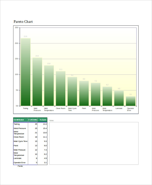
Simply having a Pareto chart isn’t enough. You should be able to analyze it as well. This Pareto chart template that you see here can help you out with that.
Sample Pareto Chart
 ncss-wpengine.netdna-ssl.com
This Excel template is a sample on which you can model your Pareto charts. You can follow the representation provided in the chart template here and abide by the format.
Revising the Pareto Chart
 cs.uic.edu
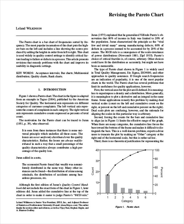
This chart template tells you exactly what a Pareto chart looks like and what it should contain. One look at it would give you an idea of what the data is trying to convey.
> Why should you use Pareto Charts?
In the field of statistics and accounts, data and information are usually represented in the form of graphs and charts. Graphical representations help make monotonous and technical data interesting and easily understandable. Usually, there are different kinds of graphs that are used – like bar graphs, pie charts, line graphs and so on. You can also see Gantt Chart Templates.
A combination of bar graphs and line graphs would help you achieve a number of objectives. Not only would you be able to represent individual graphs but would also be able to represent the net total or final outcome. That is where these amazing Pareto charts come in handy.
Pareto Diagram Template
 uphs.upenn.edu
> Benefits of Pareto Charts
The Pareto chart templates that you see here come loaded with benefits. Some of them are as follows:
- Pareto charts would help you in representing all your data and information in a logical and practical manner. They would help you present your facts and figures in a neat and well organised manner that is appreciated by all.
- If you have to deal with Pareto charts on a regular basis but haven’t had the chance to work on them previously, you could use these chart templates as a sample. You could get an idea of how to represent your data on the Pareto chart and so on. You can also see Baby Boy Growth Chart Templates.
The Pareto charts are mainly represented in the excel format since the presence of rows and columns make it easier to represent data and information. The Pareto chart templates that you see here are rather straightforward and simple. The Excel templates are to the point, neat, precise and very easy to follow.
More in Charts
| 31+ Pedigree Chart Templates - PDF, DOC, Excel | 8+ Partnership Organizational Chart Templates in PDF | Word | Google Docs | Pages |
| 10+ Seating Plan Templates in AI | InDesign | PSD | Publisher | Word | Pages | Docs | PDF | 10+ Height And Weight Conversion Chart Templates in Illustrator | PDF |
| 14+ Color Wheel Chart Templates | 10+ Family Tree Organization Chart in Docs | Word | Pages | Editable PDF | Excel | Numbers | PDF |
| FREE 10+ Research Gantt Chart Templates in PDF | MS Word | FREE 5+ Research Process Flow Chart Templates in PDF | MS Word |
| 18+ Research Flow Chart Templates in PDF | MS Word | 10+ Family Tree Chart in Google Docs | Word | Pages | Excel | Numbers | Keynotes | Powerpoint | Editable PDF | PDF |
| 10+ Office Gantt Chart Templates in PDF | Google Sheets | Word | Excel | Pages | Numbers | Classroom Seating Chart Template - 25+ Word, Excel, PDF Format Download! |
| 17+ Office Flowchart Templates in PDF | 10+ Church Organizational Chart Templates in PDF | DOC |
| 5+ Nursing Organizational Chart Templates in PDF | 33+ Company Organizational Chart Templates in Google Docs | Word | Pages | Excel | PDF |
| 7+ Real Estate Organization Chart Templates in Word | Apple Pages | Powerpoint | Keynote | Google Slides | Google Docs | PDF | 8+ Expense Chart Templates in PDF |
| 19+ Management Chart Templates | 15+ Management Flow Chart Templates in PDF |
| 16+ Training Flow Chart Templates in Google Docs | Word | Pages | PDF | 6+ Payroll Flowchart Templates in PDF | DOC |
| 11+ Construction Organisational Chart Templates in Google Docs | Word | Pages | PDF | 7+ Finance Organizational Chart Templates in Google Docs | Word | Pages | PDF |
| 6+ Agency Organizational Chart Templates in Google Docs | Word | Pages | PDF | 12+ Office Organizational Chart Templates in Google Docs | Word | Pages | PDF |
| 14+ School Organizational Chart Templates in Google Docs | Word | Pages | PDF | 12+ Technology Organizational Chart Templates in Google Docs | Word | Pages | PDF |
| 15+ IT Organizational Chart Templates in Google Docs | Word | Pages | PDF | 4+ Marketing Organizational Chart Templates in Google Docs | Word | Pages | PDF |
| 16+ Simple Chart Templates in Google Docs | Word | AI | InDesign | PSD | Publisher | Pages | PDF | XLS | 22+ Department Chart Templates in Google Docs | Word | Pages | PDF |
| 11+ Education Organizational Chart Templates in Google Docs | Words | Pages | Numbers | PDF | XLS | 15+ Company Chart Templates in Google Docs | Word | Pages | PDF |
| 13+ Daily Chart Templates in Google Docs | Word | Pages | PDF | XLS | 10+ Fundraising Chart Templates |
| 14+ Seating Chart Templates | 5+ Workflow Chart Templates |
| 11+ Weekly Chart Templates | 3+ Mind Map Chart Templates |
| 5+ Kid's Chart Templates | 18+ Chore Chart Templates |
| 20+ Comparison Chart Templates | 29+ Timeline Chart Templates |
| 18+ Flow Chart Templates | 9+ Monthly Chart Templates |
| 24+ Organizational Chart Templates | 15+ Growth Chart Templates |
| 15+ Timeline Chart Templates | 16+ Incident Flow Chart Templates |
| 10+ Excel Chart Templates | 7+ Excel Chart Templates |
| 13+ Project Flow Chart Templates | 7+ Marketing Gantt Chart Templates in PDF |
| 8+ Family Genogram Templates | 9+ Marketing Flow Chart Templates in Google Docs | Word | Page | PDF |
| 13+ Simple Wedding Seating Chart Templates | 7+ Wedding Timeline Templates |
| 6+ Sales Chart Templates | 5+ Sales Flowchart Templates |
| How to Create a Flowchart [10+ Templates to Download] | 10+ Flow Chart Templates in Apple Pages |
| 17+ Flow Chart Templates in Google Docs | 10+ Flow Chart Templates in PDF |
| 10+ Flow Chart Templates in Word | 10+ Chart Templates in Google Sheets |
| 12+ Seating Chart Templates | 12+ Seating Chart Templates in Word |
| 17+ Seating Chart Templates in Google Docs | 10+ Chart Templates in Apple Numbers |
| 10+ Chart Templates in Excel | 10+ Chart Templates in Google Docs |
| 11+ Chart Templates in Apple Pages | 10+ Chart Templates in PDF |
| 10+ Chart Templates in Word | 12+ Gantt Chart Templates |
| FREE 12+ Seating Chart Templates in Word | Publisher | inDesign | Photoshop |Illustrator | 13+ Timeline Chart Templates |
| 13+ Chore Chart Templates | 10+ Flow Chart Templates |
| 10+ Chart Templates | 5+ Banner Seating Chart Designs & Templates - PSD, AI |
| 3+ Navy Seating Chart Designs & Templates - PSD, AI | Acrylic Seating Chart Templates - PSD, AI |
| World Seating Chart Templates - PSD, AI | 5+ Photo Seating Chart Designs & Templates - PSD, AI |
| 3+ Travel Seating Chart Designs & Templates - PSD, AI | 4+ Gold Seating Chart Designs & Templates - PSD |
| 3+ Floral Seating Chart Designs & Templates - PSD, AI | 9+ Guest Seating Chart Designs & Templates - PSD, AI |
| 11+ Modern Seating Chart Designs & Templates - PSD, AI | 10+ Wedding Seating Chart Templates |
| Free Potty Training Chart Templates | 16 Temperature Chart Templates- Samples, Examples |
| 6 Table Chart Templates - Samples, Examples | How to Use Excel Chart Templates |
| 33 Sample Flow Chart Templates | 8 Chord Chart Templates - Samples, Examples |
| What Is a Gantt Chart Template? | 6 Music Chart Templates - PDF |

