Free US Food Expenditures by Household Income Group from 2015 to 2025
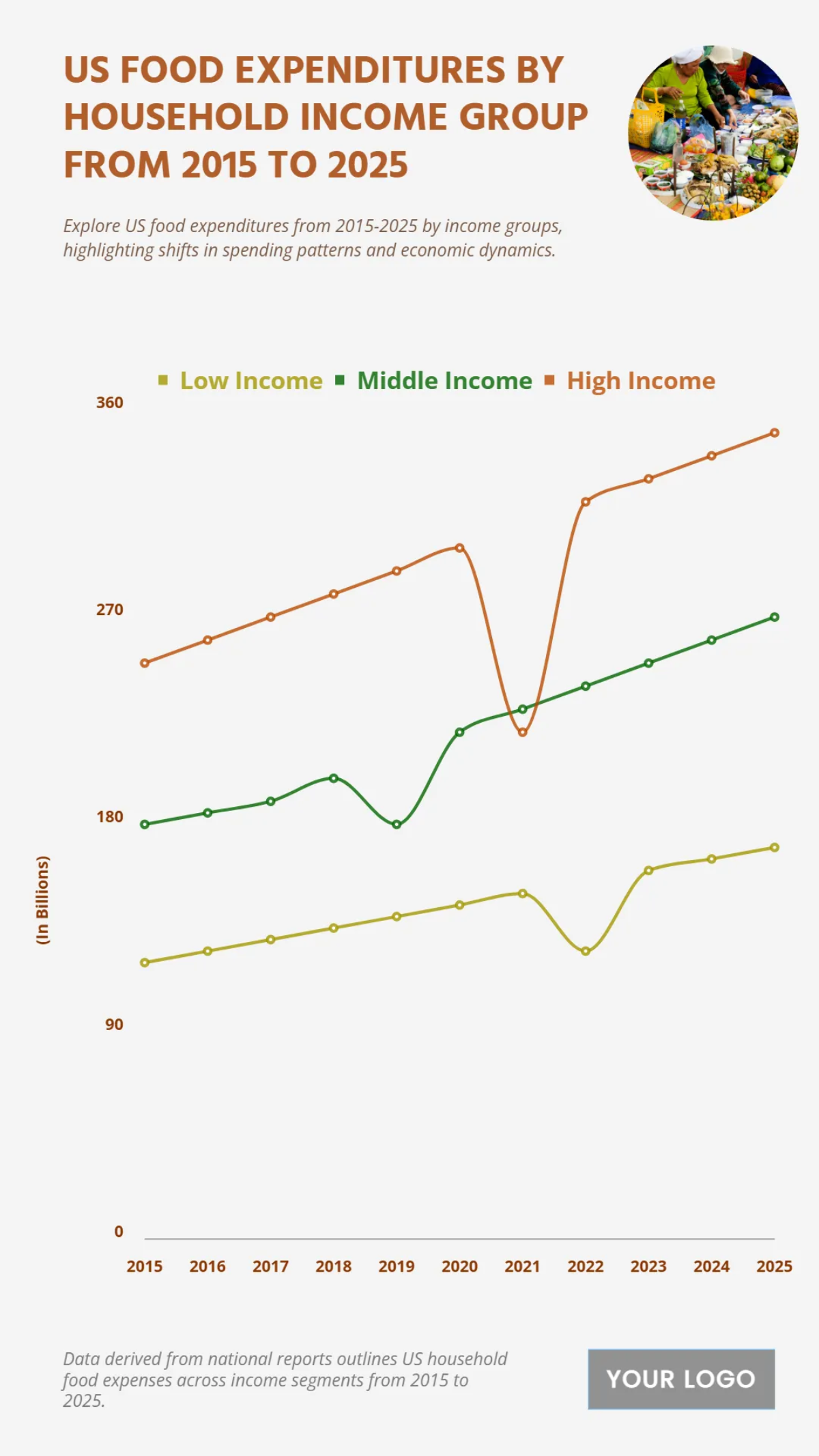
Based on the line graph titled "US FOOD EXPENDITURES BY HOUSEHOLD INCOME GROUP FROM 2015 TO 2025", a clear distinction in spending patterns is visible across different income groups over a ten-year period. The data, presented in billions, shows that the High Income group consistently has the highest food expenditures, with spending increasing from approximately 260 billion USD in 2015 to a projected 300 billion USD by 2025. The Middle Income group also shows a steady upward trend, with expenditures rising from around 190 billion USD in 2015 to an estimated 270 billion USD by 2025. The Low Income group, while spending less overall, also demonstrates a gradual increase, with food expenditures growing from about 90 billion USD in 2015 to nearly 150 billion USD by 2025. A notable dip in spending is observed in all three groups around 2020 and 2021, followed by a strong recovery and continuous growth. This chart highlights the significant spending power of higher-income households on food and the overall upward trend in food expenditures across all income brackets.
| Labels | Low Income | Middle Income | High Income |
|---|---|---|---|
| 2015 | 120 | 180 | 250 |
| 2016 | 125 | 185 | 260 |
| 2017 | 130 | 190 | 270 |
| 2018 | 135 | 200 | 280 |
| 2019 | 140 | 180 | 290 |
| 2020 | 145 | 220 | 300 |
| 2021 | 150 | 230 | 320 |
| 2022 | 125 | 240 | 320 |
| 2023 | 160 | 250 | 330 |
| 2024 | 165 | 260 | 340 |
| 2025 | 170 | 270 | 350 |
