


What is one thing in common between the flowcharts, Gantt charts, seating charts, and org charts? They are all data organization tools. That is why if you want to present different data sets in a creative and readable manner, creating charts is the way to go. We will guide you in the chart-making process as we provide fully editable, multi-format MS Word, Apple Pages, Google Docs, Excel, Numbers, Google Sheets, PDF, and PPT, and 100% expertly written Simple Chart Templates and Designs. Feel free to use any of our blank chart templates to complement your presentations, documents, and research studies. Sign up for our template gallery subscription plans now.
FREE Simple Chart Templates
Become More Productive at Work with Template.net's Free Simple Chart Templates! Our Website Offers a Diverse Collection of Customizable and Printable Templates for Designing Gantt Charts, Diagrams, Flowcharts, Organizational Charts, and So Much More! Choose a Template and Acquire a Copy in Either Microsoft Word, Excel, Powerpoint, or PDF Formats!


What Is a Simple Chart?
A basic chart is a visual representation of information. Through it, you can visualize both qualitative and quantitative data sets. They are also used to showcase the relationship (or lack thereof) between two or more data sets or characteristics.
So if you are looking for a way to accurately and creatively showcase otherwise boring pieces of information, creating flow charts may be what you need to do.
How to Make a Simple Chart?
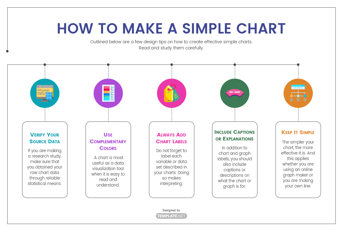
Outlined below are a few design tips on how to create effective simple charts. Read and study them carefully.
1. Verify Your Source Data
An effective chart relies on verifiable and accurate source data. With the right source data, you can determine what specific kind of chart to use. Remember, different types of charts are used for different types of data. If you use an incorrect chart, it is highly likely that the relationship or conclusions you draw from the resulting chart will be incorrect too.
2. Use Complementary Colors
A chart is most useful as a data visualization tool when it is easy to read and understand. And the use of complementary colors is the best way to accomplish this. With the right colors, you can highlight and organize the most important elements on a chart
3. Always Add Chart Labels
Do not forget to label each variable or data set described in your charts. Doing so makes interpreting the chart easier and quicker.
4. Include Captions or Explanations
In addition to chart and graph labels, you should also include captions or descriptions on what the chart or graph is for. This guides you in making the right interpretation of the chart as it relates to your own presentation.
5. Keep It Simple
The simpler your chart, the more effective it is. Remember, charts are data visualization tools. They should make understanding an otherwise jargon-ridden or number-infested text, research study, school report, or business plan way easier.
Frequently Asked Questions
1. What are the Different Types of Charts?
Charts come in many different forms. Bar charts and pie charts are used to represent categorized data, fixed units, measurements, or ordinal data. On the other hand, nominal or qualitative data are best represented by line charts or bar graphs alone.
2. What is the Difference Between a Chart and a Graph?
A chart is used to represent qualitative and quantitative characteristics or data. The most common examples are pie charts and bar charts. While graphs are used to showcase two or more quantitative data sets and how they are related to each other. A good example is a line graph.
3. What is the Difference Between a Chart and a Diagram?
A chart shows a visual representation of a data set while a diagram is an illustration that depicts how something operates (or a plan on how to operate something).
4. What is a Statistical Chart?
A statistical chart, also known as a statistical diagram, is a drawing or outline of data obtained during the data-gathering phase of a research project. They can come in the form of timetables, leaf diagrams, tally charts, and frequency tables.